


Thanks for the image use advice. It is always a challenge to find an image when you are writing something abstract and while an image can speak a thousand words, if those words are not relevant then poufff you are out of where you want your reader to be 🙂
Warning: Using the Wrong Images Can Confuse Your Learners
November 20th, 2007Studies show that using images and text to represent your ideas is more effective than just using text. The key is choosing the right images because those same studies show that images with no purpose can actually make learning harder.
To lessen the cognitive load and make your content more memorable, it’s important to use images that contribute to the learning experience rather than detract from it.
Here are three things to consider when using images in your elearning courses.
Use Images to Tell a Story
Images are effective because they can hook us emotionally or get us to see things in a new way. Images can connect us to greater ideas and places in time.
Look at the picture below. Even though there’s no text, it tells a story. What does this picture say to you? What story does it tell?

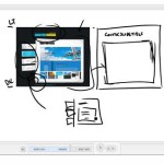
The screens below demonstrate how you can easily convert bullet point text into something that is both visually interesting and memorable.

As you can see, the second image is more interesting and whatever is missing by removing the text can be augmented with narration. The second image is more effective because it is visually memorable, the information is concise, and you can never go wrong with a pug.

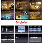
These two images come from the "Meet Henry" presentation. Spend some time studying how the designer of the slides used images and minimal text to convey key points of information.
Tell the Learners Why the Image is Relevant
While images are good at sharing information, you do run the risk that what the learner sees is not what you are trying to convey. Without guidance on your part, your learners could interpret the image differently than how you intend.
The image of the girl above is from the Great Depression. You can imagine a detailed scenario to embellish the image and create a very moving story. However, the image changes dramatically if I add the following information.

With appropriate guidance, the learner’s attention is focused on key areas and the purpose of the image is clear and contributes to the content.
Avoid Using Images Just for Decoration
A common problem with elearning courses is that we are tempted to put images on the screen to dress it up. The image serves no real purpose other than decoration.
Compare the images below. The first is typical of what we see—bullet point text with a decorative image.

The second is an example of how the image supports the content and helps the learner develop a visual model of the information. If you notice, the text is almost identical. I only made minor modifications by creating a more descriptive title and positioning the text close to its part on the image.

Make your next elearning course more dynamic by using effective graphics. Visualize your screens and use graphics that explain the content. Avoid using graphics to make your screen pretty.
With some practice and intentional design of your graphics, you will create very effective elearning.
*Demo content from Oregon State University and Shane Eubanks.
Events
- Everyday. Check out the weekly training webinars to learn more about Rise, Storyline, and instructional design.
Free E-Learning Resources
 |
 |
 |
|
Want to learn more? Check out these articles and free resources in the community. |
Here’s a great job board for e-learning, instructional design, and training jobs |
Participate in the weekly e-learning challenges to sharpen your skills |
 |
 |
 |
|
Get your free PowerPoint templates and free graphics & stock images. |
Lots of cool e-learning examples to check out and find inspiration. |
Getting Started? This e-learning 101 series and the free e-books will help. |
You might also like:
31 responses to “Warning: Using the Wrong Images Can Confuse Your Learners”
[…] Kuhlmann has an interesting post here on how wrong images in e-learning courses can confuse learners. Tom has some nice examples of how […]
I really like the before and after images because it shows that it doesn’t take much to change bullet points to something different. I am going to share this with my team.
You do what you teach. Your post is a great example itself about effective usage of images. Thanks. I’ve learned so much from your website.
As you say, you can never go wrong with a pug. 🙂
Careful selection of applicable, humorous illustrations can substantially improve the impact of your e-learning, rendering it more memorable and enjoyable for your learners (and making it more fun for you as you build your course).
Thanks for the comments. I’ve gotten a number of emails requesting more information on how to create better looking slides and graphics. Here are two books that I recommend.
Cliff Atkinson’s Beyond Bullet Points (new). There’s an updated one for PowerPoint2007 and then this is a link to the Beyond Bullet Points (PPT 2003)
I haven’t read the book, but my guess is that if it is like the blog, then the new book by Garr Reynolds is also good. Here’s a link. Presentation Zen: Simple Ideas on Presentation Design and Delivery
[…] ett budskap än vad alla ord du uppbringar. Det är definitivt något att arbeta med strategiskt. Rapid e-Learning berättar och visar tydligt hur en bild också kan förvirra läsaren. Jag valde min bild att vara suddig och röd för att du […]
Tom: Thanks for making a comment. The translationstools are rather crude so i translate the main points of my post.
I try to point out the importance of using pictures in marketing and education. We are using our sight as the main sense thus it is very important for our survival. All we take in as a picture we encode and also make social conventions about symbols and what they mean. Kings and other leaders has used symbols in their pictures for a long time. We can use symbols to make our message clear and stand out.
I used a red and fuzzy picture to make people curious about my text and so the look for an explanation of the picture…and in the process read my message
Am I the only one who thinks the Pug looks like Marty Feldman …?
Tom, I really like the 3 points and examples. My primary impression your article: It is striking how the answer is not all narration nor all image but a well planned union of the 2.
I found some related content on the Midnight Oil Production site. These guys promote effective usage of video in church services and recently posted content from an online college course they produced entitled “Communicating Visually.” It is a 4 part (so far) program and the URL for part 1 is http://midnightoilproductions.com/reading/?p=44. It contains links to the other 3 parts.
Thanks for sharing your work, Tom!
Hi,
I had come across an acronym for remembering the type of graphics that we use. I think it is DR MORIT or MR DORIT!!
D- decorative ( can be used for introductions)
R- representational ( e.g software screens, an interview scene )
M – mnemonics
0- organizational (e.g family trees, flowcharts)
R- relational (e.g graphs, and pie-charts)
I- interpretive (e.g DNA structure, that which you cannot see but you interpret)
T- transformational – stages in a procedure or process
If a graphic is not meeting any of the above types or criteria as related to the content, then we can do away with the graphic or change it.
-Anitha
I agree 300%; images tell the story. I use Power Point to teach kids Bible stories. the only “slide format” I use is the blank slide with a background scene appropriate to the story. Then instead of just pasting the figures that tell the story on the background; move them into the scene by using a “Custom Animation” effect. Where concise graphics tell the story, animation grabs and focuses attention.
The only text I will use is a quick flash of a character’s name and the key scripture verses relevant to the lesson.
My presentations are a transition from the age old “flannel board” and because of the animation possibilities they hold kids attention much longer and improve retention.
Hi Tom,
This isn’t necessarily something I want published on your blog, but I just wanted to thank you for hosting such an informative site. I have recently entered into the e-learning field, and it’s nice to read your articles about working in e-learning… actually helps me confirm that everything I’ve learned and believe about traditional training can be applied pretty much 1:1 in e-learning!
Not only is it informative, but I love the look and feel of the blog page, especially your cartoon or avatar or whatever it is! It’s probably one of the nicest looking ones I visit.
Thanks again, and keep up the great work!
Michelle
Tom, thank you for creating a blog that always interests me and gives me a new resource to explore.
At the start of your post, you indicate there are studies that confirm these ideas. Do you know where we might be able to find them? If you only have general information, could you share it so I can do some research? If I find them, I will share what I find.
Thank you!
Good question, Stephanie. Off the top of my head, I’d just recommend books by Richard Mayer, like Multimedia Learning. I think E-Learning and the Science of Instruction
is a good book and probably provides the depth most people are looking for.
If you want to do your own research, Google has a nice scholar search feature. You can also try trade journals, industry groups or the Journal of Educational Psychology.
Tom,
again many thanks for your new animation techniques tips. It is amazing help and real service you kindly offer. Great!
Tom,
Many thanks for sharing this information. I looked at Meet Harry’s presentation and I agree on the importance of having the right images when sending specific messages. However, I was a little bit concern about the numbers of slides used to do this exercise. I have heard that number of slides in presentations counts, especially if you want to call learner/customers’ attention and don’t let them get bored. Perhaps using the proper images AND considering the numbers of slides, I can create better presentations with useful meaning.
One more thing… As I’m not from United States I didn’t know what the group that represents the eagle. What’s the group’s name? (Perhaps something else to consider when having learners worldwide).
Regards,
Carolina
Hi tom,
I found your article quite interesting. Currently, I’m doing my research project based on correct image choice while using powerpoint presentations in the teaching of vocab. Therefore, your article is one of the best that I found to support my thesis. The thing is I need to quote and I dunno how I can do that.
Could you please tell me how I can quote this article??? and where did you get all this information from??.
Rodrigo
Chile.
[…] his November 2007 blog post entitled Warning: Using the Wrong Images Can Confuse Your Learners, Tom Kuhlmann discusses the importance of using images appropriately. He starts his post off with: […]
Hello Tom,
I just came across this post searching for research on exactly this point. You write at the top of your post: “Studies show that using images and text to represent your ideas is more effective than just using text. The key is choosing the right images because those same studies show that images with no purpose can actually make learning harder.”
I’m very curious about this – could you point me to some of these studies please? I’d very much appreciate it.
Kristina
I know this is an old thread, but you don’t point out the importance of using an art director and/or graphic designer skilled in eLearning initiatives. Too often, graphic mistakes are introduced by persons who are not skilled in graphic design. Imagine how the content would suffer if the instructional design of a course was developed by someone who knows nothing about instructional design.
[…] his November 2007 blog post entitled Warning: Using the Wrong Images Can Confuse Your Learners, Tom Kuhlmann discusses the importance of using images appropriately. He starts his post off with: […]
Hi Tom,
As usual, this is very informative and useful information. I’m an eLearning Instructional Designer and Masters student in Instructional Design Technologies. You mention that:
“Studies show that using images and text to represent your ideas is more effective than just using text.” Can you cite some of these studies. As an eLearning professional and student, it’s helpful to be able to cite the study when making the argument to use or not use a particular graphic or method in a course design.
Thank You,
Linda Nelson


0
comments