

[…] This post was mentioned on Twitter by Brian Batt, CiberAjuda and Jose Lozano, Aprendemasonline. Aprendemasonline said: Three Sure-Fire Tips to Build Better E-Learning Courses: In last week’s post, I offered some tips for building ra… http://bit.ly/djVCCc […]
Three Sure-Fire Tips to Build Better E-Learning Courses
August 17th, 2010
In last week’s post, I offered some tips for building rapid elearning courses when you’re short on time and resources. In today’s post, I’ll discuss some of the production techniques we used. I especially got a lot of emails about how we used Engage, so I’ll cover that as well as discuss how to do a quick pilot test and rework your objectives list.
Here’s a link to the original course, if you haven’t seen it yet. Check it out and then read the rest of the post.
Step Away from the Default Solution
Software companies build software with specific features. You’re not required to use the software as prescribed. The trick is to understand what you can do with the software and then find your own uses.
For example, we chose to build all of the technology pieces in Engage because it’s a form-based elearning tool. They’re easy to create and maintain. But we didn’t want the built-in title bar that’s part of the Engage player design. And we wanted to give the learners freedom in choosing the interaction they wanted to see and not have to go through them one slide at a time.

Our Solution
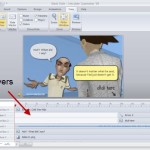
We were able to use PowerPoint’s hyperlinking for the free navigation. However, when you publish Engage using the default method, the interactions sits on the top layer and blocks the hyperlinks.
Our solution was to publish Engage outside of the course. Then insert the engage.swf as a Flash file on the slide. After doing that, we moved the .swf up and uncovered the PowerPoint hyperlinks.
- After you publish the course, you need to move the engage contents folder over to the same location as the inserted .swf. Here are some screencasts that explain how to add Engage as a Flash file and working with multiple Engage files.
- To keep the .swfs aligned, figure out how far up you need to move it. Then add a visual stopper on your master slide. This way to don’t need to worry about alignment issues across multiple slides. Here’s a quick tutorial that shows how to do so.
- David has a detailed thread in the community on how we created the hyperlinked menu bar on the bottom of the slide. You can check it out here.
Regardless of the software you use, the key point is to not limit yourself to the default use of the tool. By stepping away from the prescribed solution, you open the doors to more creativity and customization.
Pilot Test Your Course BEFORE Final Production
Between David and me, we’ve built hundreds of hours of elearning. With that type of experience, we have a sense for what works and what doesn’t. And for the most part, we’re right.
However, it’s easy to get comfortable to the point that you lose the user’s perspective. What seems obvious and intuitive to you may not be the case for those who go through the actual elearning. This is especially true for people who are less tech-savvy and not familiar with taking online courses.
Because of this, it’s a good idea to build a simple prototype that is the essence of your course. Then run it through a quick review by the types of people who will use the course. Just sit back and watch them navigate it. Observe how they interact with the screen and what they do. Also, time how long it takes them. You may think a screen is simple and only requires a minute or so; but when observing the learner, you find that it takes much longer for them to get past the information.
Our Solution
We didn’t have a lot of time, so our pilot test was conducted in my family room with my wife as the volunteer (in between commercials during Top Chef). She’s actually a good candidate because she had no vested interest in the course and doesn’t come with a lot of preconceived ideas about the way elearning courses should be designed.
As she made her way through the course, I watched what she read and where she was clicking. There were a few places where she didn’t do what she was supposed to do. Or she kind of froze looking over the screen, not sure what to do next.
What’s funny is that to me everything seemed clear. So my initial response to her was a bit condescending (as if the problem was hers and not the course design). The reality though was that our instructions weren’t always clear and that caused some confusion.
We went back to the course and made some modifications. We added better instructions. Made sure the visual elements and how they were used was consistent. And we compressed some of the screen content.

The key point here is that even if all you have is one person review the course, you’re better off than no one reviewing it. A few tips:
- Build a quick prototype and get it tested. Rapid elearning tools are great because you can build a course close to the final version quickly.
- Recruit people who are like the learners. Pull in people who have no vested interest in your course. They’ll give good feedback from a different perspective.
- Don’t recruit the subject matter experts (or IT people who think they know usability design). They tend to overplay minor issues and focus on the wrong things.
Lose the Bullet Point Objectives
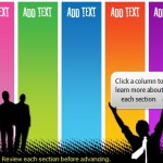
One thing many elearning courses have in common is the bullet-point list of objectives. We wanted to step away from a list of objectives. Besides, most people just click the next button when they see a list of objectives.
Ultimately the goal is to connect the learner to the course. It’s to help them see how the course content is relevant to what they do. To accomplish this, you don’t need a bullet-point list of objectives.
Our Solution
Our objectives list could have looked like this:

Instead, we dropped the list and offered a simple statement that tied the objective of the course to the organization’s mission. It told them what the course covers and why. They’ll get the rest of the details as they go through the course.

Even if you’re forced to create a bullet-point list of objectives, there’s no reason why you can’t offer a more compelling screen up front that invites them to learn more. Start with a scenario that reveals a gap in understanding. Or show an example of what happens without the course information.
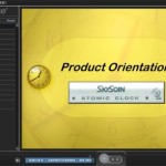
I like the way e-Mersion states the objectives in this CPR demo. It’s starts with a little drama and then reveals the objectives. It’s a simple way to offer a compelling reason why the course is important and what is being covered.
Like many courses, there’s a lot more to share from what we learned during this project. I haven’t even covered how to work with virtual teams or what we did to quickly implement changes. I’ll work some of that into future conference presentations.
When you’re under pressure to deliver a good course with limited time and resources, what tips do you have? Feel free to share your ideas by clicking on the comments link.
Events
- Everyday. Check out the weekly training webinars to learn more about Rise, Storyline, and instructional design.
Free E-Learning Resources
 |
 |
 |
|
Want to learn more? Check out these articles and free resources in the community. |
Here’s a great job board for e-learning, instructional design, and training jobs |
Participate in the weekly e-learning challenges to sharpen your skills |
 |
 |
 |
|
Get your free PowerPoint templates and free graphics & stock images. |
Lots of cool e-learning examples to check out and find inspiration. |
Getting Started? This e-learning 101 series and the free e-books will help. |
You might also like:
13 responses to “Three Sure-Fire Tips to Build Better E-Learning Courses”
Great Post Tom!
This widget will let you hide the Title bar and/or navigation controls in Engage Interactions.
Simply edit an XML file to select which interactions are effected.
http://elearningenhanced.com/products/engage-controls
Excellent post, Tom (and David, for the project)!
I have a new project on my desktop that I’ll apply your suggestions to, so thank you.
My husband is going to be a Beta tester; since you were brave enough to ask your wife to test, I’m going to try the same approach.
The more you (and the Community) share ideas, the more amazed I am at the versatility and flexibility of the Articulate ’09 Suite.
@James – Great widget!
Keep ’em (ideas) coming, Tom!
@jenisecook
Hi Tom, We did a project a while back and tried inserting the Engage interactions as Flash objects. We moved them up and scaled them so that they would fit better in our template. They looked great in the preview and looked great when we published the course and ran it locally. Unfortunately, when we uploaded the course to our LMS, the Engage interactions seemed to have shifted. We also uploaded to our website, just to see if it was a problem with our LMS, but the problem persisted.
I was wondering if you have encountered anything like this? – I’m thinking now that it this happened because we resized the Engage files. Anyway, we ended up removing them from the course.
[…] Three Sure-Fire Tips to Build Better E-Learning Courses […]
Great post Tom, if anything, it keeps me thinking that consistency and a common style (across an entire library) can only go so far to facilitate a good learning environment.
Thanks for sharing the CPR example. I really appreciate your different examples that aren’t necessarily your own.
The Red Cross changed the techniques for CPR. However, I think it’s still spot on for someone who stopped breathing. I’m checking with a wilderness first aide instructor. If I’m right it may be another tool to help test Scouts on what to do under pressure.
Thanks
John Poe
Hi Tom! I was wondering how you create those orange buttons under “Step Away from the Default Solution” section? Thanks for the insight.
@tiffany – Hi and great question.
Believe it or not, that’s nothing but an Engage Tab Interaction. We used a creative workaround to insert the Engage interaction not as an .intr file but as a .swf file.
Here are two screencasts on the process:
Inserting single Engage file as .swf: http://screenr.com/msp
Inserting multiple Engage files as .swf: http://screenr.com/yaK
We have a lively thread on using the technique. You can also grab some working source files to play with, too.
Please let us know if you have any questions!
It is real new concept of PPT: it moves from content approach to learner activity or thinking way approach. It is so effective.Thanks a lot for prompt of that. In practice I use add on of VBA and have some progress of interactivity in lessons.
[…] Tidbits: I’m presenting on PowerPoint on August 18. Three Sure-Fire Tips to Build Better E-Learning Courses » The Rapid eLearning Blog […]
“What’s funny is that to me everything seemed clear. So my initial response to her was a bit condescending…”
Yes! Yes! Yes!
Not that I think you’re condescending–I’m just so happy to see a good-humored admission of the curse of knowledge.
Instructional designers in general spend so much time on the materials they create, whether for elearning or some other format, that they notice the slightest details. Meanwhile, back on earth, the people experiencing those materials have other priorities, including getting back to work to finish stuff that needs to get done.
If everyone who thought a three-hour mandatory course or a 400-slide deck was a good idea would have to sit through someone else’s brilliant idea, we’d have a lot less of that stuff inflicted on us.


0
comments