I read a blog post recently on website usability. The author mentioned five usability issues from navigation to engaging the site’s visitors. While the post specifically deals with website design there is a lot in there that’s relevant to the design of elearning courses, too.
After reading the post I reflected on a few issues I see quite a bit.
Are you intentional in how the course is designed?
One issue is what I call the bouncy button where the button to navigate changes location. Often this happens because of the way content is laid out on the screen. Each screen is a bit different, so the developer moves the button to accommodate the screen’s content. This makes it confusing when trying to interact with the screen.
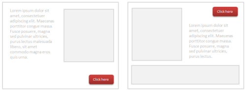
The fix is to be consistent in how the course is designed and how the user is to interact with the content. For basic courses, the authoring tools already provide consistent navigation. But when creating custom navigation, make sure to be consistent so that navigating the screen is as intuitive as possible.
Is your software creating usability issues?
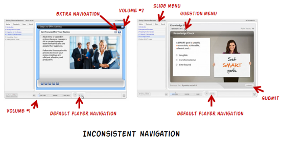
One common problem with rapid elearning courses is that they’re built with multiple tools. When they’re added together they look cobbled together. It’s what I call the Frankencourse.
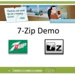
As you can see in the image below, by inserting outside content, the navigation starts to get a bit confusing. You’ll also notice duplicate volume controls, two sets of navigation, and two menu lists.
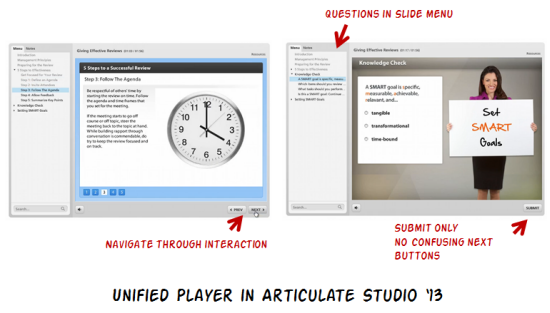
If you’re an Articulate customer you’ll be glad to know that this isn’t an issue now that Studio ‘13 has a unified player. Compare the image below with the image above and you can clearly see the difference between the older cobbled look and the new unified player.
Are you providing clear instructions?
In an ideal world the user experience is intuitive. If you have to explain how to navigate the course, then there’s probably more that can be done to make the course more user friendly.
However, that’s not always the case. As noted above, sometimes the software creates a few issues. Other times, there may be an interaction or something else you want to add to the course where the navigation is different than the default. In those cases you need to add additional instructions.
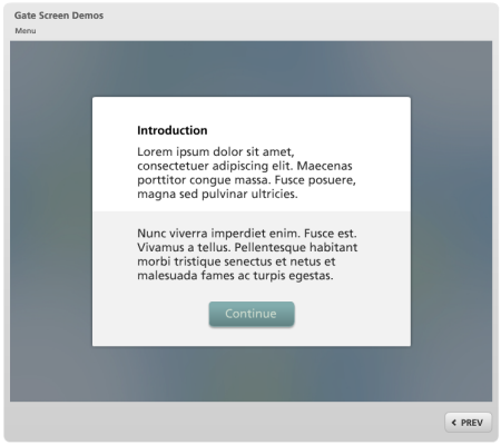
I like to use gate screens because they pause the course and allow me to redirect the person’s attention. You can learn more about gate screens in this post and find some free ones to download here.
Are you getting feedback from your users?
It’s important to pilot test your course design to make sure that there are no blind spots. As I mentioned earlier, most of the software already provides a user-friendly player. That covers the basic navigation. However there may be other ways the person is supposed to interact with the course such as during a decision-making scenario.
In those cases it’s good to get some feedback from those who take the courses. You don’t need a big pilot group. Just find a few people who don’t normally take elearning courses and watch how they interact with the screen.
Usually I find that my instructions aren’t clear and the user’s not quite sure what’s expected. It’s also good to do this before you spend too much time designing the course. Use an iterative approach where you can quickly test ideas and make adjustments before you spend a lot of time and resources.
Those are a few of the issues I’ve run into. What usability issues have you identified in your course design? Share your thoughts here.
Events
Free E-Learning Resources


0
comments