The Rapid Elearning Blog

Articulate Rapid E-Learning Blog - are you sure you want to click that next button

In my elearning workshops we discuss the parts of elearning courses that are common to most courses. One of the goals is to get participants to think through the common parts of a course and then determine how much of that can be prebuilt to save time.

For example, most likely the course will have welcome and exit screens. They may not look the same for each course, but odds are that both will exist. Why not build a template that has a screen reserved for the welcome and exit process of the course? At this point, you’re not assigning a look or feel; you’re just making a space for it.

Introducing the Gate Screen

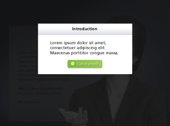
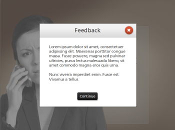
Another common part of many courses is what I like to call the “gate screen.” It’s a screen that serves as a gate by stopping the flow of information until the learner is ready to move on. Generally, there are two types of gate screens: introduction and feedback.

Introduction Gate. This gate usually appears prior to the start of an interaction. It pauses the course to provide some introductory information and instructions. Then when the person is ready, she can advance.

Articulate Rapid E-Learning Blog - example of an elearning gate screen

Feedback Gate. The feedback gate does the same thing as the introduction gate—it pauses the flow and provides some information which is usually the result of a decision the learner’s made. This type of gate is very common as feedback in elearning quizzes. Make a choice and hit submit. Up pops the feedback screen. Read the feedback and then click the next button (or possibly go back to make a different choice).

Articulate Rapid E-Learning Blog - example of an elearning gate screen for quizzes

Both of these gates are essentially the same because they stop the flow of information, let the person regroup or get oriented, and then move on.

As I stated earlier, these are fairly common in the construction of elearning courses. And since that’s the case, why not plan for them in your design before you get started?

  • Create a placeholder for the gate screens in your initial design so you don’t forget to add them in during the production process.
  • Plan the look so that it fits your course design. The last thing you want is a Frankencourse. I usually use the same design for both gates and then just change the buttons and placement of them for each screen.
  • Determine the user experience. How will they work and will they seem intuitive to the flow of the course?

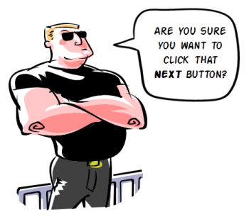
The two gate screens are essentially the same. They’re gates that stop what you’re doing; get you to focus on something; and when you’re ready let you advance (or go back). And odds are that they’ll be in your next elearning course. So why not save some time by putting them in the production queue before you get started?

Do you use gate screens in your elearning course? If so, share with us how you use them.

Events

Free E-Learning Resources

Want to learn more? Check out these articles and free resources in the community.

Here’s a great job board for e-learning, instructional design, and training jobs

Participate in the weekly e-learning challenges to sharpen your skills

Get your free PowerPoint templates and free graphics & stock images.

Lots of cool e-learning examples to check out and find inspiration.

Getting Started? This e-learning 101 series and the free e-books will help.


10 responses to “Sometimes It’s Good to Stop Your Learners Before They Get Started”

Hi Tom: Fantastic idea. Taking something we already use frequently and finding another great use for it. I just created a screenr the other day about using cue points and syncing audio and layer triggers. Someone mentioned that when one designs this kind of interaction, if the user uses the seekbar to jump ahead this can keep the audio playing, but the layers will appear and stay visible. Essentially the slide functions only if it is allowed to play straight through.

One way to avoid the user jumping ahead would be to create a gateway slide as you suggest to introduce the next “slide” and how it functions. There could be 2 buttons, one to continue, one to jump to a static version of the slide as well.

Certainly, I’m going to find many ways to start incorporating your tip.

Hi Tom, will you be having any of these workshops in Toronto, Canada?

I was asked to convert some compliance training produced by another division within our area. They provided a 44-slide Power Point presentation. Every slide was identical in appearance and filled with text. The presentation was to be followed by a 10-question quiz over all of the material that must be passed with a score of 7/10. Because of the nature of the training requirement, I had very little leeway in improving the appearance of the content.

I was able to break the content into several smaller topics. Each one ending with a slide or two titled “Knowledge Check.” These slides contained the assessment questions and answers related to the portion of the material just viewed.

The slides serve two purposes. They break up the content as you’ve suggested, and they give the Users a clear review of the content they need to retain for the assessment.

I really enjoy your tips!

Rebecca.

@Andrea: I don’t solicit the workshops. Usually what happens is one of the local training groups like ASTD will contact me to do a workshop. I’d love to go to Toronto. If there’s a local training group, have them contact me.

My section develops/manages development of e-learning for the Marine Corps. We use a variety of “gates,” including those you described. We also use the same approach for what we call “speed bumps” and “road blocks” within a sequence of jump screens to let learners know if they have not selected all the available instruction within the sequence.

As one might expect, a speed bump pop-up is essentially a notice and can be bypassed to move on. A road block, which we apply sparingly to critical (often safety-related) content, requires the learner to go back and access all instruction before being allowed to move forward.

I’m intrigued by your initial cartoon graphic though, Tom, and envisioning ways we could use a burly uniformed Marine with just that caption…

@Susan: that’s a modified clip art image. I’m sure you could turn the guy into a marine.

I use Gate Screens for topics in intermediate courses. The participant may not be ready for the topic. The screen refers the participant to the foundation course appropriate for the topic.

Thank you Tom for your always useful and insightful tips. Here are my two cents: In Mexico there’s a huge Digital Divide as you may know. Hence, users tend no to know what to do when told they are about to start their e-Learning courses.

I asked myself how I could help them out to avoid frustration and to motivate them from the start. I came up with two opening screens named, External and Internal Navigation. Visually they show users what they can do and how they should cover their LOs, Learning Objects. I gradually increase the Interaction Patterns so every new pattern is included as an explanation on those two slides if necessary.

Unfortunately, Discovery Technique to navigate courses doesn’t pay off in Mexico. May I ask what you think about this approach of mine? Regards, Ernesto.

@Ernesto: when people first get started with online learning, there probably needs to be more hand holding through the process. I do think a discovery process could work as long as it’s guided appropriately. I like the way the Wii games walk you through the process of playing the games with quick tips on using the remote and giving a few practice activities. But then it releases the learner (game player).

March 18th, 2013

Learning is the result of personal choice. The next question is the choice to strengthen my devotion and commitment to achieving my goals. That is the passion called learning. Live the adventure. The rewards are great.