


I completely agree with you! And your last tip was best – don’t hire someone who can’t figure out the “play” button. But – you’d be stunned at just how many people out there STILL don’t understand the most basic business communications tools.
Do You Really Need Instructions on How to Use an E-Learning Course?
August 24th, 2010
In the late ‘90s the company I worked for was installing a new network in anticipation of the Y2K bug. I was responsible for training how to use the computers on the network.
Back then most people didn’t have computers. So before we could teach them how to use the computers, we had to teach simple things like using a mouse. I recall a few people who actually waved the mouse in front of the monitor hoping to get it to work.
E-learning has a similar history. Because it was new and there wasn’t a lot of consistency around interface design, most courses started with a “how to navigate this course” course. It made sense back then.
I’m not sure if it makes much sense today because most people are familiar with computers; so figuring out how to click a play button or forward arrow isn’t too hard. And besides, many elearning courses use a similar layout which makes it easy to know what to do. Because of this, it’s probably not necessary to have a mini course on how to navigate the course within your course.

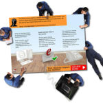
With that said, the majority of the courses I see do offer the mini course. I think that in most cases they can be eliminated or at least simplified. Here’s an example from a recent course I previewed:
This is the volume button. Some slides may or may not have audio. Those that do have audio can be adjusted using the volume control button. If you want to increase the volume, place your mouse over the volume control. To turn the volume up, drag the mouse to the right. To turn the volume down, drag the mouse to the left. Find a volume level that is comfortable for you.
Do I really need a thirty second explanation of the volume control? This same course continued through explanations of all of the player features. They even went on to explain the logo panel. It probably took about 5 minutes just to get through the user interface. I’m not sure exactly, because I fell asleep.
Obviously, you want to let the user know how to get around the course. However, in many instances the navigation is obvious and needs no instruction, or just something real simple. They definitely don’t need a full course on how to navigate the course.
The goal is to create a frictionless experience. A mini course on navigation impedes the flow and pacing of your course. So here are a few tips:
- Get rid of the navigation instructions. When you watched your first YouTube video, did you have problems figuring out how to get it to play? If your course player follows convention, then it’s usually not hard to figure out what’s a play button and what’s a back arrow.
- Follow conventions and don’t customize every course you build. It’s more fun to create a custom look and feel for your elearning courses. But, there’s a lot of value in having a consistent player structure. It means people know where things are and where to look for help. This lets them focus on the content and not how to navigate the course.
- Provide clear instructions if you do have unconventional navigation. Ideally, the interface should be comfortable and intuitive…and shouldn’t require a lot of instruction. But if you do violate some conventions, then be sure to provide clear instructions. Something to keep in mind is that if you have to offer a lot of navigation tips, you may want to rethink how you built the interface.
- Offer just-in-time prompts. Instead of throwing all of the navigation tips out at once, just offer them at the point where they need to be used. For example, the first time you want them to click play, just add a “click play now” prompt. After the first time, they should get it. This is a better approach than offering 30 navigation tips and a long, boring tour of the interface upfront. Most people won’t even remember all of that stuff, anyway.
- Create a “voluntary” player tour. You may not be comfortable offering no navigation tips. And some clients will demand it anyway. So instead of forcing everyone to go through the tour at the front end, just add a help section where they can get some tips if they’re stuck. Many people who use Articulate Engage will create a drop down tab with detailed instructions for those who need them.
- Consider your audience. Personally, my choice is to avoid building the “how to take the course” tour. But I still have to think about the audience needs. If you work with a pool of people who are not familiar with computers or seem intimidated by taking a course online, then you want to do everything you can to make it easy for them. This is where convention and just in time prompts are valuable.
- Don’t hire people who can’t figure out how to press a play button. It’s one thing if the elearning course has some novel interface that is a bit confusing. But most elearning courses have the same basic structure. If the person can’t figure out how to advance the screen without help, they might not be the right person for the job. 🙂
Below is a quick demo with a few different ideas on how you can approach the slide navigation instructions.

Click here to view the tutorial.
There are a lot of ways to build navigation tips and prompts into your elearning course. There’s really no right or wrong way. In fact, in reviewing the recent Articulate Guru Awards, it’s interesting to see some of the ways this is dealt with. I’ll share more later.
How do you deal with this in your elearning courses? Share your thoughts by clicking on the comments link.
Events
- Everyday. Check out the weekly training webinars to learn more about Rise, Storyline, and instructional design.
Free E-Learning Resources
 |
 |
 |
|
Want to learn more? Check out these articles and free resources in the community. |
Here’s a great job board for e-learning, instructional design, and training jobs |
Participate in the weekly e-learning challenges to sharpen your skills |
 |
 |
 |
|
Get your free PowerPoint templates and free graphics & stock images. |
Lots of cool e-learning examples to check out and find inspiration. |
Getting Started? This e-learning 101 series and the free e-books will help. |
You might also like:
57 responses to “Do You Really Need Instructions on How to Use an E-Learning Course?”
People’s familiarity with computers is on the rise by the day. My neighbour’s son who is barely seven is able to search on the internet and get to videos on YouTube. With the current scenario being such, it is indeed pointless wasting time on ”how to navigate” tours with the learning package. We do need prompts at occasional places, especially when it comes to learner activities, but making an entire demo is not worth it. It’s a waste of time and resources.
All great recommendations, Tom. I’ve long believed that if you need a lesson to teach people to use your lesson you’ve failed or you’ve picked the wrong people to include in your organization.
One other way I’ve gotten away with NOT having a “How do I use this” tutorial is by framing it in a different way. In courses that may have special features which may not present an obvious idiom, I build these into a marketing slick that also doubles as a mini instruction. Something that looks attractive, yet simple. That way if someone asks if I needed to build instructions for the use of the course I can respond with “No”:P
People can figure things out if things make some logical sense. We strive to make things as easy / natural as possible. But occasionally, there’s call for something that’s just a little bit different. Just in time prompts work well in these cases.
I read an article on Bill Scott’s blog a while back that relates to the theme your talking about here. Aligning to an existing expectation or idiom, or at least targeting a reasonably attainable new idiom is the goal. Neither should require much instruction to acquire. If it’s logically designed and follows standard conventions for interaction elements, people will adapt.
http://looksgoodworkswell.blogspot.com/2009/08/renting-idiomatic-experience.html
Thanks for your post, very useful.
Where did you get the picture of the teacher? It’s the kind of design I’m looking for a project in progress.
Pedro.
>Don’t hire people who can’t figure out how to press a play button.
They are called baby boomers and they are still clogging up the system. 😉
We have a short, separate navigation tutorial in our e-learning repository. The regular e-courses don’t include navigation help. That way, users who need help can learn up front and users that don’t need help aren’t bored.
Fair comments, but as you say “…sometimes corporations just want this”. Often, there’s just not way to say “Yes – but…..”!
QUESTION – on the “video” example, I would have liked it much more if the presenter had the gestures within frame, when pointing to Attachments for example she looked but her hand was almost invisible.
I like the concept here though, and there are some great ways to do this – I am tinkering around with the concept of a video of drawing the appropriate symbols for eg. “Play” and “Attachment” on a flipchart whilst narrating…
Thanks
Bruce (BrucUK)
With the Articulate player, I do find people have trouble with the play button and next/back buttons in the player. Because of that, I try not to use them. Most all my courses either advance automatically, or there are places on the screen where people have to click a choice (not a next btn) to continue. The only time I use a next btn is if they are exploring several things on a slide and need to click next when they’re ready to move on.
I’ve found people get used to either clicking on the slide or clicking in the player bar — and don’t like to do both. That’s why I’ve put in a feature request for a template to show only the left navigation but hide the player buttons (just like you can hide the seek bar). Fingers crossed it makes the cut! 🙂
When I do have to use the player controls, I use the “just in time” approach the first time (point to button w/ text “click the flashing Play button to continue). Next time they need to use it, they will know. This is my least favorite method, though.
I, unfortunately, have to disagree. If your audience always takes courses generated with the same tools on a regular basis, I could agree, but each vendor has its own player controls, its own helpful ancillary tools, and sometimes its own technology platform which affects how the lesson will play. In my experience, most learners take a class only occasionally and each course comes from a different vendor. Navigation question phone calls really interrupt my development time, so I include the navigation tutorial and just don’t require it to be seen to register as a ‘completed’ course. That way, there’s no hunting for it. Learning may be the center of *our* universe, but it’s really on the fringes of the typical employee’s daily routine.
Good tips Tom! One question: You mention “Many people who use Articulate Engage will create a drop down tab with detailed instructions for those who need them”, and I see this in the “Drop Down Help” in the example. I’m relatively new to Articulate and I couldn’t find where to enable that Help button. Is it in the Player Templates settings? I found how to turn the Attachments link on and off, but no luck with help…and searching the help docs on “help” isn’t helpful!
Thanks!
Carol
Great Stuff! I especially liked the video that EVISION did. While most people these days seem to be comfortable with computer interfaces, there are still many who use computers at work because they have no choice, but they are still not comfortable with them, so having some sort of instruction is helpful. As always, you’ve got to know your audience. At the Articulate training I recently attended, Charles Zoffuto with Yukon Learning suggested a PowerPoint slide with a motion path animation that quickly showed users how to navigate the course. Simple, yet effective.
Seems like all of us can relate to past experiences as developers and users. I recall an elearning project I worked on back around 2003 where it was insisted we build a intro module on how to use the course. Not only that, but build an intro to the intro on how to use a mouse, turn on the computer, and use a keyboard!
Today’s world is much different than just 5 years ago and we (elearning designers and developers) need to keep our fingers on the pulse on what our audience “needs” and be patient with what the client “wants.” We’re not going to win every case, but I think it’s imporatant to explain the “why’s” and Steve’s link above is a great resource to champion those debates.
When we talk about convention, Bill Gates has done a lot for the elearning industry already. Just think about it…he put the [X] button in the upper right corner of the window. Not everyone is a Windows users, but more often than not users in corporations use Windows. So why would we put the [X] or [EXIT] buttons anywhere other than the upper right corner. People are already “trained” on how to close a window so why would we interrupt that convention other than style?
Great post Tom! A topic we should all remember to add to the front end of design when working with clients. Not going to win them all, but at least it may prevent having to build “how to” instructions in the middle of development, or worse…at sign-off time.
Oh, and eVision just gave me a crazy idea for a novel intro!
I’ve just been struggling with this issue. As a fairly newbie to Articulate, I was and still am amazed that this isn’t built INTO the Articular Template. None of us should have to spend the time to build the Navigational Instructions. Can’t Articulate find the best one out there that is already developed, buy it and put it into the next version? Or, is there anyone out there who already HAS excellent tutorial they are willing to share. As a newbie, it has taken me as long to try and develop this module on navigational instructions and now you all think it isn’t necessary. I agree if this is for the business world. But I’m developing for continuing education for healthcare professionals who have been in the field FOREVER! Yes, they get a computer, but not as well as their kids. There is some comfort knowing there is a “How-to” if needed. I wouldn’t trade these experienced professionals for the world just because they can’t find the play button on some technology that is new to them.
Is there anyway to get Articulate to provide a “canned” navigational tool so we can all move on to the important content? Just wondering.
They are called baby boomers and they are still clogging up the system.
—-
Response to this rude statement: We work in a diverse world. Why don’t we respect these differences? If our company of 50,0000 got rid of your so called clog, we would alleviate the need to have a company because the boomers hold most of the patents and intellectual property. This would leave several professional button pushers without a job, so perhaps you should focus on Tom’s original intent, which is the way that you can make it simple for both sets of users.
Since the post I’ve decided I want to try some sort of Navigation video based on the “flashcard” concept you can see here – http://www.youtube.com/watch?v=mxELSzay2lc . Failing that, I have another slightly off the wall idea that’s burbled up from the depths of my brain…..That’s my evening gone 🙂
Thanks Tom for your insight. I’m developing an eLearning for the company I’ve recently joined and had the same feelings that it really wasn’t necessary to provide upfront navigation instructions. eLearning is new at this firm but most employees are young, smart and should be quite capable of figuring out get around. At this stage of the game, as you said “If the person can’t figure out how to advance the screen without help, they might not be the right person for the job”.
I agree Tom. About three years ago, we made the decision to remove our “tour” at the beginning of our courses – it was redundant for those who could figure it out on their own. Funny thing is, we actually made the same “if they’re not smart enough to figure this out…” comment when we decided this!
When we’re working with third party vendors to develop courses for us, we request the navigation be similar to what we usually use within our homegrown courses. No sense in confusing anyone.
Over time, I have graduated from a series of single slides illustrating navigation to a single Engage tab slide in the main program to a labled graphic as a drop down–just the evolution you describe. However and ironically, we have had to *increase* the amount of instruction on the last slide to use the ‘exit’ drop down rather than ‘x’ing out in order to record the completion via SCORM! Otherwise, we have 10-15% of our employees calling to tell us that there’s something wrong with the course because it didn’t mark them complete on their LMS transcript! Any suggestions on that end of things will be welcomed. And no, we can’t select our (fed’l) employees based on their computer skills 8^)
I think this article makes a good point. Although, if you’re using Articulate Engage Objects, some of them may not be “conventional.” We have one slide in each course called “elearning orientation” where we point out the different kinds of objects. We also add an instruction line as the last line on every screen to say something like “click another tab to continue,” because we learned that our users were not viewing all the material on each slide because they were clicking through, not realizing there was more than just what was displayed when they landed on the slide.
Thanks Tom! So easy when you know where to look!
I just came across this amazing e-learning site. It’s well beyond anything I imagined. I’m a e-learning newbie. While this caliber of training is probably a stretch for most, I think it has some great ideas. I encourage you to check it out. It definitely raises the bar on e-learning.
http://www.bbc.co.uk/raw/
Tom, I always enjoy your posts. But I believe this one needs to be taken in context. Within the context of and Elearning object or within training for an organization I would agree that perhaps you would not need to develop these instructions. However in the field of distance education higher education I have found that course design varies by instructor and student experience vary widely. Throw in stress and the distance ed component and this type of hand holding is required in my opinion.
Hey Tom, Thanks for this, it has made me re-think spending a lot of time creating a guide on how to use my elearning site. My elearning site is for 16-18yr old students and now I seriously doubt they need me to tell them how to use the site. You’ve saved me a lot of time and bother, thanks
Tom I agree with all your points except for the last one, “Don’t hire people who can’t figure out how to press a play button” (please excuse me if this was meant to be taken with tongue in cheek). I work for a government organisation with over 18000 employees. These people range from Gen Y back to the Baby Boomers, and in some instances earlier. We receive a significant number of calls from our more mature people seeking assistance in how to progress through an online module. Even though we have been offering e-learning for over five years, these poeple still find themself outside of their comfort zone. We (try to) provide clear instructions and consistant interfaces, but we also provide a Help button that links to a standard set of help screens. This gives the learner the option to seek additional help without getting in the way of those learners more comfortable with online technologies. Thanks for your great blog!
Excellent post as usual.
I remember working on a project back in 2004. In addition to teaching the learners how to use a proprietary system and how to navigate the eLearning tutorials we were building for them, we ended up having to teach them basic computer skills. This was definitely scope creep. But we had to address it because all the learners needed a similar skill set in order to use the eLearning. I remember thinking, how did these people get this job anyway, if they don’t have basic computer skills …
Thanks for the great tips. It is easy to make it a habit to explain too much. Important to remember who the recipient is and what level they are at.
Good post and I agree that for most of the work we do that additional instruction is not necessary and wasteful. However it does depend on your audience. We’ve done some projects where the users have not been very computer savvy and good guidance was vital to stop them giving up in frustration when they weren’t sure what to do.
I think there is another option to consider: the minimal approach. Which means only explaining the most important and the most unfamiliar features. In this case I would probably choose to only explain the Notes tab (especially when it contains the voice-over transcript), the dragging of the blue seekbar (not always known by users), maybe the pause button, and the options at the top right, such as Attachments, Glossary, Help, etc. (otherwise they might not notice them), and then explain any customized buttons or branching used in the course.
Together with the Labeled Graphic in the Help tab (as Tom suggested) for the more inexperienced users and some just-in-time prompts (for the users who were sleeping/distracted during the first explanation and for the customized buttons/branching), the minimal approach is to my opinion a way of practicing what you preach (We say this to the SME’s ourselves isn’t it? ‘You don’t need all those slides for the course’).
I think we often refer to folks with poor general problem solving skills as ‘not computer savvy’ when we provide a mediated products and they have trouble figuring out how to continue when there’s a big flashing button labeled next, or an organic cue with button qualities.
There’s only so much you can do for folks without skills to assess the landscape, identify the cues, and make things happen.
I find it a little irritating that we say people have poor computer skills when the same folks have trouble doing other new but simple tasks that don’t involve a computer. In my opinion, it’s not about computer skills. There’s another skill / capacity that’s missing.
And this is NOT generational, in my experience. I’ve met super sharp and curious explorers in all ranges. And I’ve met the opposite in all of the same generation categories.
We user test all of our new assemblies prior to implementation and then user test each assembly again with multiple focus groups. We tried removing the Next button entirely, since I think it encourages tendencies to push content on a conveyer belt, in favor of more organic activity cues to drive the experience. But that wasn’t the right thing either, according to our focus groups (it wasn’t what folks had become accustomed to). The focus group feedback, even feedback from a minority of the participants, is processed and implemented in some way if we can articulate a good solution that works for most if not all of the potential audience.
We’ve settled on simple controls we think most people will understand in tiered groups of operation. At a minimum, if someone can read and has even mediocre comprehension skills, they can succeed comfortably. Nearly everything has a just in time ‘hey, dude / dudette – here’s what you do now’. The controls don’t use icons (except for the optional play / pause control) in favor of a plain text label for all activity functions and shell operation (menu | downloads | info | exit).
We’ve also lightened our package complexity. Two modes (media | document) and only one layer deep. No complicated Module > lesson > topic > screen, branched reading assignment non-sense, etc.. That’s not to say that we exclude activities and content delivery methods that aren’t challenging, but we draw the line at making the packaging complex.
It’s simple and it works pretty well so far.
Thanks for the comments here about our eVision-Design video describing how to use the Articulate interface. We sometimes put an Engage labeled graphic to describe our courses but had just purchased a FLIP camera so I shot that video in one day at no cost. We thought it was a fun intro to our Calling Card since one of the points was to introduce ourselves and get our clients excited about the product.
We enjoy getting creative about delivering instruction and we feel that informal video is an engaging way to both introduce a narrator and quickly get information across in a fresh way. Plus FLIP makes it cheap to produce (speaking of which I need to re-shoot that video so my hand is viewable when I point to the Attachments tab – thanks for catching that). And since I don’t have to go into an expensive studio to re-do it, it’s easy.
We were surprised when we QA-ed our trainings with some very savvy users that they were still a little flummoxed with an eLearning interface. And people are often so impatient that they actually get annoyed that they don’t know what to do and quit! They don’t blame themselves but, instead, end up getting frustrated and feeling there’s something wrong with the training! So why not add a quick video to describe where they are and get them involved in an engaging and creative way? It settles them in and gets them comfy in your learning space.
Thanks Tom for posting our video and we’ve loved reading the responses and discussion here. Great ideas!
I agree entirely in principle and theory and the best eLearning courses (or any computerised/online systems) are thoise that are self-describing and intuitive.
However, in reality, when you have an audience of cohorts such as ‘Matures’ (born prior to 1946) and ‘Boomers’ (born 1946-1964) who lack basic computer/IT skills and perhaps haven’t even seen the internet, providing guidance is sometimes necessary. Not so much the case for ‘Generation X’ (1965-1980) and ‘Generation Y’ (1981-1994) users.
In an ideal world, yes, we shouldn’t have to spoon-feed learners and tell them how and where to click their mouse, however, in reality, guidance is sometimes necessary.
[…] […]
I completely agree with you as well. I know that the audience is the critical factor here (and their experience with eLearning), but it’s challenging at times trying to figure out how much to walk them through the navigation (even in a voluntary accessible nav aid).
I just taught my first synchronous online academic class using Elluminate. Sure, it isn’t quite the same as an Elearning module that is designed basically as “plug and play”, but it promised to be easy to figure out. Unfortunately, that was not the collective experience of this class. There were technical issues with microphones. Students could not locate the materials. Participation was pitiful. And terminology of application icons did not evoke the same meaning for everyone. All in all it was a rocky start.
So . . . my recommendation is know your audience and don’t assume all elearning courses are created equal. If pushing you into the deep end of the pool resulted in Olympic swimmers, the YMCA wouldn’t be teaching swimming classes.
I agree that the intended audience’s experience with online navigation is the critical factor for how much instruction is needed. A pilot, who’s life depends upon instant visual recognition of instrument controls, will intuitively understand online course navigation symbols. A corporate senior administrator, who depends upon an assistant to help attach a document to an email, may need step-by-step instructions and the option to access them throughout an online course.
These are two extreme examples. More typically in a corporate environment where colleagues have different levels of online experience and the mandate is 100% compliance to complete an eLearning module, it may be best to let participants the option to access instructions though the ‘help’ button.
[…] Do You Really Need Instructions on How to Use an E-Learning Course? […]
I decided to use the Labeled Graphic interaction for my navigation help. The learner’s not forced to sit through instruction and gives them the control in the course. Although many are ‘computer savvy’, when I put the Articulate player in front of them they are totally intimidated by it. It never fails, I will always have a couple of people to look at the course and be totally freaked.
I think it’s pretty harmless. 😉
This is useful blog which make us know the important of instructions on how to to use E-Learning course. Thanks for great post and i will share this post in my Best E-Learning
to let my friend know its important. Awesome!!!
In the past four years I have NEVER added nav instructions to a tutorial. Might as well put them in problem solving mode from the gate. MUUuahahahaHA! (Thank you Michael Allen!)
Many of my audience are cubers (medical coders) that don’t have speakers (or in some cases, sound cards) so I make sure to use captions that mimic the narration.
Favorite line:
Don’t hire people who can’t figure out how to press a play button
To stop reading this comment, look below.
@davHwrd
I agree about cutting down on the navigation instructions. We’re dealing with (generally) a generation who knows what a play button looks like and more importantly, isn’t afraid to hit buttons to see what they do.
Unfortunatley, it does come down to audience and around here we are dealing with folks who don’t often use a computer and who probably have never taken e-learning.
So we just keep it simple on the surface but attach a more detailed demo they can click on if they have problems.
[…] ELearning Blog is a great resource for anyone designing or building elearning courses. I liked this post in particular because it called out something I’ve suspected for a while (and we all like validation, […]
I agree with Chris Osborn, you’d be amazed at what people don’t know. Unfortunately in an educational setting you can’t “fire” them from your class. 😀
Sharing and giving tips could be the other way on how elearning will be a sources for cost effective training solutions for everyone.
[…] And Tom Kuhlmanns work in relation to do we really need instructions on how to use an elearning course? […]
[…] And Tom Kuhlmanns work in relation to do we really need instructions on how to use an elearning course? […]
[…] addressed this in a previous post where I asked if you need instructions on how to use an elearning course. In today’s post we’ll take a look at some real examples of how people have dealt with the […]
[…] an interesting comment on navigating eLearning courses. This post builds on an earlier post ‘Do you really need instructions on how to use an eLearning course?‘ which is also worth reading. Although the posts seem fairly obvious and the main take-home […]


0
comments