
[…] This post was mentioned on Twitter by Brian Batt, Red CLED, juandoming, Daniel Taylor, Technical Comms and others. Technical Comms said: 5 E-Learning Design Ideas I Got While Traveling http://bit.ly/hzy9Rr #elearning […]
5 E-Learning Design Ideas I Got While Traveling
February 22nd, 2011
When it comes to graphic design, it’s important to continually find inspiration from other sources. One of the main reasons for this is because over time, you develop a distinct visual style. And when you’re the only one working on your elearning courses, eventually they all start to look the same.
I’ve discussed this in previous posts:
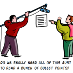
- Here’s How to Get past a Screen Full of Bullet Points
- Inspiring Designs to Keep Your E-Learning Courses Looking Fresh
- The Secret to Creating Your Own PowerPoint templates for E-Learning
A great place to look for design ideas is in magazines. On a recent trip I was looking through one of those airline magazines they have in the seat pockets. One of the illustrations in the magazine caught my attention. I thought that the way it was designed would work great in an elearning course.
So I continued through the magazine, challenging myself to find at least 10 graphic design ideas I could use in an elearning course.
Here’s a link to the issue I was looking at. And following are the tips. I also created some tutorials to show how to create some of the effects in PowerPoint.
Layout Ideas
What I find most valuable is coming up with new ways to layout the screen content. There are a bunch of good ideas that you can glean from the magazine. For example, I liked the colors and general layout of this page below.

It could be the inspiration for a safety training module, like the example below.

There are a lot more cool layouts that could help bring a fresh perspective to the way you design your screen content.
Markers
I noticed that the magazine had all sorts of call outs and markers that you could also use in your elearning courses.

I counted at least ten different markers and callouts used in this issue. All of them could find their way into an elearning screen. Build out a few ideas, and then save them as images. This way you always have some different markers and callouts available to use.
Filled Shape

You’ll notice that in several places they use circles filled with images. This is easy enough to do in PowerPoint. And if you have a lot of straight lines, using an occasional organic line helps to break up the content and adds some good contrast to the screen elements.
Click here to view the tutorial.
Once you learn to do the effect, you’re not limited to just using circles. In fact, Stephanie Harnett had a good follow-up tutorial to one of my PowerPoint templates, and used the fill effect to add more pizzazz to the template.
Organic Lines

Adding organic elements to your content area is a great way to add contrast and draw attention to parts of the screen. I discussed this a bit in the post on adding personality to your courses.
Creating the non-straight lines is easy enough. Use the drawing tools that come with PowerPoint. In most cases, I’d probably use the curved tools rather than the scribble because the lines look better. But if you have a tabletPC or Wacom tablet, then you can draw your own.
Of course, you could always download all of the hand drawn objects from this post, Here’s a Boatload of Free Hand-Drawn Graphics. That makes it a lot easier. We also have some additional hand-drawn shapes in the user community.
Organic Shapes
As I mentioned above, organic shapes are effective in creating contrast that you can use to draw the learner’s attention. The magazine also used a few organic shapes throughout.

They used them as titles and in highlights. I like the look of the layout on the titles. Here’s a quick tutorial where I walk through how to create the shape and a quick layout. I also created a quick tutorial to show how easy it is to create highlights for your text boxes.
It’s all about consistent design.
There’s really a lot more to mine from that issue. One of the most important things to consider when building the look and feel of your course is creating a unifying design theme.
As you page through the magazine, look at how certain visual elements are used throughout. Those are the things that tie everything together. Then when you build your courses, do the same thing. Make a li
st of the screen elements that you normally have and then design them with a consistent look so that they tie the course together.
Here’s a challenge for you. Design a template around one of these layouts. If you do, share it with me and I’ll be sure to make it available for others to use.

Events
- Everyday. Check out the weekly training webinars to learn more about Rise, Storyline, and instructional design.
Free E-Learning Resources
 |
 |
 |
|
Want to learn more? Check out these articles and free resources in the community. |
Here’s a great job board for e-learning, instructional design, and training jobs |
Participate in the weekly e-learning challenges to sharpen your skills |
 |
 |
 |
|
Get your free PowerPoint templates and free graphics & stock images. |
Lots of cool e-learning examples to check out and find inspiration. |
Getting Started? This e-learning 101 series and the free e-books will help. |
You might also like:
29 responses to “5 E-Learning Design Ideas I Got While Traveling”
[…] Traduzione autorizzata tratta dal post originale di Tom Kuhlmann sul “Rapid E-Learning Blog”. Il post originale è disponibile qui […]
Leggi la traduzione (autorizzata) in italiano di questo post qui:
Great tip! I discovered the same thing a few weeks ago and started a folder containing torn out magazine pages to thumb through for designing and laying out pages. I was able to put design ideas to use right away on some recent projects.
very good post and tutorial!
I believe that the best designs are the cleanest and functional.
Tom,
Thank you very much for all your help, insight and creative design features. We love and appreciate the free downloads too (saves many hours of work, which we don’t usually have to spare)! All of us at Children’s thank you!
Kathy
Tom:
Thanks again – each time I go to start a new online course – this time Health & Safety Ed. for Teachers – I get inspired to try some new look from your blog. I specially liked the use of red and yellow (safety colors)and the use of organic components. I have finished the course outline, collected materials that we want to highlight – so here I go.
[…] Here is the original post: 5 E-Learning Design Ideas I Got While Traveling » The Rapid eLearning Blog […]
I love that Articulate QuizMaker has many of the options for image formating that the new PowerPoint has. Since I am still working in Office 03, I can use Quizmaker to create images and save them as assets.
This is a great post. I’m always surfing the web, looking at billboards, the sides of buses, flyers, brochures, etc. to glean concepts and ideas. What I’ve forgotten to do recently is look at the overall layout while surfing…I’ve been focusing more on individual elements but put them together and you get sparkle and shine, particularly rapid when applied to existing templates.
This is really valuable information i enjoy to read it.
Dear Tom: I just know your blog and it is fantastic!
I am starting in elearning world and all your contribution, to share your ideas and knowledge makes you a outstanding man.
Thanks a lot!
Carmen from Paraguay, south america
[…] siguiente es una implementación realizada para participar en el desafío lanzado por Tom Kuhlmann en su blog The Rapd E-Learning Blog y para poder mostrar como se puede lanzar un curso desde […]
Hi Tom , hi guys :
Here me implementation for the challange :
I hope you like it and thanks for you great post.
@Patricio: Your template design looks great!
What a clever source of inspiration – thanks for sharing the source and your ideas with us! We have a few magazine subscriptions that come to our house…and I guarantee I’ll be looking through an “eLearning Ideas” lens the next time I page through one.
[…] 5 E-Learning Design Ideas I Got While Traveling […]
Oh my goodness, Tom you’ve inspired me so much, and this post inspires me more. These ideas are right in front of my face, but I would have never looked at them this way.
Thanks so much!
[…] 5 E-Learning Design Ideas I Got While Traveling » The Rapid … […]
Some of the links do not work (view the tutorial, create organic shapes, etc.). Any ideas as to why?
Receive Http500 internal server error
Thanks
very good post and tutorial!
I believe that the best designs are the cleanest and functional.
This was a fantastic way to gain better insight on e-learning and the tools and techniques available. I’m new to the area of e-learning and using articulate, but this is something that is now being used in my workplace so I’m glad I took time out to review this blog. Not only did I learn some great e-learning tips, but I also learned a lot about blogs themselves from the example presentation. Thanks much!
[…] 5 E-Learning Design Ideas I Got While Traveling » The Rapid eLearning Blog And when you’re the only one working on your elearning courses, eventually they all start to look the same. Free Courses and Resources Tools For Educators Recovered Tools For Educators video lectures Mathematics [+] STEM transforming events Creative Education video information Math world mathematics interactive Technology create Online Education learning Learn flash popular course outils info shorten reference twitter education/learning publish famous Free Online Courses content distance Education Links lands Video Sites clips Video Resources for Educators featured edu vid video project worth DIY leaves recycle recycled Documentary Power every Resources design british Science video templates really Moodle create education graffiti Development mental Finance money investment understand Edu moral salman school stuff to do quenya Learn something speed improve Professional Development online technology DigitalTeachingTools online secure showme apprendre tutoriels homework Open Education global learning opencourseware Educate Yourself Online for Free thenewboston podcasts hopkins Nerd School information remote rendering Math world videos homework Brain Food stanford Education/Learning forum number improving Online Ed introductory Education Resources classroom altered during Ed Tech video internet learning studio ideas educate yourself earth study browse education project ready school genocide Flipped Classroom teacher western Sciences aliments table rapport Free college courses online video New private educate video web2.0 home • contact • blog • fb • twitter to experience pearltrees activate javascript. […]
[…] 5 E-Learning Design Ideas I Got While Traveling […]
I know this is an old post, but have you tried the shape subtract?


0
comments