The Rapid Elearning Blog

Here’s an easy way to add some visual impact to your elearning courses.  Start with an image and then recolor it.  There are all sorts of ways that you can use a colored image in your courses.  For example, the colors can match your organization’s brand. 

In the example below, you see the original image with three different colors applied.  Each color could represent a different section of the same course.  Another idea is to color the images based on the emotion or feeling that you want them to convey.  They don’t need to be as dramatic as the images below.  The color shift can be subtle.

 The Rapid E-Learning Blog - color image examples

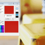
Most graphic editors have an easy way to recolor your images.  If you have PowerPoint 2007, you can do this in just a few mouse clicks using the recolor feature.  You can even use colors that are part of the color themes.  So when you change a theme, all of the colored images are changed as well.

The Rapid E-Learning Blog - color options in PowerPoint 2007

Photos are great because they have a depth and richness that’s not easy to manufacture in clip art or vector images.  In addition, they can convey information without using words.  Coloring the image allows you to leverage the rich texture of the image to create some visual interest. 

Compare the original image with the two examples I made below it.  The original has so much going on that it’s not easy to control where the learner is looking.  By coloring it, you tone that down a bit and gain some control. 

You also have a lot of options in how you can use the colored image.  In the first demo, I use it as a title screen.  I’m able to mute the brightness of the original and still capture the essence of the how the image relates to the content.  The second image uses a rectangle with a gradient fill that matches the overlay color.  Then I made the top part of the gradient transparent.  The good thing is that I was able to do all of that right inside PowerPoint.  Obviously, these are both simple examples, but they give you a sense of what you can do.

The Rapid E-Learning Blog - colorized examples

When we shoot our own photos they typically don’t look as nice as those done by professionals.  There are usually some lighting imperfections or color shifts.  The light source will cause your images to color a certain way.  For example, tungsten lights are yellow; fluorescent lights are green; and daylight is blue.  So when you shoot your own photos without any real lighting considerations you’ll end up with images that are a little off because of the original light source.

Using the coloring technique, you can cover up imperfections in lighting and still use the photos.  It’s a great way to bring "real" people into your courses and not worry about being a professional photographer.

You’re also not limited to using the entire photo.  In the example below, I used a “cutout person” and then colored her. 

The Rapid E-Learning Blog - color cutout characters

You can also do the opposite, where you color the background image and insert the cutout person on top, as I did in the example below.  It just all depends on where you want the learner to focus.

 The Rapid E-Learning Blog - colorize background images

Applying a color to your image is relatively easy to do yet it opens the door to all sorts of creative uses.  For example, in a recent blog post on using your PowerPoint slide notes I customized an image to look like a subject matter expert.  Does this add value as an instructional design consideration?  No.  However, it can make the way you present your information a little more visually interesting.  And this does contribute to your instructional design.

The Rapid E-Learning Blog - colorized example

The only limitation with this technique is your creativity.  How would you apply this idea to your elearning courses?  Feel free to share your thoughts by clicking on the comments link.

If you liked this post, you might also like these:

Events

Free E-Learning Resources

Want to learn more? Check out these articles and free resources in the community.

Here’s a great job board for e-learning, instructional design, and training jobs

Participate in the weekly e-learning challenges to sharpen your skills

Get your free PowerPoint templates and free graphics & stock images.

Lots of cool e-learning examples to check out and find inspiration.

Getting Started? This e-learning 101 series and the free e-books will help.


22 responses to “Are You Looking for an Easy Way to Make Your Courses Look Interesting?”

If using Flash, you can import photos and convert them to vector graphics and then manipulate them to the enth degree including giving them a cartoon look.

Here is a post that will show how: http://www.minutebio.com/blog/?p=18

Thanks for another great post.

Good stuff as usual Tom. You have a great eye! But I’ve already told you that :-). I really like the effect of the company color gradient with the text overlay. Thanks for that link Jeff. I’m about to check that out as well.

The use of the rectangle in matching color with transparent top is awesome looking. I can do it in GIMP, but I have not been able to do it in PPT2007, or at least not as good-looking. Can you explain how it is done. I am sure it is quite simple when you know how to do it.

I really like this effect when it’s coupled with a standard colored photo/illustration like you’ve done in the last two examples. This is an especially great tool to use if you have two photos or elements that really clash when you put them onscreen together.

I usually like using Photoshop’s “Match Color” effect to remedy clashing photos, but PP07’s recolor tool has been a great “fix” as well.

You always have some very interesting blogs about elearning. I always make sure I stop by to read them.

I really like your innovative idea of adding color to the images to make them a little more interesting. There are so many way to do this and it is very easy, it is surprising that it is not just a standard thing.

April 21st, 2009

Verrry nice Tom!

I also like to use gradients to create reflections – check out: http://i39.tinypic.com/14uj6lv.jpg

To create this effect I:
1. Took a screenshot
2. Skewed the image a little to give it perspective
3. Copied and pasted the image, then flipped the copy over to create a “mirror image”
4. Applied a gradient box (gradient from transparent to white) to the “reflected image”, to make it fade away
5. Applied a drop shadow to the original image.

An oldie but a goodie! And a great way to present screenshots of an application or logo in a more visually appealing way, e.g. for use on a title page.

Kia ora Tom

And thanks for these wonderful tips – very useful. In addition, Picasa has a similar colour grading feature.

Catchya later

April 22nd, 2009

Great…!!!
It´s simple and fast…!!

Thank
Carlos

Tom, Jeff and Tim

Tom, thanks for sharing some really neat tips on photos. ;-] I discovered PPT recolor feature by accident and still enjoy exploring it. Customers really like this customization of graphics in their products. It appears to them that it is just not another cut-n-paste effort for effects. Jeff…will try the BMP in Flash, and Tim…where (application)were your steps completed? really like the 3D effect it provides. A really nice “pop” to the screen.

Thanks, Tom.

Tom, thanks for another creative post, and for the opportunity for us all to share tips and tricks!

@Tim/@Michelle:

The wonderful thing about PPT 2007 is that we can create that same effect (skewed with reflection) easily, right inside PPT 2007!

I used to do this effect the “old way” in either Fireworks or Photoshop, but with PPT 2007 the simple steps are:

1. Click the Insert tab > then Picture.
2. Choose your image.
3. Click on the image to see the Picture Tools Format tab.
4. Look for “Picture Effects”.
5. Click the down arrow to the right of Picture Effects.

For the reflection…
6. Mouse down to Reflections and choose a style under Reflection Variations.

For the skewed effect…
7. Mouse down to 3D Rotation and choose the style you like.

It takes less than a minute to create the skewed reflection, and I don’t have to open another software program!

Great- and fun!- tips as usual, but one question: how do you get a “cutout person” version of photograph? Is it possible using PPT 2007 or do you need specific digital software like PhotoShop?

April 22nd, 2009

Nice post Tom…..I like to use PPT2007 to fade photos out to emphasize text. Here’s a look at how to do that. http://coursecontent.ntc.edu/doughert/articulate/PICTURES/player.html

April 22nd, 2009

I’m new to eLearning and your posts never fail to provide me with applicable tips and inspiration. Thanks Tom!

Is there a way to “cut out” portions of photos in PowerPoint?

Tom,

I just want to say thank you for all of the great ideas you publish on this blog. I eagerly anticipate each and every post. You always have somethng useful to say, I find so many of your tips helpful for things other than just e-learning too. Love the ideas on the coloring.

Your Friend,(from Training 2009, Atlanta)

Matthew Bray Nimeth
IT Training Manager
Compassion International

April 22nd, 2009

Hi Tom, I’m with you. I have a number of different graphic programmes, but I keep returning to Word and PowerPoint because they are so easy to use.

I’ve been using this technique now for a while. For my OHS eLearn, I created some simple characters in PowerPoint which I can manipulate quite easily so that they sit, stand etc. But instead of creating an image of a PC monitor, chair, etc, I used cut-outs and recoloured them using this technique. I then overlay my character over the top. The big benefit is that you can use a wider variety of images and give your training materials a homogenous theme.

April 23rd, 2009

Hi Tom,
I’m addicted to your posts and my elearning has flourished as a result. I have a workaround for those (like me) who can’t color the photos directly. Today I put a picture on a slide and changed it to black and white in the picture properties. Then I added a regular box shape and made it the same size as the picture. In the properties of the box, I removed the line and chose the color I wanted. I then changed the transparency to about 60%. I went the added step of creating a second box and layered on top of half of the image. I set the same color and only about 50% transparency. this allowed for a little less of the original image to show through but gave me an acceptable writing surface for half of the picture, with the other half being the more easily visible image. Thanks for the inspiration!

I am new to elearning and to this website. Posts have interesting and useful tips.

Thanks Tom for some great tips. I’m currently a graduate student from Bloomsburg University with instructional design major and I’ve learned a lot from your posts about eLearning. I like the fact that you can take a simple picture and make it look interesting. Keep up the great work!!

Thanks,

April 30th, 2009

Tom, not only do you produce great posts but you generate some great comments. I learn a lot from both. Speaking of picture effects, this seems like a good place to ask this question. Sometimes I open a colleague’s powerpoint file and I see an effect I like. I select the image and look at the effects or colors or whatever property I’m interested in … and there is no detail about what effect is being used. Which means I can’t reproduce that effect elsewhere or apply the effect consistently in another slide in the same file. Why is this and how can I get the information? Thanks.

June 24th, 2010

Great tool for volunteer (Company Employee) seminar briefers/instructors to prepare their slides/presentations.

[…] Are You Looking for an Easy Way to Make Your Courses Look Interesting? […]