The Rapid Elearning Blog

Archive for February, 2013


Articulate Rapid E-Learning Blog - three common elearning issues

I review lots of elearning courses and demos. Since elearning is a mostly visual medium visual inconsistencies tend to stand out. They’re the types of things that cause the Frankencourse design.

I’ve been making a list of some of the more common issues that I find. So in today’s post I’ll highlight three that I see quite a bit and offer some feedback on how to avoid them.

Images are Skewed

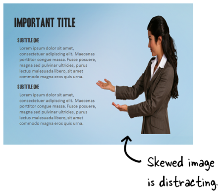
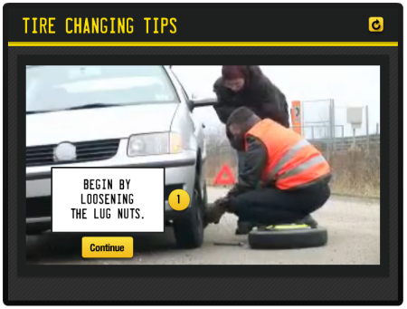
Images on the screen are obviously not the right dimensions. They’re usually skewed or flattened. This is probably the number one issue I see and easily fixed. The most common reason an image is skewed is because it’s resized to fit a specific area or shape. To get it to fit, we use the anchors on the side or top and bottom to change the shape. What happens is that the shape is resized but doesn’t maintain its aspect ratio. So it looks off.

Articulate Rapid E-Learning Blog - skewed images in elearning are distracting

Here are a couple of quick fixes:

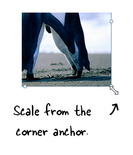
  • Use the corner anchors. To scale or reposition the image without skewing it, hold the SHIFT key and drag from one of the corner anchors. That resizes and keeps it from skewing. This also goes for shapes, especially circles. I notice that a lot of circles become egg-shaped when resized without proper scaling.

Articulate Rapid E-Learning Blog - scale images using the corner anchors in PowerPoint or Storyline

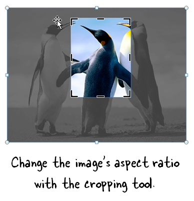
  • The cropping tool can change the image dimensions without skewing. The cropping tool in PowerPoint 2010 and Articulate Storyline lets you crop the image to a specific aspect ratio to meet the size requirement for the space available without losing the image quality. You can also move the image around inside the crop to get exactly what you need.

Articulate Rapid E-Learning Blog - use the cropping tool to create teh right aspect ratio in PowerPoint or Storyline

Font Confusion

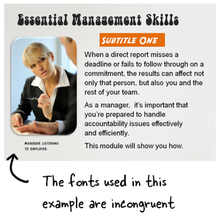
Many courses tend to use too many fonts and without rhyme or reason. I usually tell people to limit the fonts they use to about seven. Just kidding! Often I’ll see all sorts of whacky fonts plastered on the screen. When I ask why they chose a certain font it’s usually because they wanted to make the course more interesting or engaging.

That’s a good goal. But an interesting font is not going to make your course interesting. And a poorly chosen font may even distract from it. Or just make it seem less polished.

Articulate Rapid E-Learning Blog - too many fonts used in an elearning course

As a general rule of thumb (especially for those just getting started) limit yourself to two or three fonts. Typically you need:

  • Title

  • Subtitle
  • Body font
  • Emphasis: this could be the body font bolded or recolored

Being deliberate about your font choice and user fewer in your courses is an easy way to add consistency and polish to your elearning course. Here’s a previous post on working with fonts which offers some ideas on which ones to select.

Text Alignment Issues

Text is the most common element on the screen. Obviously we use text to read and acquire information, but the text also is part of the course’s visual design. Because of this, alignment is important. Here are three common issues I see regarding text:

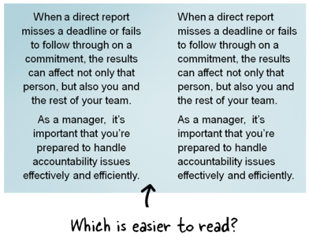
  • Large blocks of text are centered. Centering works for titles or small chunks of descriptive text, but not for big chunks of text. A clean side margin looks good and makes it easier for the eye to track.

Articulate Rapid E-Learning Blog - avoid centering large blocks of text

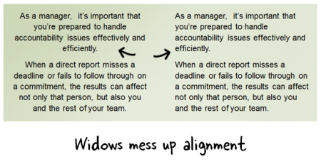
  • Avoid widows. If you’re inclined to help the widows and orphans that’s good. But you don’t want any widows hanging around your elearning course. What’s a widow? They’re those single words that hang out at the end of a block of text. Fix them by resizing the text box.

Articulate Rapid E-Learning Blog - avoide leaving widows in the your text

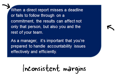
  • Margins in textboxes are inconsistent. This is fairly common. Sometimes text is scrunched to the side or top with no margins and sometimes the margins are too big; or they’re not applied consistently. This is easily fixed by modifying how the text appears in the box/shape. I like to create a separate text box over the shape. This gives more control to nudge the text inside the shape without being constrained by the shape’s text formatting.

Articulate Rapid E-Learning Blog - review the margins of text boxes and shapes on the elearning screen

You don’t need to be a graphic designer to know when something doesn’t look right. We may not always be able to explain why something doesn’t look right, but we do know it when we see it. And that’s the case with these little annoyances. If they don’t exist no one notices. But when they do, things just don’t look right.

The good thing is that they are easily fixed and doing so will help your course have more polish.

Events

Free E-Learning Resources

Want to learn more? Check out these articles and free resources in the community.

Here’s a great job board for e-learning, instructional design, and training jobs

Participate in the weekly e-learning challenges to sharpen your skills

Get your free PowerPoint templates and free graphics & stock images.

Lots of cool e-learning examples to check out and find inspiration.

Getting Started? This e-learning 101 series and the free e-books will help.


Time and money are the resources most of us don’t have. So in today’s post I thought I’d share some free applications that you may find handy as you work on your elearning courses.

Find Everything

The app is called Everything by VoidTools. David Anderson shared this with me after a recent workshop. It’s a simple application that lets you quickly search your computer. I created a custom keyboard shortcut and use it throughout the day because it really is super-fast.

Articulate Rapid E-Learning Blog - free program to seach your computer

I’m addicted. I just start searching stuff because I can. Sometimes I get up in the middle of the night just to do random searches. Works like a charm. There are other tools like this out there. If you don’t use one, Everything is worth trying and the price is right.

WaveShop

In a previous post I shared some tips on recording narration and ten free audio programs that can be used for elearning. I’ll throw WaveShop in the mix of good free audio editors.

Articulate Rapid E-Learning Blog - WaveShop a free audio editor

WaveShop is straightforward and has a lot more than basic editing functions. So if you only need to do something simple, you’re all set. But if you want to do more, then there are plenty of features to let you.

K-Lite Codec Pack

This isn’t really an application as much as a great resource. When working with multimedia you may run into issues playing audio or video files. Often these issues can be resolved by making sure the audio and video drivers are up to date for your computer’s hardware.

Articulate Rapid E-Learning Blog - free audio and video codecs for multimedia

Another simple solution is to make sure you have updated audio and video codecs. They help encode and decode the various media formats. The K-Lite Codec Pack is a collection of all sorts of filters and codecs. Don’t confuse this pack with the Chi-Lites where you’re limited to soulful funk but no AV codecs.

Cool Job: Work with the Articulate Community

I mentioned this open position in last week’s post and had a few people email questions. You can learn more about the job and apply here.

Articulate Rapid E-Learning Blog - community manager job for the world's coolest elearning company

What you’ll need:

  • Writing examples
  • Portfolio that shows your best skills

We won’t start to look at the applications until after the Learning Solutions conference so that should give you time to put together samples of your best work. Articulate’s a great company with some of the smartest people I know. And our elearning community is filled with some great people, too. So we’re looking for someone who’s going to fit right in. That could be you!

Events

Free E-Learning Resources

Want to learn more? Check out these articles and free resources in the community.

Here’s a great job board for e-learning, instructional design, and training jobs

Participate in the weekly e-learning challenges to sharpen your skills

Get your free PowerPoint templates and free graphics & stock images.

Lots of cool e-learning examples to check out and find inspiration.

Getting Started? This e-learning 101 series and the free e-books will help.


Articulate Rapid E-Learning Blog - cool bullet points

Before elearning I did a lot of video production. Back then it was time intensive and costly. But in many ways that’s changed. Today you’re able to shoot decent video on your smart phones or inexpensive HD cameras. And then editing them is also relatively easy and inexpensive. In fact, most smart phones have access to video editing apps and there are plenty of free or low-cost video editors to use with your personal computers.

A few years ago you’d never consider adding video to a course because of the time and expense. But today adding video to an elearning course is easy especially if you keep the project relatively simple. You can create a decent elearning course that uses video in no time and at little cost.

The trick is finding ways to use video in your course and still maintain some form of rapid development. A great place to start is with your bullet points. Why not use video to make your bullet point information more interesting and engaging? In today’s post I’ll show one way to create interactive bullet points that when combined with the right type of video can make your elearning course more media rich and interactive while not adding too much to the production.

Example 1: Learn to Cook

Demonstrate the finer points of cooking. Watch the video and at any point where you want to learn more, click the information bullet.

Articulate Rapid E-Learning Blog - interactive elearning demo

Click here to view the demo via Mike Enders

Example 2: Change a Tire with Your Friend

Follow a step-by-step process of how to change a tire. This particular video demonstrates how to deal with the non-helpful observer.

Articulate Rapid E-Learning Blog - interactive elearning demo tire change

Click here to view the demo

For this type of course to be effective, you need a topic that works with video. The most obvious is when you can show procedures like working on a machine or operating some equipment. It also works for role play scenarios. For example, record an interaction between a manager and co-worker. Then use the interactive buttons to point out key points during the interaction.

The key is to select a topic that is easy to record and that can be augmented with bullet point information. Here’s a quick demo I put together showing how to use the Keurig brewer.

Example 3: Using the Keurig Brewer

Following is what the information about the brewer may have looked like in a standard elearning screen. It includes four steps and corresponding information.

Articulate Rapid E-Learning Blog - standard bullet point screen

And here’s the same information using a video and interactive bullet points. The video allows the learner to see what’s happening. And then interactive bullet points appear along the timeline to add additional information. If the learner wants to acquire more info, she can click the button. If not, she can ignore it and continue watching the video.

Articulate Rapid E-Learning Blog - elearning example how to use Keurig Brewer

Click here to view the elearning demo.

Here’s what I like about this approach:

  • Video is easy to shoot and relatively simple to edit with today’s tools. So it lets you make an elearning course that doesn’t look like every other course. Even if it’s a simple procedure like the demo above, it’s more interesting than a screen full of bullet points.
  • Today’s elearning software offers more capability. A few years ago even a simple project like this wouldn’t have been possible for someone without programming skills. However, that’s changed. Today’s tools make this type of project possible. For example, I shot the video and compiled the course in Storyline in about 30 minutes.
  • Flexibility for the learner. This is a great way to address different learning needs. Experienced people can watch the videos only and those with less experience can click on the interactive buttons to collect more information.

Of course this type of approach won’t work with every course and it’s not always feasible to shoot video and make interactive buttons. But if you want to use video in your elearning courses, this is a good place to start because it’s straightforward and simple to produce. Give it a try.

Added later:
Here’s a link to the same demo built in Quizmaker ’13 (would work the same in ’09). The only difference is you lose the interactive part, but you can leverage layering info on the video timeline.

Events

Free E-Learning Resources

Want to learn more? Check out these articles and free resources in the community.

Here’s a great job board for e-learning, instructional design, and training jobs

Participate in the weekly e-learning challenges to sharpen your skills

Get your free PowerPoint templates and free graphics & stock images.

Lots of cool e-learning examples to check out and find inspiration.

Getting Started? This e-learning 101 series and the free e-books will help.


Articulate Rapid E-Learning Blog - choose the right course background

The single largest visual element in your elearning course is the background. And the right background can set the stage and build expectations for your learners. A course that looks like a converted PowerPoint file isn’t as inviting as one that is aesthetically rich and looks more professionally designed.

Here are some quick examples. Look at the image below. It looks like a typical rapid elearning course screen. It’s not bad, just not very dynamic or rich.

Articulate Rapid E-Learning Blog - basic elearning course slide

Now look at the following makeovers. Just changing the background adds a more polished look. The background images match the course context and they offer a richer visual experience. This approach also doesn’t require advanced graphics skills or creativity to implement.

Articulate Rapid E-Learning Blog - elearning example

Articulate Rapid E-Learning Blog - elearning example

Start with a Good Background

In a previous post, we discussed tapping into the visual voice. It’s the process of crafting the course’s visual elements to meet the expectations of a given course subject or context.

For example, if you are going to build a course on operating room technology, what colors would you use? What would the people look like? What are they wearing? What fonts would you select for that course?

Capturing your visual voice helps identify the key design elements in your elearning course. However many of you aren’t graphic designers. So it can be a challenge to create a course that is visually rich and engaging.

Choosing the Right Image

If you can’t design everything on your own a good substitute is to at least start with the right background. The trick is to find the single image that best represents the elearning course or screen that you’re building. Here are some tips on selecting the right image:

  • Brainstorm a few ideas. Think about the images that bets represent your course content. Write them down and use that list to look for the right image. If not, you’ll go to an image site and waste a lot of time searching. You’re better off having a list and using that to start. From them take note of the keywords used to describe the image. That will help you extend the search.
  • Look for simple images that convey the essence of what you need but without too much detail. The images above suggest hiking but they don’t have a lot of extra information that may distract. Keep in mind that everything on the screen communicates something. The more you have on the screen, the more apt you are to miscommunicate. Thus you want to reduce the amount of information and detail on the background image. The image should provide visual context but not content.
  • Find content holders. The background image is just that—a background. Because you’re putting content on top of the background find images that have some flexibility. I look for images with solid colors or blank areas that work for text or media elements like the two hiking images above. The people in the image suggest hiking, but the snow areas are perfect content holder. I try to stay away from really busy images because I don’t want the background content to conflict with the teaching content.
  • Find more than one image. You’re not limited to a single background for the entire course. You can select different backgrounds per screen or section. As the context changes feel free to change to the appropriate background image.

Starting with a visually dynamic background that is contextual and matches the content can set positive expectations for the course and adds a lot of aesthetic appeal. It’s not going to replace good content, but it is a start to building an engaging course especially if you have limited resources.

Events

Free E-Learning Resources

Want to learn more? Check out these articles and free resources in the community.

Here’s a great job board for e-learning, instructional design, and training jobs

Participate in the weekly e-learning challenges to sharpen your skills

Get your free PowerPoint templates and free graphics & stock images.

Lots of cool e-learning examples to check out and find inspiration.

Getting Started? This e-learning 101 series and the free e-books will help.