


[…] on http://www.articulate.com Share this:TwitterFacebookLike this:LikeBe the first to like this. This entry was posted in […]
How Your Visual Voice Helps Build Better E-Learning
January 15th, 2013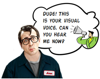
Having the right look for your elearning course can help engage the learner and set initial expectations because how your course looks tells the learner what to expect.
There’s a look that’s right for your elearning course. It’s just a matter of finding it. And that’s when listening to your visual voice is critical.
What is the Visual Voice?
You may not be a trained graphic designer, but odds are that you can tell when things look right or not. That’s because there’s a voice in the back of your head that lets you know. At least there is in mine (but that could be the result of mental issues and/or beer).
If I design a course for kids, I already have some preconceived ideas of what look is appropriate for that audience. Most likely I’ll stick with primary colors and the characters may be a bit cartoony.
Each one of us has a visual voice that we can hear and learn to build better looking elearning courses. The secret is learning to hear the voice.
E-Learning Workshop Example
Here’s an exercise we do at the workshop. Suppose you’re hired to develop a western movie poster.
- What colors would you choose?
- What about fonts?
- What people would be on the poster? What would they wear?
In most cases, people tend to agree on the colors and general look of the poster. It has that dusty brown look with cactus and tumbleweeds. As far as the font, they may not know the name but they know the right font when they see it. And of course the people in the poster would look like cowboys. In addition, there’d be all sorts of design elements that have a western context (like wanted posters, horses, lassos, etc.).
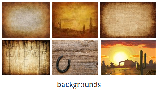

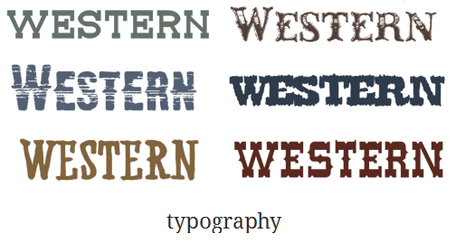
While we may not agree on all of the details, we’d probably come up with something very similar. And that’s because we have a visual voice that tells us what a western movie poster should be. If it doesn’t look like right, it throws off our expectations.
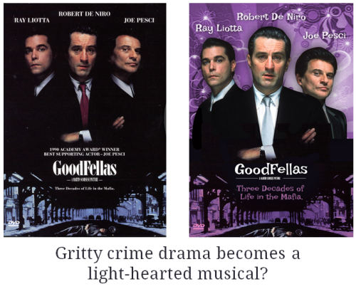
Suppose you were going to do a Mafia movie poster. What colors would you use? Most likely you’d use black, white, and red. Sure enough! If you do a search, you’ll see that most Mafia movie posters use those colors.
But, if the colors (and fonts) were different you’d probably change your expectations of what the Mafia movie was about. In the example below the fonts and background are changed. How does that change your perception of the movie?
The Visual Voice for E-Learning
These principles work the same for an elearning course. Posters aren’t that much different than the screens in your elearning courses. The design elements are generally the same. You’ll use colors, a background, characters and text.
Here’s an exercise for you. Suppose you are going to build a safety course. What colors come to mind? Which fonts? What types of characters? What would they wear? What design elements do you recognize as safety-related?
Now, let’s switch the course topics and suppose you’re building a course on handling customer calls in a call center. How would the look of the course be different than the safety course? Why?
There are number of ways to tap into your visual voice. Here are four things I try to expose:
- What colors will I use?
- What’s the right font?
- What will the characters look like and wear?
- What images can I use?
The key is that your elearning course is going to look like something. The secret is figuring out what that something is. Tapping into your visual voice helps you figure it out. And from there you’ll be able to set the initial expectations and engage the learner. And this is one of the first steps in creating effective elearning.
Events
- Everyday. Check out the weekly training webinars to learn more about Rise, Storyline, and instructional design.
Free E-Learning Resources
 |
 |
 |
|
Want to learn more? Check out these articles and free resources in the community. |
Here’s a great job board for e-learning, instructional design, and training jobs |
Participate in the weekly e-learning challenges to sharpen your skills |
 |
 |
 |
|
Get your free PowerPoint templates and free graphics & stock images. |
Lots of cool e-learning examples to check out and find inspiration. |
Getting Started? This e-learning 101 series and the free e-books will help. |
You might also like:
14 responses to “How Your Visual Voice Helps Build Better E-Learning”
Great post! So here’s something for the Storyline wishlist. Could we have some additional “wardrobe choices” for the character packs? 🙂
Good stuff Tom! I would so love to see a Good Fellas musical!
I’ve been doing a lot of studying on the Visual Cortex, specifically the dorsal stream where we store and recall from long-term memory what something is supposed to ‘look’ like.
Love the term “Visual Voice” as that’s essentially what it is. Our neurons sort of know when something doesn’t appear to be visually correct. Your Western poster and Mafia Musical are great examples!
[…] How Your Visual Voice Helps Build Better E-Learning […]
Tom,
Great post! This is a subject I always empahsize with my SME’s as we begin the process of course development. It also adds to the case against using standard PowerPoint templates as the “design” for an elearning course, especially having logos on every slide! Can’t wait to hear when you’ll be in North Carolina. Agree with Kevin Thorn, would love to see a “Goodfellas” musical, it would be a hoot!
[…] How Your Visual Voice Helps Build Better E-Learning […]
Hi great post, design is important you can have the best course with the worst design which will have no interest from learners,.
Great article.
Tom,
I’ve been reading your blog for a while now and recently joined e-Learning Heroes.
Regardless of whether a person is developing an e-Learning course or a PowerPoint presentation the information you provide is of the highest caliber, practical, and effective.
The conversational tone you write with and the engaging demos and examples you provide to punctuate your points is done in an upbeat energetic way.
Thank you for your willingness to share your expertise. Please keep up the excellent work you do.
Yours,
Bob Hayes
Great tips Tom! Thank you it helps me a lot.
Tom, thank you for the insightful post. I am currently studying instructional design and technology and, I am discovering the value of your blog to my development as an aspiring instructional designer. Regarding visual voice, I wanted to ask if you were aware of any recent trends in e-learning content design, either in your experience or through research? For example, is there any information indicating that audiences tend to find certain fonts and/or colors more appealing than others? Do adult learners appreciate cartoons and/or avatars as much as children? Or do they tend to prefer more lifelike imagery?
Second, I’ve often heard the phrase “simple is better” regarding to designing PowerPoint presentations. What are your thoughts on how this may (or may not) apply to e-learning design. Thanks again.
Charles
Good topic. I needs to spend some time studying more or working out more. Thank you for magnificent information I was looking for this information for my mission.


0
comments