The Rapid Elearning Blog

Archive for June, 2012


Articulate Rapid E-Learning Blog - curse of the frankencourse

A while back I got an email from a blog reader who was excited about her first elearning project. She said that she had used every single tip I ever shared on the blog. Sure enough, she did. In fact, her product was less elearning course more Rapid E-Learning Blog museum.

I mention this because something she did in her course was common to many of the courses I see. It’s what I like to call the Frankencourse. And it’s something that’s easy enough to fix.

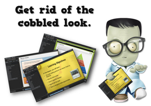
On the surface Frankenstein looked like a person, albeit partially decomposed. But he really was a bunch of people cobbled together—an arm here, a leg there. And in a similar sense instead of looking like a single course, many elearning courses look like a bunch of courses cobbled together.

Tools within Tools

Most rapid elearning tools are like Articulate Presenter and convert PowerPoint slides to Flash (and soon HTML5). And they can be augmented using a series of form-based tools like Quizmaker and Engage. Or if you’re using other products you’ll add the Flash output to the PowerPoint slide.

 Articulate Rapid E-Learning Blog - get rid of the cobbled look

On one hand this is really cool and convenient and is what makes rapid elearning so popular, especially the form-based authoring. On the other hand it introduces some design challenges that you’ll need to consider when building your courses.

Each tool you import also exists as a standalone product. That means it has its own player and distinct look. This is especially true of form-based tools where you have less control over the look and layout because the software creates it for you.

Because of this, it’s important to be intentional about the design of the course. If not, you run the risk of having that cobbled look instead of a cohesive product that looks like everything belongs together.

Be Consistent with Intentional Design

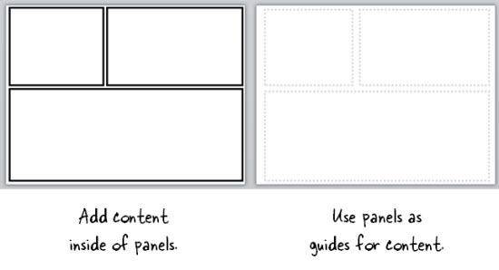
In a previous post we looked at how to be intentional in the course design. This is probably the single biggest way to avoid the Frankencourse. Be intentional about what goes on the screen. Nothing’s there by accident.

Articulate Rapid E-Learning Blog - what content is on your elearning course screen

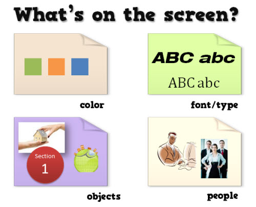
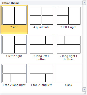
There are only so many things you can put on the screen. Which fonts are you going to use? How many? Which colors are in your course? Will all of your shapes be the same? Are you going with vector objects like clip art and shapes or you going to use photographs?

The screen is going to have some content and that content is going to have a look, whether you plan it or not. To avoid the Frankencourse, be intentional about what goes on the screen and why.

Understand the Authoring Tools

The more you know about the tools, the more you’ll be able to do to avoid the discordant look of the course. Many of the rapid elearning applications are form-based so they come with a specific look.

Articulate Rapid E-Learning Blog - getting started elearning course

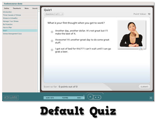
Often people go with the default settings. However the default settings aren’t necessarily aligned to your course’s look. In the example below, you can see that the default quiz that’s inserted in the course doesn’t have a layout or color scheme that matches the course image above.

Articulate Rapid E-Learning Blog - using a default rapid elearning application

  • Make your templates match. When adding content from other applications match the color schemes and design elements used in the course. This way they’ll look like they belong together.
  • Blend the different applications. Create a transparent player for the application you insert. This way you get the functionality of the inserted application and it pulls in the background from the course screen.

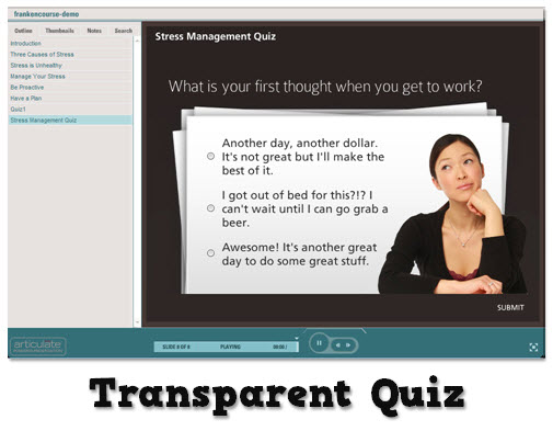
In the example below, I used the same quiz as above. But instead of going with the default, I made the quiz player transparent and matched the color scheme and design elements so it looks like it’s part of the course design. It’s the same quiz, but I think you’ll agree that it looks much better in the course.

Articulate Rapid E-Learning Blog - using Articulate Quizmaker to create a dynamic elearning quiz

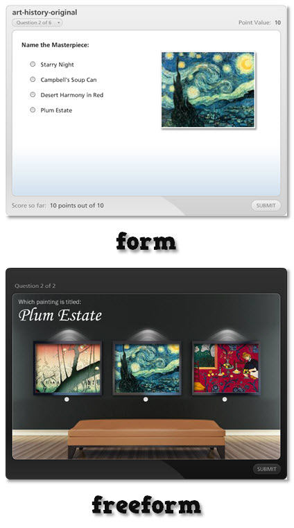
Many form-based tools, especially quizzes have that blocky form look. One of my favorite features in Articulate Quizmaker is being able to switch to slide view. This provides a freeform screen to compose your own look.

Compare the two before and after images below. The first image is the default quiz form and the second is the exact same question composed in slide view. As you can see slide view gives you freedom to create the look and feel you need and still offers the easy authoring of rapid elearning.

Articulate Rapid E-Learning Blog - comparing Articulate Quizmaker form and freeform

Of course when you use a tool like Storyline much of this changes because everything’s part of a single application. But if you do combine PowerPoint-to-Flash with other applications, you’ll need to examine the tools. And then see where you can make edits so that the content you pull together all looks like it belongs together.

In either case, whether you use rapid elearning tools or a more custom approach there are things you can do to avoid the Frankencourse. The main point is to be intentional about what you want and then to make sure that the design decisions you make are applied consistently throughout the course.

*Frankenstein icon via yootheme

Events

Free E-Learning Resources

Want to learn more? Check out these articles and free resources in the community.

Here’s a great job board for e-learning, instructional design, and training jobs

Participate in the weekly e-learning challenges to sharpen your skills

Get your free PowerPoint templates and free graphics & stock images.

Lots of cool e-learning examples to check out and find inspiration.

Getting Started? This e-learning 101 series and the free e-books will help.


The Rapid E-Learning Blog - did the Avengers skip their safety compliance training?

Comic book layouts are pretty popular. And they work well for elearning courses. For one, they look different. It’s that type of contrast that can hook your learners who might be bored with the standard-looking corporate elearning.

On top of that a comic-like layout breaks the content into panels which allows you to control the pacing and flow of information as each panel progressively reveals more. It’s a great way to still have the simplicity of a linear course, but make it seem more engaging.

A while back I shared how to be inspired by others and included links to two comic-style elearning courses. Based on the feedback, the examples were a hit. I got quite a few emails asking how to build a similar type of course.

The Rapid E-Learning Blog - examples of comic book style elearning

In today’s post I’m going to show three ways to build a comic-style layout for your courses. To keep it simple we’ll use PowerPoint, but the ideas should work regardless of the tool you use.

Choose a Layout

Layouts are the key distinguishing feature for the comic book look. Typically they follow some sort of grid. The good thing is that there’s really no right or wrong way to create the grid. Some comics use straight lines and even sized panels. And some use an assortment of panel sizes.

The Rapid E-Learning Blog - layouts for comic book style elearning

If you’re looking for layout ideas, the first place to look is at comic books. You could attend a comic book convention, but you’ll probably have to wear a goofy costume. A better solution is to go to one of those comic creation sites and see what types of layouts they offer. Here are a couple of good sites:

You can also create your own layouts with existing clip art. Here’s an example I shared in this blog post on using Clip Art to create your elearning template. This also lets you build a layout that has that hand-drawn look.

The Rapid E-Learning Blog - build your own comic style elearning using PowerPoint clip art

For this demo, we’ll use a few simple layouts. I created them as shapes in PowerPoint. As you can see below, creating the layout’s pretty simple. Feel free to create as many layouts as you want.

Keep in mind that too many choices can be overwhelming. Instead of building 200 possible layouts, stick with 5-10 common layouts.

The Rapid E-Learning Blog - comic style elearning layouts built in PowerPoint

Another consideration with layouts is determining how you’ll present the content. Review the two elearning examples above and notice how the layouts follow a consistent pattern. For example, you may have one type of layout for information, another for decision-making, and another for feedback.

Deciding how to use the layouts will help you best determine which types of layouts you need.

One last point, the more panels you add to the layouts, the less space you get. If you have too many panels the content make look cluttered and seem confusing. I’d err on the side of fewer panels.

Option 1: Create Master Slide Panels & Layouts

Use PowerPoint’s master slides to create the layouts. You can have as many masters as you like so the best bet is to create all of the possible layouts that you’d use in a single file. And then when you’re ready to go, select a layout for the slide and add your content.

The Rapid E-Learning Blog - build as many layouts in PowerPoint master template as you like

Two ways to work with the master layouts:

  • Create the entire panel look on the slide master. Then apply it to a slide and add content within the panel.
  • Create watermarked panels on the master slide and use them as guides to control placement of your content. The benefit to this is that you have the general layout mapped, but you’re not confined by the panels if your content doesn’t fit perfectly.

The Rapid E-Learning Blog - create two types of layouts

A few tips when working with these types of layouts:

  • Use thick lines and determine how colorful you want the panels to be. Think loud and in your face.
  • Not all of your content will fit perfectly in the panels. That’s OK. Build your content on the panel and get it to fit the best you can. Then copy and paste it as an image. Use the crop feature to perfectly crop it to the panel.
  • Tutorial: this tutorial walks through the template and shows a few production tips.

Option 2: Create Custom-Sized Slides for Each Panel

Instead of building the layouts on the master template, build them on the slides. This gives you more control over the panels because you have direct access to them since they’re not buried in the masters.

Build a master PowerPoint file that has all of the layouts you’d use. Then start with that file when you want to build a comic-inspired course. Make sure to save it with a different name. Duplicate the layouts you want and then add your content.

How to add content to the panels:

  • Instead of creating your panel shapes on the master slide, create them on the slide. This lets you manipulate the shape at the slide level. Add content on top of the panel shape.
  • Create panel shapes with thick lines and no fill color. Then place them on top of the content. The thick lines will cover up anything that doesn’t fit perfectly.
  • Fill the panel shapes with an image. I like this approach because the panels and content will always align perfectly. The only thing that changes is the fill image for the shape.

Bonus tips:

Option 3: Create a Master Panel Image

This is probably the easiest way to create a comic layout. Instead of messing with a bunch of images and trying to get everything laid out perfectly, just create a series of layout images that you place on top of your content.

Essentially, you have one image of the entire page. Then you cut a hole out of the page for each panel. All of the content sits underneath the page image and can only peak through the holes. This guarantees that everything is perfectly aligned inside the panel.

I like this approach because you can move each object in the panel and the overlaid master image masks any overflow to create the illusion of panels.

Extra tips:

  • Add your page images to the master slides so that you have a layout. This will act as a general guide. Your slide for each layout you provide should consist of a master slide with the same page layout and the page layout image on the actual slide that acts as the cover.
  • Be sure to use the selection pane in PowerPoint (starting with PowerPoint 2007). Hide the page image and add your content using the master as a guide. Then unhide the page layout on the slide when you’re ready to publish. Make sure the cover image is always on top in the selection pane.
  • Tutorial: How to create layout mask images to use as panel covers.

To help you out, I created a starter PowerPoint template pack. You can download it in the elearning community. It includes folders for each type of template. You can use them as they are or build your own.

The Rapid E-Learning Blog - example of the free PowerPoint template demo

Comic strip layouts are popular and a nice way to make your courses look a bit different. The trick is to determine the type of layout you want and how to get the content into the panels with the least amount of work.

There are many ways to layout the comic panels. Once you decide the type of layout you want, then you need to determine how you will get the content into the panels.

Events

Free E-Learning Resources

Want to learn more? Check out these articles and free resources in the community.

Here’s a great job board for e-learning, instructional design, and training jobs

Participate in the weekly e-learning challenges to sharpen your skills

Get your free PowerPoint templates and free graphics & stock images.

Lots of cool e-learning examples to check out and find inspiration.

Getting Started? This e-learning 101 series and the free e-books will help.


The Rapid E-Learning Blog - be intentional about your elearning design

Typically elearning courses start from existing content. And often that content dictates how the course is structured and how it looks. And that may not always be best.

The guiding principle for rapid elearning design is to be intentional. Everything you do while developing your course should be planned and exist for a reason. You don’t want existing content to dictate the design of your course. This seems obvious but often isn’t the case.

Getting to Intentional Design

Many elearning courses start as classroom content that needs to be converted and put online. Or subject matter experts hand you a bunch of PowerPoint slides that they want to turn into elearning courses.

This type of content already has some instructional consideration, albeit for a classroom. And it has some visual design that usually comes from a template with specific colors, schemes, and fonts.

Instead of being intentional about the instructional and visual design of the course we allow the existing content to determine how we build it. What we should do is take a step back, think about general course design, and then map our content to the design that’s appropriate to the course objectives.

The Rapid E-Learning Blog - three parts to an elearning course

As I’ve mentioned in the past, elearning courses have three essential elements. I like to frame them as questions.

  • What will the course look like?
  • What content needs to be in the course?
  • What will the learner do with this content?

These three questions help to drive the intentionality of your course design.

Put Your Hands Up & Step Away from that PowerPoint File

Here’s a typical scenario. You’re handed a PowerPoint file and some other documents. The subject matter expert has been using that content for years in a successful classroom setting and now wants that converted to elearning.

Easy enough.

The Rapid E-Learning Blog - step away from the PowerPoint slide

In this scenario, we typically open up the existing PowerPoint file and make decision on a slide-by-slide basis. We start on slide one, make some adjustments, and then move on to slide 2. Make a few more adjustments, and then move on to the next slide.

The challenge with this approach is that you’re letting the existing content and instructional structure drive how you build the course. That may work on some occasions but for the most part it’s not ideal.

Be Intentional about the Course Design

Even if the existing content looks right, don’t start there. Take a step back and start with a blank screen. Then determine how the course needs to be built and what content you need.

If the existing content you have works, great. If not, then you’re not letting it dictate your course design. In either case, you want to be intentional in how the course is designed. This will ensure that you’re moving in the right direction.

Let’s revisit the three essential questions.

What will the course look like?

The course is going to look like something. Even if you are in a hurry and decide to do nothing but a simple conversion, the course is still going to look like something.

Most likely the look that isn’t right for the course is the one that comes from the existing content. But, there is a look that is right for the course. It’s just a matter of finding it.

Be intentional about the visual design of your elearning course.

What content needs to be in the course?

Subject matter experts tend to think everything’s important. And it probably is in the proper context. But “important” content is not the same as the “right” content that is appropriate to the goals of the elearning course.

Not all of the information about a given topic needs to be in an elearning course. I prefer a backwards design approach. At the end of the course, what change should I expect from the learner? What does it look like if I see it? Then build the course so the learner can practice and demonstrate that desired change.

Be intentional about the aligning the course content to the course objectives.

What will the learner do with this content?

This question builds off of the second one. The content in the course is structured to meet specific objectives. As the learner goes through the course, what is she supposed to do? This question helps focus on the interactive component of the course.

Do you want her reading and reflecting on content? Is there a place for her to do something, to make some decisions? Once she’s exposed to the course content, what s she supposed to do?

Sometimes the course content is simple refresher material and doesn’t require a lot if interactivity. But often the content is new and is tied to some sort of performance expectation. What can you do to get the learner to practice using the information in a setting similar to what they’d do in the real world?

Be intentional about aligning the course’s interactivity to meeting the course’s objectives.

As I mentioned earlier, the capabilities of the authoring software has evolved. This has opened the doors to do more with elearning. But easy course creation is not going to replace being intentional about how you design your courses. It just makes it easier to build what you intend to build.

The trick is to intend to build the right type of course. It requires that you answer those three essential questions: What will the course look like? What content needs to be part of it? And what is the learner supposed to do with this course?

If you can answer those questions you’re on your way to building effective elearning.

Events

Free E-Learning Resources

Want to learn more? Check out these articles and free resources in the community.

Here’s a great job board for e-learning, instructional design, and training jobs

Participate in the weekly e-learning challenges to sharpen your skills

Get your free PowerPoint templates and free graphics & stock images.

Lots of cool e-learning examples to check out and find inspiration.

Getting Started? This e-learning 101 series and the free e-books will help.


One of the most common complaints I hear from elearning developers is that they have to build the same types of courses over and over again. And often they’re given little latitude in how the courses are designed.

This can be stifling and in many ways retard your growth as an elearning developer. You may get to work on a hundred projects, but they’re basically the same project built a hundred times. This means you get little opportunity to expand your skills and do something different. And then later when you go to look for a different job, you won’t have much interesting to show prospective employers.

A great way to grow your skills and add to your portfolio is by volunteering to build courses. You get to work on new content and meet some great people. You also get to help others less fortunate.

How to Volunteer

LINGOs is a consortium of NGO organizations that shares learning resources and experiences. Each year they run a Global Giveback campaign where they connect elearning developers to humanitarian organizations.

In a previous post I discussed the Global Giveback program and how it can be a win-win for you and the organization you support.

This year the Global Giveback’s focus is to build a library of courses, Last Mile Learning, that teaches topics related to People Management, Team Management, Strategic Management and Project Management. This library of courses is free of charge and available to anyone working to reduce poverty and alleviate suffering in the developing world.

How Can You Help?

Volunteer to offer your expertise to Last Mile Learning. The LINGOs organizations and volunteers will form a team that will develop content in four formats:

  • Self-led elearning
  • Face-to-face curricula
  • Online synchronous curricula
  • Blended learning curricula

As you can see the teams will develop content that runs from classroom to elearning. So there’s plenty of opportunity to apply your skills and expertise.

What’s in it For You?

Your help extends the resources of the NGO organizations so they don’t need to spend more money on training. This means that communities could excavate more wells, protect more sensitive areas, feed more malnourished children, introduce more agricultural innovations and implement more life-saving health programs – without additional resources!

There’s great satisfaction in knowing that the skills you have can be a blessing to others all over the world. And the projects will help you develop skills that may round out your elearning and training experience.

You’ll also be able to add a new project to your portfolio and you’ll get to network with others in our industry. It’s those relationships that could prove valuable somewhere down the road.

Other relevant posts:

Who Should Volunteer?

Bored with what you’re currently doing? You’d make a great volunteer. Freelancer trying to build a great showcase and connect with others? You’d make a great volunteer. Teach instructional design students and tired of assigning projects that have a 2 week shelf life? You and your students would make great volunteers.

Basically, if you’re in the learning and development industry then you’d make a great volunteer. To volunteer check out this information.

If you’re looking to help others or get some more experience to flesh out your work portfolio, then building a LINGOs course is just the ticket.

Events

Free E-Learning Resources

Want to learn more? Check out these articles and free resources in the community.

Here’s a great job board for e-learning, instructional design, and training jobs

Participate in the weekly e-learning challenges to sharpen your skills

Get your free PowerPoint templates and free graphics & stock images.

Lots of cool e-learning examples to check out and find inspiration.

Getting Started? This e-learning 101 series and the free e-books will help.