 Ever wonder how to present e-learning course ideas to your customers?
I had a conversation the other day with someone who was presented with a somewhat boring course project. We chatted about ways to make it less boring. During the conversation, the person was concerned that the customer would never go for a different idea and only wanted the tried and true, click-and-read course.
This is a common challenge because the easiest course to build is the linear, explainer type course with information and next buttons. It's also what many ...
Ever wonder how to present e-learning course ideas to your customers?
I had a conversation the other day with someone who was presented with a somewhat boring course project. We chatted about ways to make it less boring. During the conversation, the person was concerned that the customer would never go for a different idea and only wanted the tried and true, click-and-read course.
This is a common challenge because the easiest course to build is the linear, explainer type course with information and next buttons. It's also what many ...
Read the full article
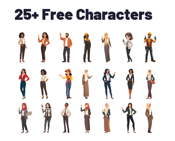
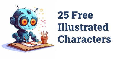 Here's a back-to-school special! As you may know, I've been playing around with AI and creating illustrated characters for e-learning. Each day I committed to releasing one character which you can find below. As a grand finale, I pulled together 25 illustrated characters for you to use.
25 Free Illustrated Characters
Here's a batch of characters with some diversity. The file includes 25 characters with 100 poses. You can download them here.
Here's a back-to-school special! As you may know, I've been playing around with AI and creating illustrated characters for e-learning. Each day I committed to releasing one character which you can find below. As a grand finale, I pulled together 25 illustrated characters for you to use.
25 Free Illustrated Characters
Here's a batch of characters with some diversity. The file includes 25 characters with 100 poses. You can download them here.
 Learn to Create Your Own ...
Read the full article
 We've all been there, building courses where we don't have much say in the content. You know the ones I'm talking about - those compliance courses or those annual refreshers that are driven by content more so than performance. Truth be told, the organization isn't really expecting miraculous performance improvements from these courses. They simply want to ensure that everyone reviews the content, passes an assessment, and tracks completion for their records. Permanent records. You know, all that stuff that gets brought up at the pearly gates ...
Read the full article
 There's a lot of promise to artificial intelligence (AI) for image generation. However, as it currently works it's not as simple as prompting an image and getting something perfect to download and use. AI can generate a lot of nice results quickly. However, using the images for production work can be a challenge.
My key objective is to create viable (not necessarily perfect) characters that I can use in online training programs or PowerPoint presentations. I am not a professional illustrator or Photoshop pro, so I want ...
There's a lot of promise to artificial intelligence (AI) for image generation. However, as it currently works it's not as simple as prompting an image and getting something perfect to download and use. AI can generate a lot of nice results quickly. However, using the images for production work can be a challenge.
My key objective is to create viable (not necessarily perfect) characters that I can use in online training programs or PowerPoint presentations. I am not a professional illustrator or Photoshop pro, so I want ...
Read the full article
 I see the promise of AI generated assets for e-learning. I'm not an illustrator. I have limited Photoshop skills. Because of this, my options for custom illustrations are slim. However, with AI I can find a balance of creating viable illustrated characters with minimal skills.
In previous posts we looked at:
I see the promise of AI generated assets for e-learning. I'm not an illustrator. I have limited Photoshop skills. Because of this, my options for custom illustrations are slim. However, with AI I can find a balance of creating viable illustrated characters with minimal skills.
In previous posts we looked at:
Today, I'll show some of the basic steps I use to create the illustrated characters ...
Read the full article
 I've been messing around with different generative AI apps, just like many of you. I'm trying to figure out how I can use them in my job and also get really good at using the various AI tools. Because I create online courses, I've been working on making my own illustrations that work well.
In a previous post, I shared some tips based on things I've learning using AI. I am using Midjourney for my examples, but there are a lot of tools out there for your initial experimentation.
Here ...
I've been messing around with different generative AI apps, just like many of you. I'm trying to figure out how I can use them in my job and also get really good at using the various AI tools. Because I create online courses, I've been working on making my own illustrations that work well.
In a previous post, I shared some tips based on things I've learning using AI. I am using Midjourney for my examples, but there are a lot of tools out there for your initial experimentation.
Here ...
Read the full article
 Like many of you, I've been playing around with AI to generate images. There is a certain magic to it all. Add a text prompt and in a few minutes you're presented with mostly viable images. On the surface, it's all really cool. Many of us use stock images. This works OK, but the problem with stock images is that they are stock and very generic. Trying to find specific images to meet the needs of our courses isn't always easy.
And that's where the promise of ...
Like many of you, I've been playing around with AI to generate images. There is a certain magic to it all. Add a text prompt and in a few minutes you're presented with mostly viable images. On the surface, it's all really cool. Many of us use stock images. This works OK, but the problem with stock images is that they are stock and very generic. Trying to find specific images to meet the needs of our courses isn't always easy.
And that's where the promise of ...
Read the full article
 There are a lot of really cool things you can do with 360° images in e-learning. You can see some examples here.
However, I've chatted with a lot of people and the single biggest challenge for them is getting usable images.
In most cases, 360° image interactions are exploratory and based on real-world context. In those case, stock imagery doesn't work. This requires that the course author have a camera or other means to craft the images. However, it doesn't mean you can't create an interaction using stock 360° ...
There are a lot of really cool things you can do with 360° images in e-learning. You can see some examples here.
However, I've chatted with a lot of people and the single biggest challenge for them is getting usable images.
In most cases, 360° image interactions are exploratory and based on real-world context. In those case, stock imagery doesn't work. This requires that the course author have a camera or other means to craft the images. However, it doesn't mean you can't create an interaction using stock 360° ...
Read the full article
 Many e-learning developers create multiple courses, but these courses are often very similar in content. Instead of building different courses, they are essentially building the same course repeatedly.
A job seeker expressed their desire to move away from creating basic click-and-read e-learning content and work on courses that have a more significant impact. However, they were unsure of which organizations are producing these types of courses and where to look.
The main question then becomes: where can you find the best e-learning courses? I have some brief thoughts ...
Many e-learning developers create multiple courses, but these courses are often very similar in content. Instead of building different courses, they are essentially building the same course repeatedly.
A job seeker expressed their desire to move away from creating basic click-and-read e-learning content and work on courses that have a more significant impact. However, they were unsure of which organizations are producing these types of courses and where to look.
The main question then becomes: where can you find the best e-learning courses? I have some brief thoughts ...
Read the full article
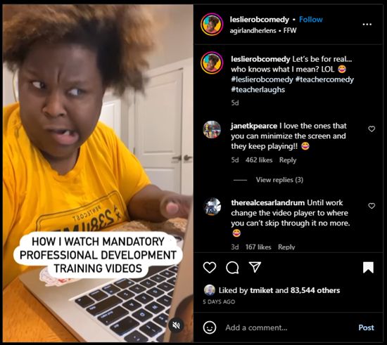
 I saw this video clip the other day on Instagram about how comedian and teacher, Leslie Robinson, views mandatory training videos.
It's funny and it's true!
What's even better are the comments like this one:
"I had 7 of those to watch one day, tried watching them on different browser windows simultaneously, but no luck, those developers outsmarted me."
"Yeah, they're messing up our learning process" 🤣
I saw this video clip the other day on Instagram about how comedian and teacher, Leslie Robinson, views mandatory training videos.
It's funny and it's true!
What's even better are the comments like this one:
"I had 7 of those to watch one day, tried watching them on different browser windows simultaneously, but no luck, those developers outsmarted me."
"Yeah, they're messing up our learning process" 🤣
 Click here to view on Instagram.
The comments are loaded with good ...
Click here to view on Instagram.
The comments are loaded with good ...
Read the full article
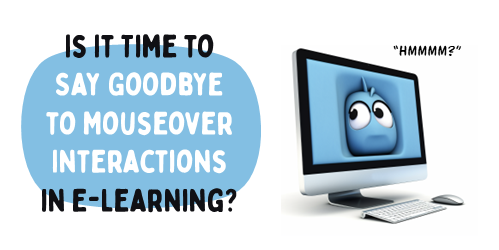 There are three primary forms of onscreen interaction used in e-learning courses: clicking, mouseovering and dragging. If desired, user input interactions such as data entry or text input with variables can also be added. However, the majority of interactivity is based on the three aforementioned types.
Recently, I was experimenting with a mouseover interaction concept which was mainly a gimmick, and wouldn't be feasible as a real e-learning course. This nonetheless made me ponder the various uses of mouseover interactions and the current state of e-learning.
How Are ...
There are three primary forms of onscreen interaction used in e-learning courses: clicking, mouseovering and dragging. If desired, user input interactions such as data entry or text input with variables can also be added. However, the majority of interactivity is based on the three aforementioned types.
Recently, I was experimenting with a mouseover interaction concept which was mainly a gimmick, and wouldn't be feasible as a real e-learning course. This nonetheless made me ponder the various uses of mouseover interactions and the current state of e-learning.
How Are ...
Read the full article
 There are times we're asked to work on projects where the client's ideas are wrong or what they want to do won't produce the results they want. This is a common problem in our industry and the reason a lot of e-learning courses (and training programs for that matter) are ineffective.
The challenge is figuring out how to keep the customer happy and get the right product out the door.
Here are three quick tips to move you in the right direction.
Manage the Customer Relationship
There are two key ...
There are times we're asked to work on projects where the client's ideas are wrong or what they want to do won't produce the results they want. This is a common problem in our industry and the reason a lot of e-learning courses (and training programs for that matter) are ineffective.
The challenge is figuring out how to keep the customer happy and get the right product out the door.
Here are three quick tips to move you in the right direction.
Manage the Customer Relationship
There are two key ...
Read the full article


0
comments