Storyline 360: Definition of Built-In States
Article Last Updated
This article applies to:
States let you change the appearance of an object based on learners' actions. For example, you might enlarge a button when learners hover over it or add a glow effect when they click it. You can even change a character's expressions and poses with states.
Storyline 360 has built-in states for objects (such as pictures, shapes, and buttons), drag-and-drop interactions, and illustrated characters. Each built-in state is explained below.
Pro Tip: Starting with the May 2022 update and later for Storyline 360, you can rename and reorder object states.
Object States
There are several built-in states that you can apply to objects in Storyline 360:
- Normal: This is the neutral state for an object. By default, it's also the initial state for an object (i.e., how it looks when it first appears in the published output), but you can change the initial state if needed.
- Hover: This is how an object appears when learners move their mouse over it. If this state exists for an object, it'll automatically display when learners hover over it. You don't need to create a trigger to invoke the hover state, but if you want to use this state on a trigger, note that trigger conditions won’t restrict its built-in function.
- Down: This is how an object appears while learners are clicking it. If this state exists for an object, it'll automatically display when learners click it.
- Selected: This is how an object appears when it's been selected. It's generally used to indicate that a learner has chosen the object. For example, a check box uses the selected state to provide a visual cue (check mark), indicating it has been clicked.
Selected states are often used in conjunction with button sets, so only one object gets selected at a time.
If the selected state exists for an object, it'll automatically display when learners click it. You don't need to create a trigger to invoke it, but if you want to use this state in a trigger, note that trigger conditions won’t restrict its built-in function. - Visited: This is how an object appears after learners click it. It's useful when you want to provide learners with a visual indicator of the objects they've already clicked (for example, a series of buttons).
Storyline 360 remembers this state when learners revisit the same slide later unless you've configured the slide properties or layer properties to "reset to initial state."
If the visited state exists for an object, it'll automatically display after learners click it. You don't need to create a trigger to invoke it, but if you want to use this state in a trigger, note that trigger conditions won’t restrict its built-in function. - Disabled: Use this state when you want to disable an object. A disabled object is visible to learners, but it won't respond when hovered over, clicked, or dragged. Unless it's the initial state of an object, you'll need to use a trigger to invoke it.
- Hidden: This state makes an object invisible. Unless it's the initial state of an object, you'll need to use a trigger to hide an object.
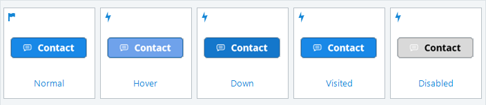
By default, buttons already include most of these states. Here's an example:
You can add built-in states to other objects, too, such as pictures, shapes, captions, characters, and markers. You can also modify any built-in state (except Hidden). Learn more about adding and editing states.
Drag-and-Drop States
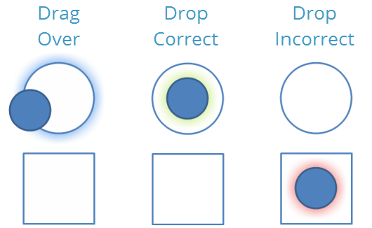
When you're working with drag-and-drop interactions, you have access to three special built-in states:
- Drag Over: This is how a drag item looks when it's dragged over a drop target or how a drop target looks when an object is dragged over it. If this state exists for an object, it'll automatically display when learners interact with the drag-and-drop scenario. You don't need to create a trigger to invoke it, but if you want to use this state in a trigger, note that trigger conditions won’t restrict its built-in function.
- Drop Correct: This is how a drag item looks when it's dropped on the correct target. If you want this state to display after learners have submitted the interaction for evaluation, mark the option to Delay item drop states until interaction is submitted. On the other hand, if you want this state to display immediately (i.e., before learners submit the interaction), do not mark the option to Delay item drop states until interaction is submitted.
- Drop Incorrect: This is how a drag item looks when it's dropped on an incorrect target. If you want this state to display after learners have submitted the interaction for evaluation, mark the option to Delay item drop states until interaction is submitted. On the other hand, if you want this state to display immediately (i.e., before learners submit the interaction), do not mark the option to Delay item drop states until interaction is submitted.
Learn more about adding and editing states.
Character Expressions
Illustrated characters have numerous built-in states for a variety of expressions (or emotions), including:
- Alarmed
- Angry
- Asking
- Confused
- Disappointed
- Happy
- Neutral
- Stressed
- Surprised
- Talking
- Thinking
- Worried
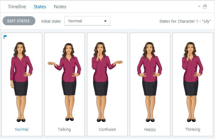
Here's an example of an illustrated character with several built-in states (expressions):
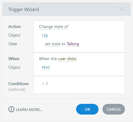
Use the Change state trigger to change a character's expression when a specified event occurs: