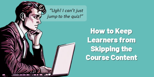
 When it comes to courses, there are two key stakeholders: the person who commissions the course and the person who consumes it. Each of these stakeholders has their own objectives and needs for the course, and ensuring that these are met can be challenging.
For the person who commissions the course, their objectives will usually be closely aligned with their organization’s goals. However, these objectives may not always be in alignment with the needs of the learner. And for the person consuming the course, it’s important that ...
When it comes to courses, there are two key stakeholders: the person who commissions the course and the person who consumes it. Each of these stakeholders has their own objectives and needs for the course, and ensuring that these are met can be challenging.
For the person who commissions the course, their objectives will usually be closely aligned with their organization’s goals. However, these objectives may not always be in alignment with the needs of the learner. And for the person consuming the course, it’s important that ...
Read the full article
 Like many of you, I'm not a big fan of meetings because most of them tend to be presentations. The entire time I'm thinking, "Why didn't they just record a presentation and send that out rather than have a bunch of people sit in a meeting with no expectations or action items? Seems like a big waste of time."
We've all been in those meetings. And we don't like them. Why?
Because while on the surface the purpose of the meeting seems meaningful, for most attendees the meetings are largely ...
Like many of you, I'm not a big fan of meetings because most of them tend to be presentations. The entire time I'm thinking, "Why didn't they just record a presentation and send that out rather than have a bunch of people sit in a meeting with no expectations or action items? Seems like a big waste of time."
We've all been in those meetings. And we don't like them. Why?
Because while on the surface the purpose of the meeting seems meaningful, for most attendees the meetings are largely ...
Read the full article
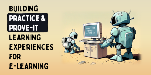 Much of online training is content that's created with an e-learning authoring tool and positioned as e-learning courses. However, these courses aren't necessarily the best at getting people to learn. I know there are some in our industry who'll stand on their soap boxes and tell everyone how that's not real e-learning in the first place. They're free to do that, but they're wrong.
It's real e-learning, it just may not be complete e-learning. It all depends on the course objectives.
Content is Part of ...
Much of online training is content that's created with an e-learning authoring tool and positioned as e-learning courses. However, these courses aren't necessarily the best at getting people to learn. I know there are some in our industry who'll stand on their soap boxes and tell everyone how that's not real e-learning in the first place. They're free to do that, but they're wrong.
It's real e-learning, it just may not be complete e-learning. It all depends on the course objectives.
Content is Part of ...
Read the full article
 Copying text from images comes in handy especially when updating old e-learning courses. Sometimes you may not have the source file and have to work for older published content. In those cases, do a screen grab of the course and then extract the text from the image. Then copy and paste the text into the application you use to build your e-learning courses.
How to Copy Text from Images
You may already have some applications that can extract the image. Here are a couple of common ones:
Copying text from images comes in handy especially when updating old e-learning courses. Sometimes you may not have the source file and have to work for older published content. In those cases, do a screen grab of the course and then extract the text from the image. Then copy and paste the text into the application you use to build your e-learning courses.
How to Copy Text from Images
You may already have some applications that can extract the image. Here are a couple of common ones:
...
Read the full article
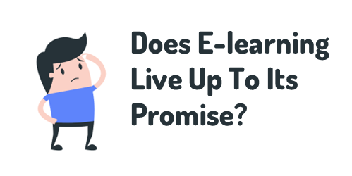 I'm putting together notes for an upcoming webinar on How to Develop a Successful Online Learning Strategy. I'm not one for industry hype and like to take a more pragmatic approach when offering tips because they tend to align with the reality of where organizations are compared to what they think they should be.
I've been thinking about the promise of e-learning and everything you read in books and online and hear at conferences from thought leaders about what effective e-learning should be.
E-Learning Thought Leader
There's a disconnect between ...
I'm putting together notes for an upcoming webinar on How to Develop a Successful Online Learning Strategy. I'm not one for industry hype and like to take a more pragmatic approach when offering tips because they tend to align with the reality of where organizations are compared to what they think they should be.
I've been thinking about the promise of e-learning and everything you read in books and online and hear at conferences from thought leaders about what effective e-learning should be.
E-Learning Thought Leader
There's a disconnect between ...
Read the full article
 As a steward of an organization's e-learning resources, it's essential to make decisions that improve the bottom line. Aligning e-learning courses to the organization's performance goals is key to ensuring positive results.
However, there are a number of other factors to consider when building out courses, such as cost and time savings. E-learning courses can reduce the cost incurred for facilitated classroom training, as well as increase accessibility for those who can't attend scheduled training. Additionally, a great e-learning program can provide a return-on-investment to justify its presence ...
As a steward of an organization's e-learning resources, it's essential to make decisions that improve the bottom line. Aligning e-learning courses to the organization's performance goals is key to ensuring positive results.
However, there are a number of other factors to consider when building out courses, such as cost and time savings. E-learning courses can reduce the cost incurred for facilitated classroom training, as well as increase accessibility for those who can't attend scheduled training. Additionally, a great e-learning program can provide a return-on-investment to justify its presence ...
Read the full article
 I get a lot of questions from organizations that are at the beginning of their e-learning journey and not quite sure how to get started. The following tips are three key considerations to get your program moving in the right direction.
What Type of Course Are You Building?
I like to keep things simple. Generally, there are two types of courses that get built: explainer and performance.
I get a lot of questions from organizations that are at the beginning of their e-learning journey and not quite sure how to get started. The following tips are three key considerations to get your program moving in the right direction.
What Type of Course Are You Building?
I like to keep things simple. Generally, there are two types of courses that get built: explainer and performance.
- Explainer courses present key content critical to the learning experience. This can be content like user manuals, video tutorials, company policies, etc. These
...
Read the full article
 One of the best ways to learn to build courses is to get inspiration from what others build. That's one of the reasons I like the weekly challenges.
Everyone is presented with the same challenge, yet each challenge entry offers something unique. There's always something to glean: from interesting visual design to creative use of the application's features.
When I get the chance, I like to highlight the work that people put out there. Today, we'll look at some of the examples from Samara Reyneke. Keep in mind ...
One of the best ways to learn to build courses is to get inspiration from what others build. That's one of the reasons I like the weekly challenges.
Everyone is presented with the same challenge, yet each challenge entry offers something unique. There's always something to glean: from interesting visual design to creative use of the application's features.
When I get the chance, I like to highlight the work that people put out there. Today, we'll look at some of the examples from Samara Reyneke. Keep in mind ...
Read the full article
 It is important to manage the customer relationship while building courses, as customers may not always know what they want. Customers often default to building more training as a solution to issues, but course designers need to step in and provide the best solution.
Here are a few tips on managing the relationship with your customer.
It is important to manage the customer relationship while building courses, as customers may not always know what they want. Customers often default to building more training as a solution to issues, but course designers need to step in and provide the best solution.
Here are a few tips on managing the relationship with your customer.
- Is training the right solution for them? They want the person to go from point A to point B, but what are they doing now and why aren't they getting there? How is
...
Read the full article
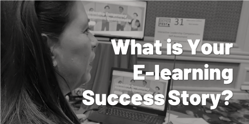 A guest post by Elizabeth Pawlicki, Senior Customer Advocacy Manager, Articulate.
Last week I was at Devlearn, one of my favorite events of the year. After no event in 2020 and a scaled-back Articulate presence in 2021, it was nice to be back and see some familiar faces and meet so many new people.
What I enjoy the most about Devlearn is DemoFest, where people show off real e-learning projects. And they showed up in big ways, with examples ranging from health literacy to escape games to how ...
A guest post by Elizabeth Pawlicki, Senior Customer Advocacy Manager, Articulate.
Last week I was at Devlearn, one of my favorite events of the year. After no event in 2020 and a scaled-back Articulate presence in 2021, it was nice to be back and see some familiar faces and meet so many new people.
What I enjoy the most about Devlearn is DemoFest, where people show off real e-learning projects. And they showed up in big ways, with examples ranging from health literacy to escape games to how ...
Read the full article
 The organization's ultimate goal is not to build a course. Instead, the goal is to meet some sort of performance need. And in that sense, the e-learning course is a solution to meet an objective.
And this is where e-learning often falls down.
Effective training programs successfully meet learning objectives that aren't fuzzy and non-measurable. On top of that, e-learning is usually just part of the overall training program. So it's not the end-goal.
I'm often asked about how to build better e-learning. From my perspective, many of the courses I see ...
The organization's ultimate goal is not to build a course. Instead, the goal is to meet some sort of performance need. And in that sense, the e-learning course is a solution to meet an objective.
And this is where e-learning often falls down.
Effective training programs successfully meet learning objectives that aren't fuzzy and non-measurable. On top of that, e-learning is usually just part of the overall training program. So it's not the end-goal.
I'm often asked about how to build better e-learning. From my perspective, many of the courses I see ...
Read the full article
 I'm a big fan of e-learning! I've been in the industry for almost 30 years and I think it's a great way to learn. I also think it's a great way to keep people engaged in their work.
I recently had the chance to ask a group of people about their training experiences and I was surprised by how negative much of their feedback was. Don't get me wrong, I'm not surprised that there are problems with many training courses. I'm just surprised that so many people have such negative things ...
I'm a big fan of e-learning! I've been in the industry for almost 30 years and I think it's a great way to learn. I also think it's a great way to keep people engaged in their work.
I recently had the chance to ask a group of people about their training experiences and I was surprised by how negative much of their feedback was. Don't get me wrong, I'm not surprised that there are problems with many training courses. I'm just surprised that so many people have such negative things ...
Read the full article


0
comments