

[…] Traduzione autorizzata tratta dal post originale di Tom Kuhlmann sul “Rapid E-Learning Blog”. Il post originale è disponibile qui […]

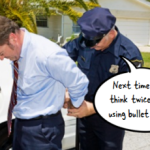
Years ago when I did video production, it seemed that every one of my customers wanted the final video to be like an MTV music video—fast moving with quick cuts. They didn’t seem to care much about whether or not that was the right approach; they just knew they wanted it to be like MTV. By the way, this was back when MTV actually showed music videos.
That was challenging enough because not every subject required an MTV-type video. However, a bigger challenge was when they had those expectations for the product but never shared them with me. I’d only find out later down the road that the project didn’t turn out the way they had envisioned it.
What’s in Your Client’s Head?
In today’s media-rich world, we’re exposed to all sorts of multimedia which helps inspire ideas for elearning course, but it also can create customer expectations. This can be a challenge when working with customers because many of them have preconceived ideas of what they want, whether or not it’s appropriate to the course or you have the resources to deliver it.
Also because they’re exposed to so much multimedia, they may have a mental model of what they want, but they’re not quite sure how to explain it. In those cases, they get more clarity by seeing things they DON’T want versus being able to identify what it is they DO want. Of course this can waste a lot of time if they’re waiting for you to design something before they tell you they don’t like it.
Get Them to Empty Their Cup

Before you invest too much time in prototyping some mock ups, get them to empty their cups, so to speak. Have them share as much as possible. Ask them to show you examples of what courses they like or have seen. Odds are that if they have a strong idea about what they want to do, then most likely they’ll have examples to pull from.
It’s also important to get a sense of their expectations. For example, if you’re working with a rapid elearning tool and they’re showing you something that has to be custom programmed in Flash, it’s good to know this before you invest too much time on the project.
Give Them Some Examples

Come prepared. Have some prototypes and treatments ready to share. After they share what they envision, pull out your demos.
I usually have three basic treatments that range from a nice-looking but simple course to something very interactive. This lets them see the options and it gives me a way to discuss the time required to build the different types of courses.
Provide a list of diverse elearning examples where they can see different approaches to elearning. Have them pick out the ones they like and the ones they don’t like and identify how they distinguished them.
It’s also a great way to identify different types of interactivity and approaches you can take with the course.
Brainstorm with Them

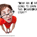
Build a real-time prototype while your client shares what they like. This is easy enough to do in a tool like PowerPoint. With it you’re able to create virtually any look and it’s easy to quickly build simple interactions. As they start to see their ideas come to life, they can offer more clarity about their expectations.
In the E-Learning Heroes community, David put together a simple visual design mind map activity. It’s a great tool to help come up with the right look and feel for your courses. It’s also a great tool to collaborate and brainstorm with your clients so that you can clarify their expectations and how they envision things to look.
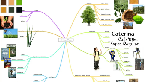
Click here to view the tutorial.
For example, I’ve had plenty of projects where the client says, “This doesn’t look right,” or “We need more normal looking people.” These all subjective statements and you can waste a lot of time trying to clarify what “normal” means.
Use the visual design activity above to quickly brainstorm with your client. In the case of “normal looking” you can make a list of the types of people in the course and then copy and paste images from Google image searches and sites like istockphotos. It won’t take long to fill a page with the types of people the client considers “normal looking.”
This type of activity doesn’t take up much time. You’ll have the right images and you’ll also have a better understanding of what the client wants. A side benefit is that your client will probably be more engaged in the development process.
I know someone who built a prototype course which took some time to do. When the client saw it, he said that everything was “too American.” So the developer had to go back and redo much of the prototype. If she had done a brainstorm activity like the mind map above, she would have saved some time and started the project setting a different tone.
By helping your client clarify the mental model they have for the elearning course, you’ll build the course they desire and you’ll save lots of time during development.
What types of things do you do to get them to share their expectations on the look and feel of the course?
Events
- Everyday. Check out the weekly training webinars to learn more about Rise, Storyline, and instructional design.
Free E-Learning Resources
 |
 |
 |
|
Want to learn more? Check out these articles and free resources in the community. |
Here’s a great job board for e-learning, instructional design, and training jobs |
Participate in the weekly e-learning challenges to sharpen your skills |
 |
 |
 |
|
Get your free PowerPoint templates and free graphics & stock images. |
Lots of cool e-learning examples to check out and find inspiration. |
Getting Started? This e-learning 101 series and the free e-books will help. |
You might also like:
25 responses to “Make Sure Your E-Learning Course Looks the Way It’s Supposed To”
Leggi la traduzione (autorizzata) in italiano di questo post qui:
thanks a lot Tom,
My q is if we copy paste from Google images or istockphotos, what about copy right issues? Can we do that?
another q is out of the topic, what do you think about elearning tool like CourseLab?
Thanks for answering ,
Orzu
[…] Original post: Make Sure Your E-Learning Course Looks the Way It’s Supposed To » The Rapid eLearning Blog […]
Great advice! This is not only a great way to find out what a client wants, but also can remind e-learning companies that they need to adapt to what is in a client’s head, not necessarily what is in their head.
When I first started my career in e-learning four years ago, I worked for a company who had ONE style of an e-learning course (what was in their head). The images always had to be in a certain place on the screen along with subheadings and bulleted text. Even all of the images had to be office people! One of my first clients had something else in mind from this approach. I spent weeks on a project, only to get a subjective response. “It’s not what I had in mind.”
As e-learning professionals, it is important to embrace the different style of e-learning and adapt to the client.
Another helpful tool is to use a design document or storyboard to script out the course and all course elements.
From large projects, we learned that a learner spends approximately one minute on each screen in an elearning course. (It could be more, it could be less.) We use that as a benchmark to calculate:
a) How many screens to be created, and
b) Duration: Total for the course and duration on each screen.
When a client gave us over an hour’s worth of content from a Keynote speaker that they wanted designed into a 30-minute course, we forwarded a simple Word document with a two-column table in it. The table had 30 rows, one for each screen’s content.
In each row we had placeholder text to indicate onscreen text could not exceed 150 words. (Approx. 150 words can be read in one minute)
That simple table showed the client that the content they had from a long keynote speach would need to be edited/revised significantly to fit into 30 minutes of seat time.
And, when a client says they want video and assessments, the duration for each of those needs to be calculated as well.
In the above case, the client indicated from 5 to 7 really good videos, but to include them, we knew the course would end up being a 60 minute course and not a half an hour.
Managing expectations is both an art and a science.
BTW, Tom, I love the storyboard templates in the “Downloads” area of e-Learning Heroes. Great resource!
@jenisecook
Great ideas. I usually ask clients to find up to 3 examples to frame discussions, but the visual design map is such a great idea. I will definitely use it next time. Thanks!
Hi Tom,
Again, very good post! I like the idea of showing the client several examples to have them decide what they want.
What I found to be very helpful is Storyboarding. In the storyboard you can map out a few interactivity examples and add clear instructions of how they will work. Make sure you include all that will appear in the examples; such as content, graphics, instructions/directions and etc. This idea will allow you to explain the idea and design a blueprint of what you are trying to do.
I found that storyboarding works well for me. Oftentimes I do not have the necessary software at the moment to develop interactivity. Sometimes, there is a waiting period to receive. Also, the storyboarding option keeps me from wasting time on a design the client may not approve. Greatfully, PowerPoint 2010 has nice templates & tools that you can use to layout your examples; such as word art, tables and annimations. I have used some of the templates recommend on your Blog as well -Tom.
Additionally, i’ve learned how to pull images from Google and create my own as either a sillouettes, clip art or live. There is no harm in recreating images that you’ve seen on Google. @ Ozu: You will know what images you can not use by looking at the watermark print once you open the image. Those images yes, have copywrite requirements. However, there are free live images in PPT or Word that you can add your own flavor. I do this by changing the background color, add a few objects within the images. Change hair or clothes -ect. I utilize the SnagIt or Photoshop tools to recreate or edit images. PPT 2010 has some features as well with fading and etc.
Just a few ideas…and my 10 cents worth!
Hey, looking forward to meeting you in Orlando!
I am running into an issue with one of the Sales teams I work with consistently. They want everything to look like a video and run on it’s own with little to no interactivity. They also want things that require custom Flash development but then require the course to be completed yesterday. It’s just nice to know that I am not the only elearning developer that runs into this same issue.
Tom,
This article couldn’t have come at a more opportune time for me!
I’ve learnt over the years to get agreement on template design as well.
No good, writing something with lots of bullet points, tables etc if the client expectations is paragraphs.
Regardless of whether it is a eLearning, on-time learning or hard copy I’ve been doing this for a while (after learning the hard way).
Currently, I am working on my first big on-time learning project using mediawiki.
The first thing that I did was mock up some templates in PowerPoint for navigation structures, home page, base pages and articles.
I then put together the first draft of the home page and developed one tiny section for review with stakeholders to make sure we were on track.
I got stakeholder agreement and we all acknolwedged that as we moved forward that the templates may vary slightly as we learn the capabilities of Mediawiki.
Essentially, we are transposing much our hard copy manuals into online, ontime learning which will be suplemented by more traditional eLearning modules.
There are three of us working on the project. I got taken off the project temporarily to work on another project.
We are now about 60% into the project and in a bit of a pickle. Now that I’ve come back on, the original templates we had agreed on have been completely changed. My team mates have continued writing and now we inconsistency from a navigation from a layout etc. It’s a bit of a mess and some pages have been re-written 3 or four times into differing templates as they’ve changed. Some sections are in the old style; some in the old, old style; some in the new.
What I also didn’t anticipate is that in writing on-time learning that we didn’t account that we needed many more templates. One for ‘task’ based articles, one for ‘info’ based articles’, one for ‘theory’ based articles etc.
So my big learning here is that we did not have enough milestones in the project. When we changed templates – we didn’t go back to the stakeholder group.
The other issue is that normally I work on the design projects myself and so that language is consistant. But we now have three distinct voices. One that is very formal, one that is very casual and one that is in between. Different terminology has been used to define key topics.
I’ve been using
As always, great post and great comments! I can’t emphasize anymore than what has been offered here. The “Design” process is much bigger than just the instructional aspect and flow…yet, it should all ties together.
Storyboarding, mind mapping, visual design documents, etc. are all part of the planning process. Notice I didn’t say the development phase. A strong house only stands on a solid foundation. Getting a clear understanding from the client/customer of what “they” envision is like staking of a plot of land to build that house. In some cases a model home (prototype) is available to get ideas and build on your plans. In other cases an architect can build a small scale model (prototype).
The work starts in planning what type of house and what size it will be (scenario-based, 30 min. seat time). Plans are drawn up (storyboards), materials are gathered (images, photos, etc.), team assembled to start building (co-workers or outsourced and the tools that will be used), and then construction (elearning development) can begin.
That analogy is for building a new house (new elearning project), but the same can apply to flip a house or do renovations (edits or revisions to current elearning). Would you knock a wall down if you didn’t have a plan on what you were going to do next?
my q: When I apply for Instructional design positions, and they would like a prototype of an “assigned project” to present at the interview – should I reach out to them before the interview in email and send them 3 prototypes and they can choose one (treating them like a client)?
If you can’t tell, I am fairly new to e-Learning. I have developed a few e-Learning courses and loved it – now I am attempting to become a full-time I.D person and would like some pre-interview tips
Great information. Thanks for sharing
Great information. Thanks for sharing!
Great links have a nice day!
Tom,
I like your Blog. The graphics make is visually interesting. Thank you for creating something that keeps us “right brain” people engaged!
T 🙂
[…] Make Sure Your E-Learning Course Looks the Way it’s Supposed To […]
[…] It represents building the right look and feel, something we touched on in this previous post where we reviewed a good visual design activity. It also means have the right screen elements to place in the […]
[…] blog from The Rapid E-Learning Blog to make sure you are on the same page as your […]
[…] blog from The Rapid E-Learning Blog to make sure you are on the same page as your […]
[…] Make Sure Your E-Learning Course Looks the Way It’s Supposed To […]


0
comments