


I’m guilty of the bullet list of objectives, but have been trying–I believe, your suggestion–of creating a short scenario up front that embodies the objectives. The scenario bolsters aspects of motivational design by (hopefully) gaining attention and demonstrating how the content is relevant.
Learning Objectives Made Easy with This Simple Tip
July 30th, 2013
To tell the truth, I’m not a big fan of bullet point learning objectives. I prefer something more engaging that reveals the course objectives in a way that’s relevant to the user. But for many, having a bullet list of objectives is the expectation.
So if you’re required to list learning objectives then here’s a simple tip that helps you get away from the bullet point list and also removes some clutter from your screen.
Avoid the Bullet Point Objectives Screen
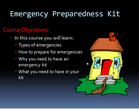
Typically courses include a list of learning objectives that looks something like the image below. This approach is pretty standard. In fact, when I first started learning to build online training courses that was how we were instructed—each course was to have an objectives screen with a list of objectives.
This isn’t a bad approach. Some people probably prefer a simple list of clear objectives than an interactive scenario that takes more time to share the same thing. I know I’ve taken plenty of elearning courses where I wish I could just see a quick list of objectives rather than sit through a long-winded interaction.
If you’re required to list the learning objectives it doesn’t necessarily mean they have to be presented as a list. You’ve probably seen those websites where there’s a top image and underneath it are some buttons to reveal additional images. Why not create something similar for the learning objectives of your elearning course?
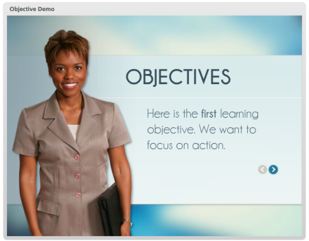
Instead of listing all of the objectives as bullet points, create a single objective on each screen. Then add a button that allows the person to navigate through the objectives. It satisfies listing the objectives, but it doesn’t force them to a bullet point list.
Here’s a quick demo I did in PowerPoint to show the idea in action.
You’re not limited to arrows or back and forward buttons. I also like the idea of lining the bullets up on the bottom and then making them clickable. Here’s another quick demo to see how the objectives screen works with all of the clickable choices lined up on the bottom. If you feel a bit adventurous, put them on the top or to the side.
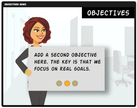
Which concept do you like best? I like the second one because it gives the person viewing the online training course the option of going straight to a specific learning objective. The arrow option forces a linear progression backwards and forwards.
One overall benefit of both options is that you decrease the cognitive load by exposing a single piece of information at a time. Depending on how you structure the objectives screen, this may help with the learning experience.
So there you have it—two ideas the next time you need to create a bulleted objectives screen. What do you think?
Events
- Everyday. Check out the weekly training webinars to learn more about Rise, Storyline, and instructional design.
Free E-Learning Resources
 |
 |
 |
|
Want to learn more? Check out these articles and free resources in the community. |
Here’s a great job board for e-learning, instructional design, and training jobs |
Participate in the weekly e-learning challenges to sharpen your skills |
 |
 |
 |
|
Get your free PowerPoint templates and free graphics & stock images. |
Lots of cool e-learning examples to check out and find inspiration. |
Getting Started? This e-learning 101 series and the free e-books will help. |
You might also like:
21 responses to “Learning Objectives Made Easy with This Simple Tip”
I have a quick question about execution. When I’ve tried to create a similar interaction using layers, I can only get the entrance animation to happen the first time the user opens the layer. So if the user clicks the dot to view an objective, they would see the objective fade in once. When they go to a new objective and return to the first one, the first objective no longer has entrance animation. It just appears. Is there a trick to resetting the animation each time that I’ve missed?
I love the idea of interactive objectives, but cannot figure out how you did this? Was this done with articulate or storyline? Any tips would be greatly appreciated.
Thanks
I really like this idea. I am working on a capstone project and yes, first slide has to have the dreaded objectives; however, it makes more senses to provide a “graphic representation” of what the objective means and allow the learner explore the competencies she will achieve.
Great tip! I’ve always presented learning objectives as a long stream, which has become a bad habit. I’ve just created a lesson objective slide using your tip, and it looks so much better!
Thanks.
If learning objectives are truly necessary, this is an excellent way to do them. I’m not convinced that they are truly necessary – but many education designers believe that they are.
I have tried to make one objective per ‘module’, and incorporate the objective in the title – like “Learn how to tie your shoe” or “What steps are required for getting dressed?”. Short Web attention spans require short modules. Dispensing with opening theme songs, credits, speaker introductions, yadda yadda yadda… it all helps to get right into the meat of the matter.
Notice that TV shows no longer show Andy and Opie goin’ fishin’ while the famous whistled tune plays and the actors’ names are revealed. Now the previous show’s credits are minimized in a window, and the action starts right away. Studios may do this to squeeze one more commercial in their allotted time… but it serves to hook the viewer right away.
We should do something similar with educational modules – get right to the part they came for, and put the stuff that serves to stroke the Project Manager’s ego in a little box that is overlayed on an otherwise unimportant portion of the screen while the real work of education goes on uninterrupted.
Fantastic suggestions and examples! I have been looking for new ways to update my current presentation library, and now, thanks to you, I have the inspiration for giving them a fresher and more interactive look. I appreciate your ideas!
Many accrediting organizations require specific, measurable objectives to be listed for each course. This is a great idea to meet this requirement. It adds a sense of intrigue – a reason to want to see more. My plan is to present this type of objective format but as a lightbox link on the player.
I think you do nice work. Thanks for sharing
Way cool! I love the interactive objectives. I’ll be using that next!
I agree with your comment about limiting the cognitive load by allowing the user to focus on one objective at a time. Your tip is a simple one and easy to implement, yet it’s supported by learning theory.
Tom,
Thank you SO much for doing your best to:
– Stamp
– Out
– Bulleted
– Lists
One of the ways to slyly work around objectives is to have an interactive menu with a question and clickable responses. Typical questions I use are:
What do you want to do today?
What do you want to learn today?
How can we help you?
These are followed by choices like:
Fidget widgets
Comprehend turboencabulation
I want to be able to bisect polynomials
Note how these include a verb and an object that is specifically action-oriented with a built-in success metric based on achievement of the educational goal. It also has the added benefit of being learner-driven (they get to choose the path) rather than making them victims of a dictatorial virtual pedant.
Great post! Keep up the good work.
Tom Kuhlmann: …I’m not a big fan of bullet point learning objectives. I prefer something more engaging that reveals the course objectives in a way that’s relevant to the user…
Bravo! I entirely agree with you. With a little thought, the ID can produce an objectives/outcomes screen can grabs the learner’s interest, instead of the usual tedious formula.
Though when you say …So if you’re required to list learning objectives…, I think you’re being rather generous to us IDers. It seems to me it’s more often simply fossilised thinking on the part of the ID than an explicit requirement that leads to the standard mind-numbing threnody, made emphatically worse when there’s a v/o narrator mimicking the onscreen text. It hardly gets any worse than that mechanistic pause at the colon, followed by the studiedly voiced “bullet points”. What a killer for the learner! Formal lists of LOs are for the course metadata, of interest to the instructor (and of course to the course design agents), and not for the learner.
Where there has been an express request to include a formal list of LOs in a module, my first approach is to reason it away with whomever has made it. Reason almost always works. Where it doesn’t or where it is “mandatory” (for example, in certification training), my usual method is to phrase the objectives in the learner-centred way Tom describes above, and separately to provide link to a popup listing the LOs, invoked from a retiring prompt (“If you would like to see a list of the learning objectives, click here.”). As far as I can tell, no one ever does, though they are there if desired. Oh, and never narrated.
Hey @Sarah! Sounds like you might need to edit your layer properties! Here’s a handy tutorial from the Articulate site that might help you achieve what you’re looking to do: http://community.articulate.com/tutorials/products/adding-and-editing-slide-layers.aspx.
You might also want to head over to the E-Learning Heroes forum (http://community.articulate.com/forums/) and post your question there. The community is fantastic and super-responsive, and you might find someone has already asked the same, or similar question, like in this post here: http://community.articulate.com/forums/t/19255.aspx
Hope this helps Sarah!! =)
Nicole
This is unrelated to the specific topic of this post, but I noticed in the first demo/example that the elapsed and total time was listed up at the top in the Menu bar. I thought that this functionality wasn’t available in Storyline. Was this in the last update? I haven’t installed it yet. If someone could explain or help me with an ‘ah ha,’ that’d be great!
Thanks for the practical solution to a perennial “problem!” I love that your demos give the user responsibility and flexibility. Personally, I like the second demo. But sadly, many of my company’s users wouldn’t understand that they need to click the circles to display another ojbective. Numbering the circles would be one solution.
@Al White:
“I’m not convinced that they [objectives] are truly necessary – but many education designers believe that they are.”
Simply put, you are wrong and they are right. Objectives are an essential anchor to every instructional product. Without measurable and observable objectives, you’re just creatively informing someone of thing, without requiring them to actively learn. However, as this article shows, you can introduce objectives in a more creative and engaging way than simply a bulleted list. I suggest Ben’s comment above:
“my usual method is to phrase the objectives in the learner-centred way Tom describes above, and separately to provide link to a popup listing the LOs, invoked from a retiring prompt (“If you would like to see a list of the learning objectives, click here.”).”
Awesome idea that I will begin implementing right away. The objectives need to be displayed to the learner in one way or another. No one wants to jump into a course blindly without knowing what they’re investing their time in. But they can be presenting in an interesting and engaging way. In fact, as a general rule that I try to follow, every single letter that is shown to the learner on every page must always take the learner’s needs into account. If it doesn’t—if it’s extraneous information that is not always necessary in order to complete the performance objectives—then it is tucked away someplace where the user can access it freely if he or she so desires. The same goes with the objectives themselves. Always present them with the learner in mind.
Great tips. I personally like the third one. But, the second is pretty good too. I think the first one is a bit too basic. It just lists things out. But, I think many would prefer that over the second and the third.


0
comments