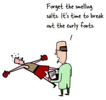
I was reviewing an elearning course recently. About twenty screens into the course, I noticed that the developer changed the title font from a solid bold type to one that was curly and much more informal.
There was so much contrast to the two titles that I asked why she changed fonts from bold to curly. She responded that the course seemed a little dull at that point, so she decided to add the curly font to liven it up.
Imagine the elearner almost asleep but then jolted to consciousness with the appearance of the curly font on slide 20. Apparently curly fonts stimulate the adrenal glands and can transform the most mundane elearning courses into ones that rival Jurassic Park for heart-pounding action. They’re our industry’s equivalent to smelling salts.
Intentional Course Design
There’s a lot that goes into building an effective elearning course. One thing you can do to guarantee success is to be intentional about how the course is designed. There’s nothing on the screen that’s there by accident. That goes for the way the course looks as well as how the learner interacts with it. It also goes for the choice of fonts used in the course.
Many course designers tend to work from existing content like PowerPoint slides used for classroom delivery. What tends to happen is the existing content dictates how the course is designed. And because of that there’s not much thought put into things like the choice of font. That means we go from one slide to the next and make decisions on-the-fly rather than based on a plan.
Limit the Course to Two or Three Fonts
A good rule of thumb (especially for those getting started) is to limit the course to 2-3 font types. Generally courses have similar layouts. The font styles may vary based on the course context, but the fact is they’ll be used in mostly the same ways.
Here are a few common uses of font types:
- Title: Titles tend to be bolder and stronger. They set the stage for the content and provide a strong visual connection to course content and context.
- Subtitle: Subtitles or sub-headings are used to segment content and help make the screen more scannable.
- Body: The body text is less visual design and more about legibility. The more text on the screen, the more we need to be aware of how readable it is; and then choose the appropriate font.
- Emphasis: Courses tend to have places where we need to emphasize the text such as bolding and italics to draw focus or captions to highlight additional information. If the need for emphasis exists, what will it look like?
Intentional course design means that we determine what the font types are prior to building the course and how we’ll use them. This becomes the simple style guide.
The consequence of not determining this prior to starting the design of the course is that a lot of time is wasted as we search for and change fonts to match what we’re trying to do at the moment. Then we end up with the Frankencourse where things kind of look cobbled together rather than cohesive.
Create a Simple Style Guide
We have identified four common uses above. You can come up with more if needed. From there we create a simple style guide that visually represents the various uses of the fonts. It may look a little like the image below that David shares in some of our workshops.
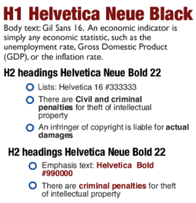
In this image, we visually represent the various headings and body text. We also identify the fonts used, their colors, and provide an example. This style guide can be saved as a document or added to one of the course screens and then copied.
Depending on the software used, the fonts and their styling can be built into the templates and layouts. This will save a lot of time and mean you won’t have to constantly dig through the font list to find just the “right” font. It definitely keeps you away from the curly font, unless of course it’s appropriate to the course design.
This approach also comes in handy when you’re sharing project files and want to make sure that others are on the same page.
The main point in this is that you are intentional in your course design. This means determining the fonts required and how they’ll be used. You’ll save time and your course will have a more polished look.
Do you use a style guide for your courses? If so, how is it determined? Share your thoughts here.
Events
Free E-Learning Resources


0
comments