


Tom, I always appreciate your posts. Thanks so much for being clear, direct, and getting right to the point with helpful ideas. I’m currently trying to obtain certification online through a large, very well known company that most of us rely on every day. You couldn’t have better described the eLearning modules that precede the very long multiple-choice tests that make up this experience. Ugh! I’ll get through the training because I need the certification, but the entire time I’m going through the material (and the tests), I keep thinking, “Gee, this could be so much better, if only…” fill in the blank with advice from Tom. Thanks!
How Not to Succeed at E-Learning
March 4th, 2014
In today’s world, elearning is an important part of learning and training employees. Some organizations use it exclusively and some blend it with other learning activities.
There are a lot of things you can do to create successful elearning, but here are some guaranteed ways to make sure that you don’t succeed and waste a lot of time and money in the process.
Build Courses Irrelevant to the Learner’s Needs
One the biggest complaints I hear from people who have to take elearning courses at work is that the course is completely irrelevant to their needs. This usually happens for a few reasons:
- Shotgun approach to compliance training. We know the drill. The organization has a bunch of courses you need to take by the end of the year. It doesn’t matter if you’re already ethical or not a sexual harasser. You still need to take those courses regardless of your needs. And when you do have a need, the course isn’t tailored to it. It’s a one-size-fits-all approach that is largely irrelevant and not suited to your real needs.
- Too much focus on information. If you want to learn to use your elearning software, I’ll show you some tutorials. Want to be a better instructional designer? Here are some good books. Want to learn more about elearning? Go to this conference. As an industry we’re good at pushing information out. But information is only part of the learning process.
- No required action. Information is good, but real learning happens when that information is applied in a context relevant to the learner’s needs. Build courses that let people practice what they’re learning. And then give them the appropriate feedback.
Build Courses That Waste Time
I always divide my courses into two buckets: information or performance. I start by asking the client what they expect the learner to do after completing the course. In many cases, they don’t really have an expected outcome. If that’s the case, then I try to talk them out of building a course that accomplishes nothing.
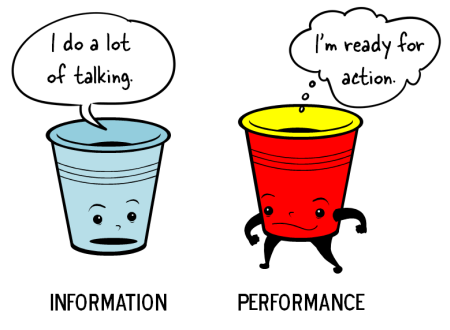
However, that’s not always going to work. The client’s often still want a course (for other reasons). And a lot of compliance training doesn’t seek to change performance as much as certify understanding, where the only goal is to get a check mark next to your name at the end of the year.
If that’s what the client wants, then I’ll build the best course at the lowest possible cost. They’ll tend to be simple, linear courses that the person can get in and out of quickly. No need to waste even more time. If the client has clear performance-based objectives then I’ll build the course appropriate to meeting the client’s needs. Those types of courses tend to take more time and require more effort.
Here’s where we end up wasting a lot of time:
- Build elaborate information-based courses. All the organization needs is a check mark at the end of the year, yet the elearning person builds a complex interactive scenario that provides no more value but takes more time to build and more time for the user to complete.
- Build simple information-based courses when you’re really trying to change performance. On top of that, most of the information is already available to the learner in other places.
On one hand the course is overbuilt for a simple objective. And on the other, when we really need to help someone learn, the course is too simple.
The key is to understand the expectations and objectives so that you can build the best course and not waste your limited resources.
Build a Course That Looks Like Crap
When I was a kid, we’d go to the horse stable and shovel a truck load of horse manure. My dad would mix it with the compost so that we could have a fertile garden. When it comes to visual design in elearning, there are two types of crap.
The good kind of CRAP is from the acronym popularized by designer, Robin Williams.
- Contrast: elements that aren’t the same stand out which enhances communication and makes it easier to see relationships between the various onscreen elements
- Repetition: repeating onscreen elements and design helps define relationships, maintain consistency and cohesion
- Alignment: when onscreen elements are aligned they’re connected together; how things are spaced allows for better comprehension and communication
- Proximity: how close objects are to one another conveys meaning and relationship; the more they are apart indicates they’re different
This is the good stuff and critical to communication. Think of it like the compost for fertile development of course design. Then there’s the other type of crap. I won’t go into a bunch of details but we know it when we see it.

We always say, “You can’t judge a book (or DVD) by its cover.” But you can entice people with a good cover. It engages their interest and can help set expectations. The same can be said for elearning design. Even if you’re building a basic course, you can still make it look good. Apply sound visual design techniques to build a look that matches your course context.
The reason we tend “not to judge the book by the cover” is because over time we’ve learned that most great looking covers make a promise that isn’t kept in the content. This happens with elearning, too. A good looking course will only get you so far. That’s why the first two points are important.
So if you want to fail, build irrelevant courses that waste time and look like crap. However, you can avoid failure by understanding the organization’s objectives, your learner’s needs, and building a great looking course that is appropriate to its learning objectives.
What are some of things we do to fail at course design and how would you correct it? Share your thoughts here.
Events
- Everyday. Check out the weekly training webinars to learn more about Rise, Storyline, and instructional design.
Free E-Learning Resources
 |
 |
 |
|
Want to learn more? Check out these articles and free resources in the community. |
Here’s a great job board for e-learning, instructional design, and training jobs |
Participate in the weekly e-learning challenges to sharpen your skills |
 |
 |
 |
|
Get your free PowerPoint templates and free graphics & stock images. |
Lots of cool e-learning examples to check out and find inspiration. |
Getting Started? This e-learning 101 series and the free e-books will help. |
14 responses to “How Not to Succeed at E-Learning”
Excellent post. It is applicable, sensible, and effective
I love this. We are trying to wean an information culture of slides that contain everything and the kitchen sink. Your RSIs have helped me take that info and put it in a performance format, but not all my SMEs feel comfortable making that leap.
When working with a client, one of my favorite questions is “If a gun were held to the learner’s head, could they meet your learning objective?” If the answer is yes, they don’t need training. They may need reinforcement or motivation, but don’t waste their time teaching them something they already know or can do.
You forgot to include “charge for it.” I’ve been a longtime fan of your work, and passed your advice on making content to many colleagues, including daughter. Great stuff. But I think traditional e-learning is going the way of travel agents.
When Khan Academy became the first killer application in online training, I simply did not understand why the rest of our industry did not, as I did, drop everything and imitate the most successful model in the history of the planet. We put our 1,100 videos from our CBTs on YouTube years ago (youtube/osisoftlearning) and never looked back. People expect it for free now. There’s no putting the toothpaste back in. Better to adapt to the new reality.
Always can count on you to tell it like it is! This information is so true – I cannot tell you how many times clients ask for training in the form of elearning that just tells, tells, tells, for awareness purposes only.
Hi, Tom: Of course, the content is spot-on, but I really dig the title of the post. I saw this pop up in my in-box and with a title like that, I just HAD to click on it. –Daniel
When you need to build information-based courses, you can improve the product by creating better slide design.
Tom- thanks so much for your posts. I am new to Instructional Design and these are excellent!! I work in a hospital and design training for nurses and residents and staff. It is hard to get everyone together so on-line training meets the needs as far as time but I feel it misses that personal interaction. Again thanks for your help here!!
leggi qui la traduzione in italiano autorizzata:
http://www.mosaicoelearning.it/blog/?p=2501#more-2501
Hi Tom,
I’m new to the blog – and relatively new to instructional design – and I’ve read several of your posts and find them incredibly helpful. Question: Do you have links to some sample elearning courses that model a lot of the great suggestions you make in your blogs? I’m looking for excellent examples of elearning courses that showcase your greatest tips. Any ideas? Links? Thanks. Keep up the good work!
One of the main reasons I have had trouble with some of my online courses is contrast that was spoken on in this article. The people who design the courses design don’t think about the different types of people that have to use the course. Icons are helpful but most of them you can’t see. This article should be send to every instructional designer at every university. The information should be shared for the success of learners around the globe who may depend on eLearning for a successful life.
This article explains why most people may have trouble with online schools. One of my main reasons for failing at eLearning is the contrast. Everything on the course design looks alike. Do any of you notice a reason why you have not reached your potential in eLearning?


0
comments