


Tom, this is a great tutorial. Is it for Office/PPT 2007 only? Thanks, Elle
Here's How to Get Past a Screen Full of Bullet Points
November 17th, 2009The tendency when working with PowerPoint is to start with the template structure. This works fine if you want to create quick presentations. The problem with that approach is you tend to get slides full of bullet points.
To get the most out of PowerPoint and build the best elearning courses requires thinking of PowerPoint in a different way. You have to think outside of the template and bullet point box.
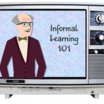
In a previous post, I showed how to expand your PowerPoint skills by creating custom illustrations. In today’s post we’ll build on that. I’m going to show how to build a television graphic in PowerPoint.
Before we get started, take a look at the example below. I built the television set in PowerPoint and then added a clip art image to create a clickable remote control.

The envelope icon exercise and this television set tutorial help you work with the PowerPoint features outside of the template structure. By practicing these types of techniques you’ll learn to get more out of PowerPoint and think about what you can do with it from a different perspective. It helps you step away from reliance on the templates and bullet points.
Recently, I ran across a series of tutorials on Vectips.com by Ryan Putnam. He does nice work and shares some of his expertise through the tutorials. While his tips are for those who use Illustrator, many of them can be applied to PowerPoint.
Inspired by Ryan’s tips, I’m going to show you how to create a television icon for your elearning course using PowerPoint.
Click here to watch the Screenr tutorial.
1. Create the television set body.

The set is made up of three rounded rectangle shapes and a gradient fill.
- Add a rounded rectangle with gradient fill to be the main body of the set.
- Create another rounded rectangle for the outer edge. Use no fill and a gradient border that is the same as the box. Make the light gray a bit lighter so it stands out.
- For the screen, duplicate the border box. Make the line thicker and flip it so it is the opposite of the set with the lighter gray on the bottom.
2. Create color bars & shimmer.

The color bars are a grouped set of colored rectangles with a 60% transparent shape to give it a gel look.
- Create the color bars by combining a series of rectangle shapes and filling with the colors. Group them and then move onto the set behind the frame.
- The shimmer is a bit trickier. Take a rectangle and convert it to a freeform and then edit the points to give it a curve. Fill it with white and 60% transparent.
3. Add the television set details.

The television set’s accessories are just basic shapes with simple gradient fills.
- Knobs: Create a circle and use the same gradient fill as the set. Duplicate the circle, flip it, and scale it down. Create a rounded rectangle with a lighter gray. Use the alignment tool to align them. Group the knob and add to the set.
- Grills: Create a rounded rectangle and fill with a gradient. Duplicate them and use the alignment tool to distribute them equally.
- Feet: Create a rectangle and add a gradient with a lighter center and darker edges.
Now you have a completed television set created entirely in PowerPoint. It’s a great display for those times where you want to add a video to your elearning course.
Bonus tips:
- I opted for a squared TV window rather than rounded since the videos have a squared border. This helps them sit in the frame better.
- Group the TV and save as an .emf and then bring it back in as a picture. This way it’s a single object and easier to work with. You’ll still have it as a vector image if you need to make changes.
- Get rid of the dials and just have a big screen to give you more real estate for the video.
- If you build the TV using the theme colors in PowerPoint 2007, you can quickly change the color of your television set when you apply a new color theme.
To help you deconstruct the file, I’ve attached the original PowerPoint file. Download it here. Feel free to use it as you wish. Also, send a nice message to Ryan and let him know how much you appreciate his tutorials.
If you experiment with some of these ideas, send them my way. I’d love to see what you can come up with. Also, if you have some other tips and tricks, share them by clicking on the comments link.
In case you missed it:
For those of you who use the Articulate products you might find these two recent posts on the Word of Mouth blog useful.
Events
- Everyday. Check out the weekly training webinars to learn more about Rise, Storyline, and instructional design.
Free E-Learning Resources
 |
 |
 |
|
Want to learn more? Check out these articles and free resources in the community. |
Here’s a great job board for e-learning, instructional design, and training jobs |
Participate in the weekly e-learning challenges to sharpen your skills |
 |
 |
 |
|
Get your free PowerPoint templates and free graphics & stock images. |
Lots of cool e-learning examples to check out and find inspiration. |
Getting Started? This e-learning 101 series and the free e-books will help. |
You might also like:
48 responses to “Here's How to Get Past a Screen Full of Bullet Points”
You are really helping me to advance the quality of my web based training – thank you! One question. how are you adding the button to launch the clips. I have Powerpoint 2002 and Articulate studio. thanks for the great updates.
The biggest hurdle is trying to convert the content from bullet points to interesting interactive content. This is a good example, any other resources from anyone? 😉
I have used a photograph (COB) of an open laptop (monitor facing full front) to display screen shots in a PowerPoint/Articulate presentation. It’s more realistic and interesting than just plopping the screen shots into the slide. It makes it a lot easier to align the screen shots if you select a photo where the screen isn’t at an angle.
This isn’t a criticism of Tom and his valuable tutorials and tips, well grounded as they are in sound instructional design principles, but rather a general observation. This business of inserting a thing within a thing within a thing can become quite confusing for the learner (thing: layer / frameset / player / gizmo / etc.). I’m pretty sure the user experience experts would assert the value of a clean interface – clean in this context meaning monolayered – and certainly from the instructional design point of view it’s a sound basis to work from. I’m not one wantonly to criticise rapid e-learning development just out of some misguided or backward-looking loyalty to traditional e-learning development and I do acknowledge the liberation (and business benefits) that rapid tools have brought, but one of their drawbacks seems to be this temptation to have multiple layers buried one within the next. Sometimes we can forget that these are training courses and that there’s a learner at the end of all the excitement and opportunities the tools present the unwary or untutored developer.
In regard to Bruce’s comment, I can see as there is a slight disconnect in the presentation of the new tool, and exactly how it is implemented within a presentation. But, at the same time, I think that there is a certain amount of assumption of prior knowledge in the readers of the blog. If one is a regular reader of the blog, chances are there is a certain amount of inherent knowledge of the procedures explained. If not, there can still be much information gleaned, but there may be an opportunity for the reader to educate him/herself on the implentation process itself. I think that by engaging a reader in this regard, the onus of learning is on the reader, and more effort will be used to understand the procedure completely, thereby lending to a greater understanding of the new procedure, or new strategy, all together. I’m new to this blog, so I don’t want to say too much; just that I like this type of learning, when the ball is in my court to figure out what’s going on, if I don’t know already.
Hi Tom,
I’ve produced an adaptation of your TV that I would like to share but I’m not clear how to share/upload it, since the comments section does not seem to have such as facility. What do I do?
Martin
Hi Tom. Thanks for another great tutorial. The “template” mindset is interesting. I’ve come from the opposite end of the spectrum; authoring in Flash to authoring (just recently) in PowerPoint/Articulate. I always developed storyboards with PowerPoint. Each slide was a blank template so that words, images, and multimedia could be assembled not by template, rather free-form. Some style consistency is needed throughout a module, but flexibility in demonstrating concepts is what I find most effective for the learner.
Anyway, to learn the new tools I’ve been playing around with a number of personal projects. Here is a partial photo album that shows a projector screen and a movie theatre similar in concept to your TV example. Nothing in this album looks like it came from PowerPoint although it was entirely built with it. Instead of progressing in a linear fashion I could have made the whole album an interactive map or route taking it even further away from anything one would associate with PowerPoint. There are about 10 slides in this example and you can see it at http://www.iceltd.ca/other/index.html.
As Bruce said, sometimes more isn’t better; sometimes it’s just confusing for the learner. I agree there should be balance. The business objectives and the learner always come first while the tools should be there to support that, not drive it.
One other thing…here is a link to a project I did for identity information management (http://www.cio.gov.bc.ca/idm/default.asp and click on Education Module). This was created in Flash however has since been converted to PowerPoint/Articulate. In the conversion process, almost everything (except the rollovers) was achieved within PowerPoint/Articulate in a fraction of the time it took to do it in Flash. I no longer need the high-end, high-cost, hard-to-find expertise of a flash developer in order to produce professional communication and elearning. Very cool!
Stephanie
I love these tutorials Tom. In this very specific case though, I would have perhaps gone a step more rapid by just using a standard TV image. Wouldn’t that have worked the same?
Hi there, Tom! Excellent post and I love all the posts I have read so far. Inspires me to think out of the box… Keep up the good work.
@ Tom – fabulous! Great idea.
@ Bruce – Hi Bruce, I think my 76 yr old dad would find this example much easier and more obvious to use than traditional eLearning modules.
In this example, the instructions are clear and even my silly old Da could follow them. However, more traditional eLearning modules would leave him (as they do many learners) baffled.
Personally, I believe the design you choose depends upon your audience and subject matter. I think the most challenging thing about eLearning is engaging the learner.
To me, the difference between rapid eLearning design and traditional eLearning design is like comparing a presenter using PowerPoint to enhance their presentation and a presenter who uses PowerPoint as a crutch. You know, the one that prepared reads 20 slides of bullet-point paragraphs and then reads every word on the slide for 40 mins.
Tom:
You are doing a WONDERFUL job with your tips! Keep up the good work.
Thank you.
I get excited every time I see those common craft videos. I’ve been sitting on this project for a bit, but was inspired by this post to create a demo. Here are some creative ways to use hand effects in e-Learning.
Hi Tom!
Thank you so much for sharing. I’ve been working on replicating the presentation and it was a lot of fun creating it. I can definitely think of other ways to use the TV set concept such as a more modern TV (LCD,Plasma), a computer screen, iPod Screen, etc. Using other sources with screens and click-able buttons could give the designer more leverage in adding several videos and content.
Here’s a link to version of the PowerPoint Monitor. Adjust your volume.
http://carolynfordburac.com/PowerPoint_Television_Monitor/index.html
Tom, this tutorial has taken my Powerpoint skills to a whole new level! It is simple, but you free me up to try a lot of ideas. I find that clip art is often insufficient for illustrating the points I want to make, and you made it possible for me to create my own. Now I wish I had paid better attention in art class…
Tom: your posts are always very interesting. I have a question for you that doesn’t relate to this blog post, but I wasn’t sure where to post the question! I want to start doing more screen casting and creating informal videos like the ones you create for your blog. Do you have a recommendation on the best quality microphone I should get and free/cheap software to use for quality sound without spending a ton of money? I appreciate your advice! Thanks, Stephanie Jarrell
Hi Tom! I’d like to know how to use photos of people with transparent backgrounds. I tried to use a feature in PowerPoint (recolor – transparent) but the picture still has a white outline.
Can you help me?
Thanks again for the insightful use of the ubiquitous Power Point. Your tutorials give me much food for thought.
Nice post, Interesting website with a lot of resources and detailed explanations.
Great tutorial Tom! Now I just need to find a good remote control graphic to complete the template for future use.
@Carolyn – nice job recreating the tv! I just wanted to mention to you, in case you plan on using it for professional purposes, that the reflection image of the tv during the video is showing the colored lines from the beginning tv image.
Hi Tom – loved this! so much better than bullet points! . Iam struglling though – how do you manage to get the video clip to play in the actual screen? Mine just seems to sit in the screen and covers the striped coloured back ground? Thanks!
Thanks for sharing! So easy! Thanks
i think this was great, however how do yu insert the footage and get it to play? I am only a beginner at all of this.
@Jennifer Hi Jennifer, thanks for your comments. (Sorry, could only get back to this now!)
Though I know what you mean about abysmally dull bullet-point type courses, I must say I see it differently – as there being good elearning, mediocre elearning and bad elearning – whatever its provenance. Both traditional “big-beast” elearning and rapid elearning have produced some shockingly poor, some mediocre, and some excellent output, technically and instructionally. Both traditions continue to do so, though the poorer is perhaps getting rarer.
Both traditions can and do learn from each other, and though one is more mature than the other, both are maturing nicely and adapting to changing tools, platforms, uses and expectations. This can only be a good thing all round.
It’s true that there still lingers, unfortunately, the sort of backward-looking loyalty to traditional elearning among some traditionalists that I alluded to in my earlier post, and this feeds a sort of us-and-them mentality (taken up on both sides) that can become entrenched as a dichotomy that is, at heart, a false one. The only sensible dichotomy should be the one that distinguishes good from bad.
To be fair to the traditionalists, the sheer cost and outrageous time-scales (by our standards!) of their development cycles, of necessity meant highly professional workforces. (This didn’t always preclude poor output, of course!) So it was no surprise that when rapid tools liberated access to the market, there would initially be a period of relatively poor quality courses, educationally and technically. And wonderfully liberating though the rapid tools were, it’s also true that initially there seemed to be a certain lack of instructional design savvy in a lot of the early “rapid” output. I think it’s healthy to acknowledge this.
Perhaps this was inevitable, when one thinks back to two similar technology-based revolutions – when mid-80s DTP tools liberated access to typographic design; and again when early-90s web tools liberated access to commercial graphic design. But just as those areas matured very quickly, mainly as skilled professionals shifted from resistance to adoption of the new technologies but also from a professionalization pe se of the new tools, so, in the main, there seems to have been a professionalization, a convergence and seeding across the elearning traditions, accompanied by more balanced outlooks, so that it’s only, dare I say, on the margins that the extreme us-and-them mentality seems to remain, and to no good purpose.
Thank goodness. This mutual acceptance and seeding can only do the industry (and the poor learner) good!
@Tom – I hope you’re right about the tools moving in the right direction (wrt my point about thinner, less confusing interfaces), and I think you must be – you’re in a good place to tell (and bring some influence to bear).
@slhice – I enjoyed your holiday album, Stephanie. If only mine were as creative!
Bruce
[…] Here’s How to Get Past a Screen Full of Bullet Points teaches you to create your own television monitor. This technique could be used for a TV or computer monitor that could hold more information. […]
I have 5th-8th grade students creating the TV graphic with remote. We can insert one video but can’t figure out how to switch to another video. We are using PowerPoint 2003. By the way we love your web site.
@Bryan: the hands demo is awesome – totally inspired!
@Carolyn: really liked how you used this concept!
@Bruce: thanks for the response. You know, I still feel that many of the best eLearning courses I ever did as a participant were built back in the mid-90s. They were mostly built by learning professionals as opposed to graphic artists and would still hold up well today (okay, the graphics would look severely dated). One was so good, that I still remember it’s content today – 14 years later!
So much eLearning is overdesigned today – there is so much meaningless animation and uber desing that it’s like we’ve reverted back to the bad old days when people annimated every word on a PowerPoint. Shudder. So much white noise that interfere with what should be our memory cues.
Somewhere along the line, it seems that we’ve ditched learning theory for graphic theory. That’s why I like this blog so much – I was looking for a long time for ideas for instructional design that went beyond ‘this is how you write a learning objective’.
I love the utterly practical nature of Tom’s ideas and the fact that there are actual learning theories that underpin them. I love that the ideas are inspirational and easy to adapt to a different context than what Tom presents.
[…] Here’s How to Get past a Screen Full of Bullet Points […]
[…] Here’s How to Get past a Screen Full of Bullet Points […]
[…] […]
Are there files we can download or do we have to re-create? Thank you!
[…] TV Monitor […]
[…] How to create the TV monitor. […]
[…] complaints about PowerPoint it’s a very diverse product that is used to create everything from vector illustrations to elearning courses. The goal shouldn’t be to force a single guideline to all uses of […]
[…] Create your own assets […]
Tom, I often recommend your site to people who (dare I say it?) are not using Articulate. With so many of your examples, it’s possible for someone to step back from the specific tool and ask, “What’s going on in terms of presentation / explanation / interaction?”
The next step is for the person to try doing that within his or her own context.
We tend to speak of elearning when in fact it’s usually e-acquainting: through the tools we apply to the skills and knowledge, a person finds out about certain knowledge and (we hope) gets the opportunity to apply that knowledge. But that opportunity is limited, and true learning will occur only with ongoing practice, feedback, and reflection.
Your tutorial is a great start; people have to decide for themselves whether start “practicing these types of techniques” so they can “get more out of” whatever’s being demonstrated. That practice opens the door, as you say, to thinking about “what you can do with it from a different perspective.”


0
comments