


Great post Tom. Here’s my quick and easy way to brand a course: http://www.youtube.com/watch?v=vthzVWKhu6k
E-Learning Design Series: Branding Your Course
January 21st, 2014![]()
I probably review at least two hundred elearning courses each year. Most of them are designed by people just getting started so they then to look for feedback that can cover a broad range of topics.
Many of the courses I review have common design issues. Often it’s those little issues that make the difference between a course that looks like it’s built by a beginner and one that’s a bit more polished.
In a previous post I highlighted three common design issues and offered tips to fix them. Today’s tips are based on some things I see quite a bit related to the branding of courses.
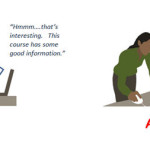
Draw attention to the subject of the course and not the brand.
While I don’t necessarily agree with all of the branding that happens in many online training courses, I understand why organizations do it. However, often the branding goes beyond common sense.
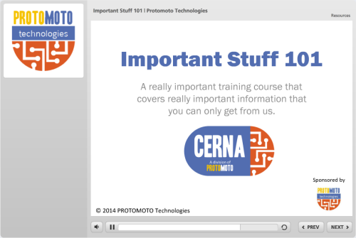
Look at the example above, how many times do you need to see the organization’s name or logo? It’s in the title, the logo panel, and on the screen at least three times.
What’s the point of this? Does all of this branding even do anything positive? I can’t imagine that it actually makes people feel better about taking courses or being part of the organization. What’s next, a company tattoo?
With all that said, the copyright is a good idea. Don’t want anyone to steal that design.
Limit branding to a single screen.
If you have to add the branded items to your course then try to limit when you do so. A few simple ideas may be to make the logos smaller or watermark them so they’re less obvious.
Something I’ve done in the past is create an animated splash screen that I can add to the beginning or end of a course. It’s a bit more elegant and consistent with the brand requirements, but it doesn’t interfere with the course content. By moving the branded elements off your content screens you’ll have more room for the important stuff.
Brand the player instead of the screen.
If you need to add branding to your course, then do it where it makes sense. Most authoring tools have a place for you to add a logo and you can also add brand colors to the template and player.
Click here to view the elearning example.
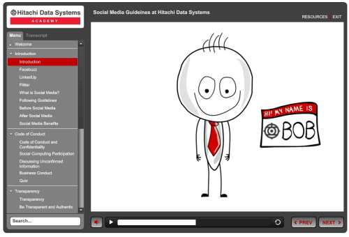
In the example above, a course on social media guidelines, Hitachi customized the template (and course colors) to match the branding in the logo. This helps meet the organization’s guidelines and still gives more control over the content on the screen.
Get rid of production credits.
I’m sure this will upset some people, but one thing I can’t stand about going to a kid’s play is that the play may only be 45 minutes long, but then after they spend another 30 minutes thanking everyone who helped out. That’s all good and I truly appreciate those who volunteered, but come on! No one came to the play for the credits. Do all of the back patting at a cast party.
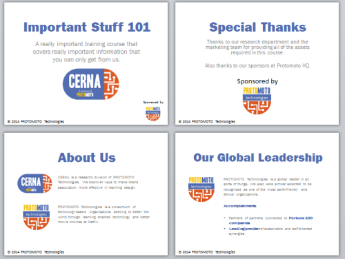
The same can be said for elearning courses. Seems like I’m seeing more and more courses that begin with a series of screens like the ones above that are more like commercials and production credits. They have little to do with the course content so it’s probably a good idea to drop them.
If you do need to add all of that information, then take it off of the course screen. A simple solution is to create an “About Me” tab to hold all of that type of information. It’s in the course for those who want it, but it’s not part of the content flow.
Also, here’s a bonus tip. If you create a live action video don’t use the outtakes to create a gag reel. Unless you’re a master comedian like Emo Philips odds are the gag reel isn’t as funny as you think it is.
Make good use of your screen space.
You don’t need to use all of the features in the player template that comes with your software. Here’s an example: many elearning templates offer a side menu. However, that feature can be turned off if it’s not needed.
In the example below, the only reason the side menu area exists is because the developer inserted the branded logo. Other than that, all of the space below the logo is wasted. It’s also confusing. If the learner is used to a side menu and then sees this example, she may think that something’s broken.
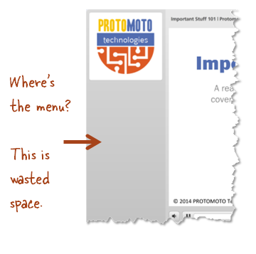
If you’re not using the side menu, a more elegant solution may be to get rid of the logo panel. This gives you a different course profile that doesn’t have a big empty area.
Like it or not, branding requirements exist. The key is to work them into your course design so meeting them makes sense. What do you do to deal with branding requirements that may interfere with your course design?
Events
- Everyday. Check out the weekly training webinars to learn more about Rise, Storyline, and instructional design.
Free E-Learning Resources
 |
 |
 |
|
Want to learn more? Check out these articles and free resources in the community. |
Here’s a great job board for e-learning, instructional design, and training jobs |
Participate in the weekly e-learning challenges to sharpen your skills |
 |
 |
 |
|
Get your free PowerPoint templates and free graphics & stock images. |
Lots of cool e-learning examples to check out and find inspiration. |
Getting Started? This e-learning 101 series and the free e-books will help. |
You might also like:
7 responses to “E-Learning Design Series: Branding Your Course”
You’re awesome! Thanks for the great information – always a good read and very informative.
Great post. I’m at a somewhat more advanced stage, but your design tips are helping me confirm that some approaches I’m taking are correct, and also helping me tweak my designs here and there.
Two questions…how did you do the animations in the Hitachi piece (like the typing hands), and also, which font did you use?
Tom,
Great stuff as usual.
You mentioned leaving the gag reel out unless we’re talented comedians. There is one eLearning expert that I bet could make a really good gag reel. I know he’s a pioneer and very serious about his profession but I bet he’s secretly a very funny guy and there’s outtakes somewhere that will have people in stitches. That’s Dr. Werner Oppelbaumer. Perhaps someone could ‘liberate’ some of those clips sometime.
–Allen
.
Those are really great tips. I like your tip about putting the logo on almost all over the page. I agree with the sample template of Hitachi. I like how they use they brand color and match it with their template. And they also maximize the use of the page.


0
comments