In a recent post, I discussed some issues that organizational branding introduces to course design. In today’s post we’ll review a few of the visual design issues I often see in some of the elearning courses I review.
Below is a demo course slide that represents a few common design issues. Look over the interactive slide and we’ll review it below.
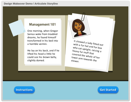
Click here to view the interactive example.
Following are a few things that stood out to me and some ideas on how to fix them.
Elements Should Follow a Consistent Design
The first thing you’ll notice about this example is that the course has a flat visual design. However, the buttons I added use the default gradient and shadowing that comes out of the box. Normally, contrast is a great way to draw attention to the onscreen information. Having a contrasting button is good. But in this case, it probably makes sense to go with the flat design of the course rather than the default buttons.
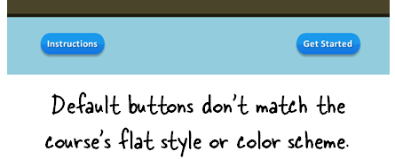
My fix would be to drop the default button settings and create a flat button that matches the course design. Also use a matching color scheme. Rounding the button works since it is a button and you do want it to stand out. I’d go with a softer rounded edge rather than the pill shape.
Not All Onscreen Objects Are Equal
You’ll notice that the two buttons are equal in prominence. However, which button do you want the learner to click? My guess is that it’s not the “Instructions” button.
Seems to me that “Getting Started” is key. That’s what I want the person to do. The instruction button is important and exists for a reason, but give it less prominence.
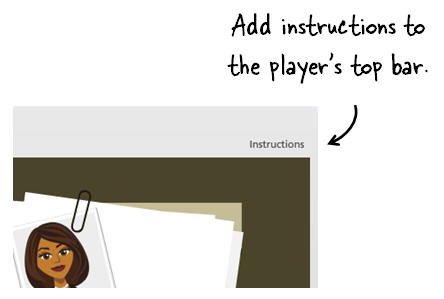
An easy solution is to add the instructions to the top tool bar. That makes them available to the person who needs them, but doesn’t make them prominent.
Or you can replace the button with a simple text link in the instructions to get started.
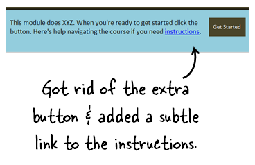
Either way, you give less prominence to the “Instructions” button and place more focus on the “Get Started” button.
How are You Revealing More Information?
Hover effects are great for elearning courses. They expand the screen’s real estate since the information is not available until the person activates the hover. Thus you don’t need to reserve space for that information on the main screen.
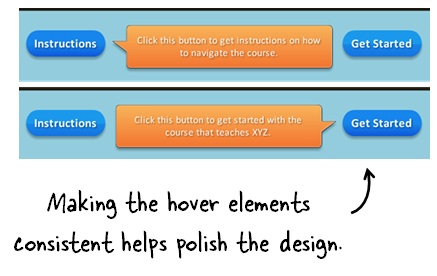
In this demo there are a few issues with the hover effect:
- Do you need instructions when the instructions are so obvious? If the button says “Get Started” I probably don’t need an additional box that states that the button is for getting started. It’s redundant and seems like a waste of time and effort.
- Assuming the call outs are necessary, don’t use the defaults. Instead, have them match the course’s visual design.
- The call outs are different sizes, the tails are different, and the alignment is off. That needs to be fixed. They’ll look better and more polished if the alignment and sizing is consistent.
- One of the callouts overlaps one of the other buttons. This is probably fine. But as a general rule, I try not to block other interactive objects on the screen if I don’t have to. Just something to consider.
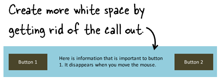
A simple solution to some of these hover elements is to create a hover dock. This is a place on the slide, where all of the mouseover information is revealed. This way you ensure consistency and don’t have to deal with the box size, colors, or shapes.
In the image above, the space between the buttons could be used as an area to reveal information. Since this is a clean space, you could get rid of the call out boxes altogether. This lightens the design and offers more white space.
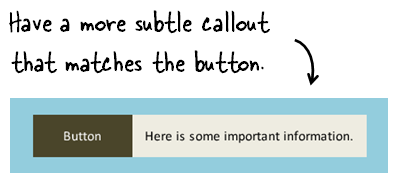
If you did want to have a call out, then do something like the image below were the call out is a bit more subtle, matches the design, and is connected to the button.
Here’s a made over demo, where I show a few different ways to modify the slides.
These types of issues are common to many of the courses I review. The good thing is that they’re really simple to fix. The key is that your design is intentional and that by fixing these simple issues you present something more polished and professional. This is really important if you have limited graphic design experience and have to do all that work by yourself.
The other point I’ll make is that a lot of this is subjective. Do what you feel works best, but be consistent in what you do.
How would approach some of these design issues? Please add your comments here.
Events
Free E-Learning Resources


0
comments