

@Tom Thanks for the schedule, useful.
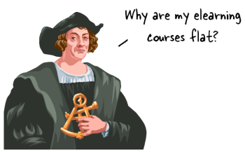
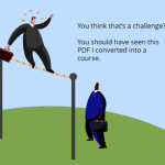
Many rapid elearning courses look at lot like the stereo-typical PowerPoint slide. They’re flat and bland. In a recent email, someone wanted to know how to make their screens look more interesting without requiring advanced graphics skills.
In today’s post I’ll show a simple tip that we’ve been sharing in our workshops for a few years now.
Why Be Flat?
We call the following tip the floor-wall-baseboard (FWB) technique. However at a workshop a few years ago, one of the participants recommended we change the FWB to WBF (Why Be Flat). I like it.
Why be flat? That question addresses the essence of this technique. Why should your screen be flat? The world isn’t flat (maybe). It has dimension and perspective. So why not do the same for your elearning courses?
The trick is to break the screen into three pieces: floor, wall, and baseboard. That’s all you need to get started. To do this, create three core shapes. The shapes can be filled with solid colors, gradient effects, or images.
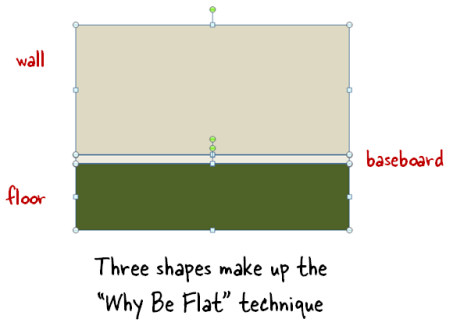
Essentially you’re adding a horizon line which creates a sense of perspective and the illusion of space. This allows you to convert a flat screen into one that is visually rich and offers a sense of perspective.
Here’s a quick example of the “Why Be Flat” technique.
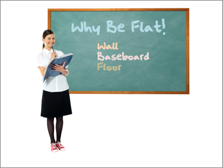
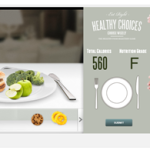
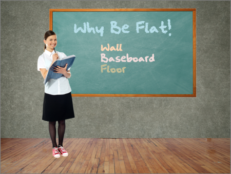
The image above represents the typical slide. We have a character and we’re using the ever popular chalkboard. This screen isn’t bad, but the background is stark and there’s no depth.
First, we’ll add a different background. That’s our wall.
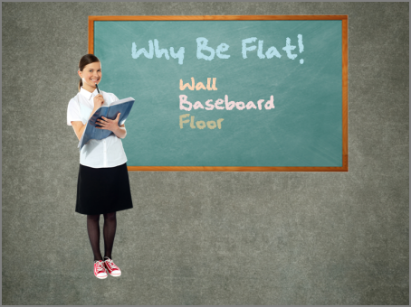
The wall already starts to make the screen look more interesting. The white’s gone and the screen has a softer and more elegant look. Next we add the floor.
The floor creates the horizon line which gives the image depth and is visually rich. But just like when remodeling your house, you want a baseboard on the floor to add that extra finish.
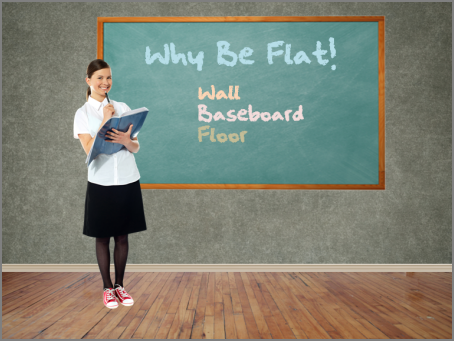
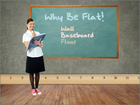
As you can see, the baseboard does a great job dressing up the image. It creates a clean line; and based on where it’s positioned, the baseboard adds perspective. The cool thing is that you’re not limited to be too literal. In the example below, the baseboard’s a ruler which ties into the visual theme of education.
The examples above are a literal floor, wall, and baseboard. But don’t limit yourself to what’s literal. The key point is to create a horizon line and then work from there. In fact, David Anderson, who presents with me at my workshops, has some really good tips on using the “Why Be Flat” technique for your elearning.
- Tutorial 1: Give your slides depth. Examples of how adding depth to the screen can really add some pizzazz. He also does a nice job showing that you don’t need a literal floor, wall, and baseboard.
- Tutorial 2: Quick way to create perspective with the floor image. This is a good tip especially if you’re limited to floor images.
- Tutorial 3: Create depth by layering images. Combines elements of the “Why Be Flat” technique by separating screen elements.
- Tutorial 4: How to create the floor, wall, and baseboard. Good overview of how to use PowerPoint’s shapes to create the elements. This would work in Storyline, too.
If you want to continue the conversation and learn more, follow this thread in the elearning community. It offers some additional tips and tricks as well as files to download.
Events
- Everyday. Check out the weekly training webinars to learn more about Rise, Storyline, and instructional design.
Free E-Learning Resources
 |
 |
 |
|
Want to learn more? Check out these articles and free resources in the community. |
Here’s a great job board for e-learning, instructional design, and training jobs |
Participate in the weekly e-learning challenges to sharpen your skills |
 |
 |
 |
|
Get your free PowerPoint templates and free graphics & stock images. |
Lots of cool e-learning examples to check out and find inspiration. |
Getting Started? This e-learning 101 series and the free e-books will help. |
You might also like:
13 responses to “Are Your Courses Looking Flat? Here’s a Simple Tip for a Quick E-Learning Course Makeover”
I love, love, love this tip. Thanks
thanks for the tutorials…u guys are so creative
Thanks for this idea. One of the problems we have is that our slides always look the same. I think we’ll try this on the next course and see what my manager says.
Looking forward to seeing you in San Diego. I like how you share your ideas. I saw David last year and met you at the jam session.
Thanks for all your team does it help us out. I work for a NGO and we have no money. These tips come in handy.
thank you for the suggestion
also thank you for links to chalkboard, i will use
I can’t believe your newsletter is FREE. (But please don’t change that!) LOL! Thanks for all you do!
Any word on registration for the Miami event yet?
Can’t wait!
Like this idea. Thank you Tom
great tips – very practival and easy to implement. Please send me more information on your workshops? I am based in South Africa.
Tom,
I am a student at Roosevelt University working towards my completion of Masters in Training and Development
(http://rutraining.org) . I always enjoy your blogs and have attended “eLearning pro-workshop” you did in Chicago last year.
Thanks for sharing these tips to induce life into dull slides. It is making a huge difference. I believe that these changes can certainly make a big difference by making course more engaging if coupled with good a instructional design.
Puneet


0
comments