The Rapid Elearning Blog

Archive for July, 2013


Articulate Rapid E-Learning  Blog - create learning objectives for online training courses with this simple tip

To tell the truth, I’m not a big fan of bullet point learning objectives. I prefer something more engaging that reveals the course objectives in a way that’s relevant to the user. But for many, having a bullet list of objectives is the expectation.

So if you’re required to list learning objectives then here’s a simple tip that helps you get away from the bullet point list and also removes some clutter from your screen.

Avoid the Bullet Point Objectives Screen

Typically courses include a list of learning objectives that looks something like the image below. This approach is pretty standard. In fact, when I first started learning to build online training courses that was how we were instructed—each course was to have an objectives screen with a list of objectives.

Articulate Rapid E-Learning  Blog - example of typical bullet point elearning objectives for online training

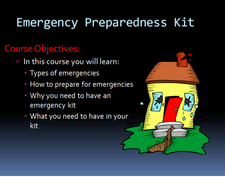
This isn’t a bad approach. Some people probably prefer a simple list of clear objectives than an interactive scenario that takes more time to share the same thing. I know I’ve taken plenty of elearning courses where I wish I could just see a quick list of objectives rather than sit through a long-winded interaction.

If you’re required to list the learning objectives it doesn’t necessarily mean they have to be presented as a list. You’ve probably seen those websites where there’s a top image and underneath it are some buttons to reveal additional images. Why not create something similar for the learning objectives of your elearning course?

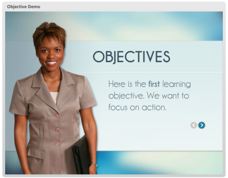
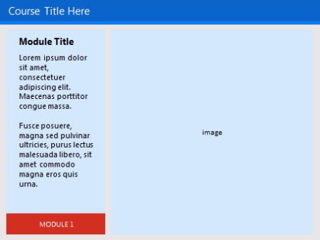
Instead of listing all of the objectives as bullet points, create a single objective on each screen. Then add a button that allows the person to navigate through the objectives. It satisfies listing the objectives, but it doesn’t force them to a bullet point list.

Here’s a quick demo I did in PowerPoint to show the idea in action.

Articulate Rapid E-Learning  Blog - how to create progressive reveal objectives for online training programs

Click here to view the demo.

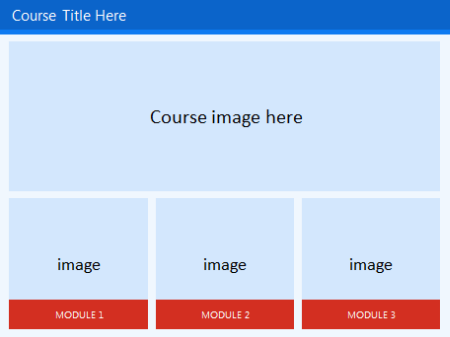
You’re not limited to arrows or back and forward buttons. I also like the idea of lining the bullets up on the bottom and then making them clickable. Here’s another quick demo to see how the objectives screen works with all of the clickable choices lined up on the bottom. If you feel a bit adventurous, put them on the top or to the side.

Articulate Rapid E-Learning  Blog - clickable learning objectives for online training and rapid elearning courses

Click here to view the demo.

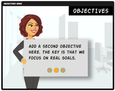
Which concept do you like best? I like the second one because it gives the person viewing the online training course the option of going straight to a specific learning objective. The arrow option forces a linear progression backwards and forwards.

One overall benefit of both options is that you decrease the cognitive load by exposing a single piece of information at a time. Depending on how you structure the objectives screen, this may help with the learning experience.

So there you have it—two ideas the next time you need to create a bulleted objectives screen. What do you think?

Events

Free E-Learning Resources

Want to learn more? Check out these articles and free resources in the community.

Here’s a great job board for e-learning, instructional design, and training jobs

Participate in the weekly e-learning challenges to sharpen your skills

Get your free PowerPoint templates and free graphics & stock images.

Lots of cool e-learning examples to check out and find inspiration.

Getting Started? This e-learning 101 series and the free e-books will help.


Articulate Rapid E-Learning Blog - welcome screen layouts for elearning and online training courses

Many elearning courses have some sort of welcome screen or a start screen where you can review module choices and select where to go. They let you set the stage for your elearning course by selecting a few key images that fit the context of the course’s content. And then use them to create a visually welcoming experience.

Think of it like a welcome mat. The visual start screen is not going to replace good content. But it does set the tone and initial perception of the course. Use it to capture the person’s attention and from there pull them into the course.

Articulate Rapid E-Learning Blog - example of elearning welcome screen

Fill In Your Design Gaps with Good Stock Images

Most course developers aren’t graphic designers. If you have a graphic designer, then you are set. But if you don’t then you’re on your own. So the challenge is how to get a nice look with limited experience and no resources.

One of the easiest ways to make up for lack of graphic design is to find a few really strong images that fit the context of your course. Here’s a good post on listening to your visual voice to figure out which images are the best fit.

  • Action item: Find some good images that work for your content.

Create a Start Screen Layout

There are a number of ways to design the layout. I like a strong title image and then add some compartment images. They can link to other sections or slides.

Articulate Rapid E-Learning Blog - example of a layout for the elearning welcome screen

You may want to create an additional layout as the destination layout. This helps set some repetition and visual continuity.

Articulate Rapid E-Learning Blog - another example of an elearning welcome screen

The examples are basic. But you can create as many layouts as you want. They can be simple like the ones above or much more sophisticated. In an earlier post we discussed ways to determine layouts prior to building your course. I’d create some layouts similar to the ones above.

Play around with the layouts. Make some horizontal and some vertical. And then maybe some that are more like a visual grid similar to what you’d see in Pinterest or on an iPad screen.

  • Action item: Create a main layout and destination layout.

Add Images to the Start Screen Layout

Once you have layouts determined, it’s just a matter of adding the right images. As I stated earlier, I look for one image that sets the tone. It represents the essence of the module or section. It’s kind of like the title font. Then I look for additional images to represent the segment topics.

Articulate Rapid E-Learning Blog - example of visual welcome screen for online training

The key when working with the images is to use a consistent aspect ratio. You want all of the images to be the same and align properly. That will save you time. If you stick with a default aspect ratio, then you can crop to that aspect ratio and only worry about resizing the image.

Articulate Rapid E-Learning Blog - use crop to aspect ratio in PowerPoint for quick cropping

  • Action item: Determine how you’ll quickly align the images to the layout.

To help you out, I created a quick tutorial of how to create a simple start screen layout and then show a simple way to crop the images to the layout so that the alignment is proper and consistent.

Click here to view the tutorial.

To save time or practice doing this, you can download the free template I used.

The initial screen sets the tone of the course. What do you want that screen to look like? Is it inviting? or does it tell the learner that this is yet one more boring elearning course? Hopefully by starting with some pre-established layouts and the right images, you’ll be able to capture the person’s attention.

Let me know what you think.

Events

Free E-Learning Resources

Want to learn more? Check out these articles and free resources in the community.

Here’s a great job board for e-learning, instructional design, and training jobs

Participate in the weekly e-learning challenges to sharpen your skills

Get your free PowerPoint templates and free graphics & stock images.

Lots of cool e-learning examples to check out and find inspiration.

Getting Started? This e-learning 101 series and the free e-books will help.


Articulate Rapid E-learning Blog - become a font pro when building online training courses

None of us have time to get caught up in wonky font talk. But the reality is that when building your online training courses you’ll need to select a font to use.

In a previous post we looked at simple ways to create font pairs when building elearning courses. But that still requires some time on your part. In today’s post we’ll look at a time-saving tip when pairing fonts for course design.

For the budget-minded you can always use Google’s web fonts. They’re free and easy to download. One of the features I like best about Google web fonts is that they already do some font pairing for me. That’s a big time-saver.

Create Font Pairs in Google Web Fonts

The first step when trying to pair fonts with Google web fonts is to filter them. You can filter by four types: serif, sans serif, display, and handwriting. Once you have a type selected you can filter by thickness, slant, and width.

  • Start with the title font. Most likely the easiest place to start is with a heading or title font. They tend to have the most personality and contextual representation of the online course subject.
  • Pop out the font. At the bottom of each font line is a pop out icon. This lets you isolate the font and look at the entire character set.

Articulate Rapid E-learning Blog - example of Google web fonts pop out

  • Select the Pairings tab. Google pairs the selected font with other fonts so you can see how they look. If they look good and follow the simple rules, then make that font pair a keeper.

Articulate Rapid E-learning Blog - Google web fonts pairing tab to pair fonts for online training

Here’s a tutorial that shows how to locate and pair fonts in Google web fonts.

Create Theme Fonts in PowerPoint and Storyline

Once the font pair is identified, download the fonts and them to PowerPoint or Storyline’s design tab as a theme font. Then you always have quick access to the font pair which will save tons of time.

Articulate Rapid E-learning Blog - create custom theme fonts in PowerPoint and Articulate Storyline

When building your elearning course, you know you’ll use fonts. And you know that you’ll need to pick the right fonts. Now you know that you can do this a lot easier and with no cost using Google web fonts.

Events

Free E-Learning Resources

Want to learn more? Check out these articles and free resources in the community.

Here’s a great job board for e-learning, instructional design, and training jobs

Participate in the weekly e-learning challenges to sharpen your skills

Get your free PowerPoint templates and free graphics & stock images.

Lots of cool e-learning examples to check out and find inspiration.

Getting Started? This e-learning 101 series and the free e-books will help.


Articulate Rapid E-Learning Blog - How to create your own graphics and illustrations in PowerPoint

Despite all of the whining about PowerPoint, I find it an effective application for much of my online training and graphic design work. There aren’t many applications more diverse. And it’s what I highlighted in this post on why PowerPoint doesn’t suck.

In that post I shared how I use PowerPoint to create my own illustrations and used the deconstructed sandwich graphic below as an example.

Articulate Rapid E-Learning Blog - create custom graphics in PowerPoint for online traininig

I had a few people email and ask how I created the image. So today’s post is a tutorial on creating illustrations for your online training courses.

How to Build Illustrations in PowerPoint

In my elearning workshops I share ideas on creating a starting template for your online courses. I like to use the sandwich graphic as we discuss deconstructing the core parts of a course. I saw a similar graphic online and decided to try my hand at creating it myself in PowerPoint.

Below is a tutorial that shows how I built the sandwich illustration. Here are the general steps:

  • To create the bread shape, I combined two shapes in PowerPoint. I filled it with a bread-like color and made the outline color brown for the crust.
  • The meat and cheese are just regular shapes filled with the appropriate color.
  • The lettuce is a hand-drawn shape. It didn’t look right filled with green, so I filled it with an image of lettuce.
  • Then I applied a rotation effect to all of the shapes to give them that 3D look.

You can get more detail from the tutorial below.

Articulate Rapid E-Learning Blog - how to create custom illustrations and graphics in PowerPoint for elearning design

Click here to view the tutorial.

Forget the Sandwich! These Tips Are Meant to Teach You More About PowerPoint

When I share these PowerPoint illustration tips I don’t expect that every blog reader is going to go out and find ways to use the sandwich graphic for elearning. Instead, my goal is to get you to rethink PowerPoint and see it’s capabilities in a new light. And I hope to inspire you to practice some of these tutorials in order to learn more about PowerPoint’s features.

You may never need to build a sandwich illustration, but you’ll definitely benefit from practicing the techniques so that when you need a custom graphic you have the skill to try building one yourself.

Articulate Rapid E-Learning Blog - how people learn

It’s a point that Julie Dirksen makes in her excellent book, Design for How People Learn. She referenced the blog post where I share how to create the envelope illustration in PowerPoint. In the book she says that just following the tutorial to learn to build the illustration isn’t enough because the goal isn’t to build that particular illustration. Instead it’s to learn to build illustrations using PowerPoint. And that won’t happen when you build a single icon. It requires more than step-by-step instructions.

Articulate Rapid E-Learning Blog - example of a graphic created for a practice elearning tutorial

The same goes for the sandwich illustration. The goal isn’t to build the sandwich illustration. Hopefully you’ll learn to appreciate the capabilities of PowerPoint, see the illustrations as distinct shapes, and then practice building your own as you need them.

With enough practice you’ll feel confident to build (or at least attempt it) the illustrations and graphics you need. If you do create a custom illustration, be sure to share it with us. I’d love to see what you create.

Events

Free E-Learning Resources

Want to learn more? Check out these articles and free resources in the community.

Here’s a great job board for e-learning, instructional design, and training jobs

Participate in the weekly e-learning challenges to sharpen your skills

Get your free PowerPoint templates and free graphics & stock images.

Lots of cool e-learning examples to check out and find inspiration.

Getting Started? This e-learning 101 series and the free e-books will help.


Articulate Rapid E-Learning Blog - free PowerPoint template for online training

Below is a PowerPoint template that you can use for your elearning courses or other online training.

Example of Free PowerPoint Template

Here is a published example of the PowerPoint template with the download link.

Articulate Rapid E-Learning Blog - example of free PowerPoint template for online training

Click here to view the demo.

Example of the Free Storyline Template

I also created a Storyline version of the template if you’re a Storyline user.

Articulate Rapid E-Learning Blog - example of free Storyline template for online training

Click here to view the Storyline demo.

Customize the Free Templates

Both templates are designed so that you can quickly create and apply custom color schemes. The module tabs use accent color boxes one through five.

Articulate Rapid E-Learning Blog - use PowerPoint and Storyline design schemes to create custom templates

Keep in mind that you can also apply your own font scheme so you’re not limited to the default fonts. This template may be a good way to practice creating some font pairs.

I hope you enjoy the templates. If you use them, send me a link. I’d like to see what it looks like.

Events

Free E-Learning Resources

Want to learn more? Check out these articles and free resources in the community.

Here’s a great job board for e-learning, instructional design, and training jobs

Participate in the weekly e-learning challenges to sharpen your skills

Get your free PowerPoint templates and free graphics & stock images.

Lots of cool e-learning examples to check out and find inspiration.

Getting Started? This e-learning 101 series and the free e-books will help.