The Rapid Elearning Blog

Archive for September, 2012


Articulate Rapid E-Learning Blog - convert click and read courses to interactive elearning

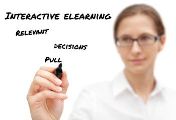
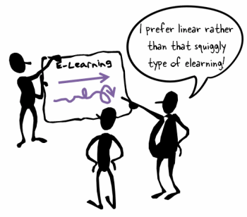
One of the most frequent questions I get is how to convert linear, click-and-read courses to something more interactive. Linear courses are often the result of our focus on sharing information and not knowing how to move beyond this.

In today’s post we’ll look at a few guiding principles that help in the transition from linear to interactive elearning.

But before we get started, let’s keep in mind that click-and-read courses are not bad. In fact, there are many times where a linear course may be the best solution. But that should be something determined as part of the process of building the course and not a default position.

Articulate Rapid E-Learning Blog - two ways to share elearning course content

The Interactive Trifecta

When it comes to creating interactive elearning, I focus on three key principles. And they’re principles that are repeated throughout this blog.

Make Your Courses Learner-Centric

We tend to be an info-centric culture. If someone asks how to learn more of something, we’ll point them to a web site or give them three good book recommendations. The assumption is that with more information things will be better. And that’s what drives a lot of linear elearning. Obviously, information is important and critical to learning. But information is only part of the learning process.

Articulate Rapid E-Learning Blog - make your elearning courses learner-centric

Interactive elearning courses require an understanding of how the learner uses the course content and then lets them practice so they can get the appropriate feedback and make the adjustments so critical to the learning process.

The first step in crafting an interactive course is to make it relevant to the learners. How will the learners use this information? Once that’s determined, you can craft relevant situations which moves the course from an info-centric design to one that is learner-centric.

Help Learners Collect Information to Make Decisions

Determine why the learner needs to know the information. Then create an environment that puts them in position to make the types of decisions they’d make in the real world. These decision-making activities are how you get them to pull and collect information.

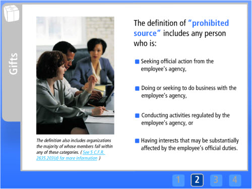
Example: A customer wants to buy a new widget. Your job is to sell him the best widget.

A typical elearning course gives them a bunch of information on widgets and customer needs. An interactive elearning course puts them in position to make the types of decisions they’d make when working with real customers.

Articulate Rapid E-Learning Blog - help learners collect information to make decisions

Get them to form a hypothesis about solving the situation. Then they make what they think is an appropriate decision, which produces consequences—sometimes good and sometimes bad.

Add a pull mechanism. Adult learners don’t like to make wrong decisions so they tend to collect information to make an informed decision. This is how you get them to pull the information they need. Here are a few simple ways to pull information in:

  • Link to additional web material like company policies
  • Include documentation and resources
  • Ask someone to gather opinions

Instead of dumping a bunch of information on them, we’ve got them interacting with the content and making real-world decisions. When they don’t know something, we provide ways for them to collect information by using different pull mechanisms.

One challenge in this is working with your subject matter experts. It’s hard enough to get your subject matter experts to provide ten good multiple choice questions. So it’s often a challenge to get them to work through decision-making scenarios. If that’s the case, work with your potential learners. Ask when and how they’d use the information. You’ll get plenty of real-world situations to use for decision-making scenarios.

Linear elearning isn’t a bad solution, but often it’s not the right solution. If you want to step away from linear elearning focus on the three essential elements:

  • Make the content relevant.
  • Give them opportunities to make real-world decisions.
  • And let them collect and pull information rather than just pushing it out.

If you do those three things you’re on your way to effective and interactive elearning.

What challenges do you find when trying to move from linear elearning to courses that are more interactive? Feel free to share your comments here.

Events

Free E-Learning Resources

Want to learn more? Check out these articles and free resources in the community.

Here’s a great job board for e-learning, instructional design, and training jobs

Participate in the weekly e-learning challenges to sharpen your skills

Get your free PowerPoint templates and free graphics & stock images.

Lots of cool e-learning examples to check out and find inspiration.

Getting Started? This e-learning 101 series and the free e-books will help.


Articulate Rapid E-Learning Blog - linear or squigly elearning? You decide.

It would be cool if every course we build was highly interactive with decision-making branches. But the reality is that not all elearning courses need to be that way.

Despite the complaints we hear about linear, click-and-read courses, there are plenty of times when linear is the best solution. This isn’t a defense of bad elearning (that often is linear). Instead it’s an acknowledgement that there’s a place for linear content.

Instead of injecting our personal views on what elearning should be, we need to focus on the type of course that is most appropriate for the organization’s goals. Whether the course is linear or interactive it’s merely a solution. So we need to step away from the solution, determine our objectives, and then select the best solution. If we do that, we’ll find that there are plenty of times when a linear course is preferred over a more interactive one.

Learning is Bigger than E-Learning

A couple of the benefits of elearning are consistent delivery of content and compression of time to deliver it. That means that even if the course isn’t highly interactive it can still offer some value to the organization.

For example, there are often training initiatives that require some face-to-face sessions and peer interaction. That’s something that elearning can’t always do effectively. But they can help make the face-to-face time more efficient.

  • Compressed time to deliver content. Classroom sessions often have delayed start times and they can be side-tracked by other discussions. It’s often possible to compress a one hour classroom session to a 20 minute online module because there’s better control of the content and distractions.
  •  Learner flexibility. People are able to take the modules at their convenience and speed. So it doesn’t disrupt their work schedule or production as much.
  • Consistent delivery of information. Each facilitator is different and each class has its own pacing. Many times we’ll spend 80% of the time going through 50% of the content. And then we’ll notice the time’s almost up and quickly skim through the last 50%. An elearning course can assure that at least the delivery and access to the content for each learner is consistent.

In that sense, linear elearning is an appropriate solution when blended with classroom activities. By compressing the time and ensuring consistent delivery of the content, it frees up time for more meaningful conversation and learning activities in the classroom.

Articulate Rapid E-Learning Blog - good example of linear elearning course

Click here to view the demo.

I like this example from Mike Enders. He took what would have been a lecture and made a multimedia presentation. It’s something the teacher only has to create once, but is available to the student at any time. Then after viewing it, the students can come back together to discuss the content.

While, the content is linear, it’s not boring. And it’s quite effective in sharing information. The interactive part of the learning experience happens in the classroom and with any papers the students have to write.

A Simple Solution Saves Time & Money

There are many times when the main objective of a course is that the learner completes it by December 31. The organization only wants a record of completion. Sure you can sit on a soapbox and lament the decline of effective learning because of this. But you’ll most likely be an unemployed lamenter.

The reality for many organizations is that they tend to require participation in elearning courses that are not always relevant and don’t require a lot of interactive engagement. In an ideal world, we work with our clients to help them frame the content so it is relevant and adds value to the organization. But if that’s not possible, the best solution for the organization is to limit the time wasted taking irrelevant training.

Articulate Rapid E-Learning Blog - let learners test out of elearning course

A simple linear course that allows the person to get the information as fast as possible is one of the best things you can do for the organization. To make it better, you may even have the learners test out so they can avoid wasting time.

Interactive elearning courses require more resources which is a challenge because most of us are working with limited resources. So when it comes time to prioritize your projects, don’t waste your limited resources on less meaningful projects. Keep them simple and you’ll have the resources available for those courses that require more.

Not All E-Learning is E-Learning

There are some elearning courses that are focused on improving performance and changing behavior. But there are also many courses that are information pieces. They exist to promote awareness and not necessarily change behavior.

For those types of courses, it doesn’t make sense to spend a lot of time on interactive content. The last thing you want is a decision-making interaction when all you need is a few screens of content.

Some would argue that if there’s no performance element, then it should just be a job aid or PDF. That’s a valid argument. But with the tools today, creating multimedia content doesn’t take much more time to pull together and distribute than a document.

I like this example from Hitachi. It’s a linear presentation of their social media policy. This could have been a simple website or PDF, but I think you’d agree that this is more interesting as a multimedia presentation. And they can always augment the presentation with interactions that let them practice applying the policy.

Articulate Rapid E-Learning Blog - good example of linear policy information

Click here to view the presentation. It looks great on the iPad, too.

Linear is just a form of navigation. What happens between the navigation can be very compelling and dynamic. It doesn’t have to be boring, bland, or full of bullet points. It just depends on how much effort you put into it.

Here are a few more examples of information modules that are mostly linear:

Articulate Rapid E-Learning Blog - more examples of elearning courses

So there you have it. Linear is merely a form of navigation. This means what happens between the next buttons is up to you. It can be bland with a bunch of bullet points, or it can be interesting and meaningful. It just depends on what you choose to do.

Events

Free E-Learning Resources

Want to learn more? Check out these articles and free resources in the community.

Here’s a great job board for e-learning, instructional design, and training jobs

Participate in the weekly e-learning challenges to sharpen your skills

Get your free PowerPoint templates and free graphics & stock images.

Lots of cool e-learning examples to check out and find inspiration.

Getting Started? This e-learning 101 series and the free e-books will help.


Articulate Rapid E-Learning Blog - free PowerPoint tutorials and template

In a recent post we looked at ways to build interactive elearning even if using PowerPoint to build the courses. One of the demos I shared prompted lots of questions. So in today’s post I’ll show you how I created the PowerPoint interaction. This lets us look at some essential production tips when using PowerPoint to build interactive elearning.

PowerPoint Tutorials

Articulate Rapid E-Learning Blog - PowerPoint tutorials

Click here to view the tutorials.

Review the PowerPoint interaction to see how it works. I also included a link to download the PowerPoint file so that you can see how it’s assembled. This may help when viewing the tutorials above. Or quickly skim the notes below. In addition, the download can be used as a template. Feel free to replace the content with your own if you need a quick interactive module. 

Use Multiple Layouts

Use as many layouts as you need to build your course. In this template I have two layouts. One layout is for the instructions and feedback; and the other layout for the interaction.

Articulate Rapid E-Learning Blog - multiple layouts in PowerPoint

As a rule of thumb, once I get three or more slides with the same information, I try to put as much as I can on the master slide so it’s easier to edit and maintain. When you build your slides, try to determine what’s persistent and then add as much of the persistent content to the master slide.

Use Slide Titles as Metadata

I like to move the titles in the master slide up and off the slide. This lets me use the title area as a way to describe the slide, but not have that content appear in the actual slide.

Articulate Rapid E-Learning Blog - slide master titles in PowerPoint

This comes in really handy when you’re creating interactive branches and using PowerPoint’s hyperlinking because the titles of the slide are easy see. Don’t be afraid to add a lot of descriptive content to the slide title.

Add Hyperlinks to the Master Slide

In this interaction, we’re working with a single image that has multiple hyperlinks. Since we’re using the same master slide for all five slides, it makes sense to add the hyperlink to the master slide. That means I only add them once and they’re easy to edit.

Articulate Rapid E-Learning Blog - hyperlinks on the master slide in PowerPoint

  • Use transparent shapes for the hyperlinks (1).
  • Title the hyperlinks so that you know where they go (2).

Create Shapes for Hyperlinks

You can add a hyperlink to any object in PowerPoint. However, if you look at the object on the slide, there’s no way of knowing which ones have links or not. Come back to a course three weeks later and you’ll have to spend a lot of time trying to remember which objects have links and where they go.

Articulate Rapid E-Learning Blog - create shapes for hyperlinks in PowerPoint

That’s why I like to create a shape just for the links. I add the link to the shape and then in the selection pane I title the shape as a link and where it goes. This makes reviewing the slide’s links super easy.

Bonus tip: CTRL+K opens the hyperlink window.

Title Objects on the Slide

In the image above I show an example of titled hyperlinks. And in the image below I show titled objects on the slide.

It’s a good habit to title objects on the slide. The most obvious reason is that you know what each object is and what it does based on how you title it.

Articulate Rapid E-Learning Blog - PowerPoint's selection pane

The other reason is that when you leave the course and come back a while later, you’ll find it a lot easier to orient yourself to what’s there. That’s a big time saver, especially if you hand the course off to someone else to maintain.

The Cropping Tool is Your Friend

In this template, I added the image of the four people on the master slide. I created a new slide and applied the master layout. Then I pasted a copy of the image on the slide itself.

From there I was able to use the crop feature to crop to the person’s head and add the image frame.

Articulate Rapid E-Learning Blog - use the cropping feature in PowerPoint

I duplicated the first slide for each additional character. Then selected the head image (see above) and opened the cropping tool. All I had to do was move the crop box to the new head and all of the same formatting was applied.

Graphic Creation Tips

One of the best parts of PowerPoint is that you can create your own graphics by combining the shape formatting with layered objects.

Articulate Rapid E-Learning Blog - create your own graphics in PowerPoint

I created a pattern background for the slide to add a little depth and visual interest. Instead of adding it to the background, I put a shape on the slide then applied the pattern fill to the shape. This gives me the flexibility to manipulate the background.

Articulate Rapid E-Learning Blog - how to create a custom drop shadow in PowerPoint

The drop shadow under the box is a rectangle that is semitransparent and uses a soft edge. Use the edit points to create a pull away shadow for more depth. Here’s a tutorial that shows how to create that type of shadow.

Articulate Rapid E-Learning Blog - create your own graphics in PowerPoint

Layer images for more effect. In this example, I started with an office image. To make it more interesting, I pulled the woman out of the image and added a lighting effect in the corner. I also added a shape to use as a text box.

In the case of the woman in front of the table, I start with the original image of the woman in the meeting room at the desk (1). Then I added a spotlight shape on top of the original
image to create a corner shadow (2). I added the semitransparent rectangle as a content holder for my title text (3).

Finally, I duplicated the image and isolated the woman by cutting out the background. Then I added the isolated woman back on top of the image. This pulls her out of the original image and puts her on top of the text box. This is a simple technique that helps create a focal point.

As you can see PowerPoint’s freeform environment makes it easy to create your own graphic effects.

Even if you don’t build the same type of interaction in PowerPoint, these production tips are generally the same ones you use to build any interactive elearning courses in PowerPoint.

Events

Free E-Learning Resources

Want to learn more? Check out these articles and free resources in the community.

Here’s a great job board for e-learning, instructional design, and training jobs

Participate in the weekly e-learning challenges to sharpen your skills

Get your free PowerPoint templates and free graphics & stock images.

Lots of cool e-learning examples to check out and find inspiration.

Getting Started? This e-learning 101 series and the free e-books will help.


Articulate Rapid E-Learning Blog - relax and enjoy the day with this free PowerPoint template

The irony of Labor Day is that many of us celebrate it by taking the day off. That means one less day to create elearning templates. No worries because we’ve got you covered.

To help you relax and enjoy the last few days of summer, I’ve included a free tab-themed elearning template. It’s a good one for  business policy and compliance courses.

Glassy Blue Template

Articulate Rapid E-Learning Blog - free PowerPoint template

Click here to view the demo template.

The image below shows the key layouts that make up the template. There’s a starting screen, a series of tab screens, a quiz start screen, and an exit screen. Included with the PowerPoint file is a matching Articulate Quizmaker template customized with a matching color scheme.

Articulate Rapid E-Learning Blog - layouts of the free PowerPoint elearning template

The Glassy Blue template is designed around a series of click and reveal tabs. That means you need to add hyperlinks from the tabs to the appropriate slides.

Here are some more tips on working with the template:

  • The start screen consists of four rectangles that represent links to four sections. If you have more than four sections, just add another rectangle. Align them with the others and change the size to accommodate the right layout. Add hyperlinks to the shapes so that they link to the appropriate sections.
  • Each distinct section should have a series of tabbed screens. You can see those above in slides 2-4. Duplicate those slides for each section. Use hyperlinks on the tabs to link to the appropriate slides. You can always add additional tabs. It probably makes sense to add the section tabs to the master layout for easier editing.
  • This template is designed using the PowerPoint design theme colors. That means you can easily change the template to match the colors required for your course and organization’s branding.

Articulate Rapid E-Learning Blog - easily create custom color schemes with your free PowerPoint template

Demos & Downloads

Following is an example of the published template. You can also download the file that includes a .ppt and .pptx version. It also includes the Quizmaker file.

Since the PowerPoint files can be imported into Articulate Storyline, Mike Enders built a Storyline template using the Glassy Blue PowerPoint file. He made modifications that take advantage of some of Storyline’s interactive features.

Articulate Rapid E-Learning Blog - free Articulate Storyline template based on the free PowerPoint template

Click here to view the demo.

The Glassy Blue template is simple and perfect for information sharing and compliance training. The tabs would also work well as a process interaction. The template is also easy enough to customize so that it meets your needs. Feel free to download it and use as you wish.

Events

Free E-Learning Resources

Want to learn more? Check out these articles and free resources in the community.

Here’s a great job board for e-learning, instructional design, and training jobs

Participate in the weekly e-learning challenges to sharpen your skills

Get your free PowerPoint templates and free graphics & stock images.

Lots of cool e-learning examples to check out and find inspiration.

Getting Started? This e-learning 101 series and the free e-books will help.