The Rapid Elearning Blog

Archive for March, 2012


The Rapid E-Learning Blog - information overload

Infographics are the hot! They catch your attention because they look great and have strong visual hooks.

I like them because they remind me a little of I Spy where you get to explore a busy graphic and search for interesting nuggets of information. Of course, not everyone’s a big fan of infographics.

There are many parallels between infographics and elearning. They both share information in a visual medium. Those who design infographics start with lots of information and distill them to a few essential points. That’s very similar to what we do when our subject matter expert hands us a 300-slide PowerPoint file to be converted to an elearning course.

For the person who desires to learn more about visual design and processing lots of information, infographics are a great source of inspiration. Let’s look at what makes them so effective.

Keeping it Simple

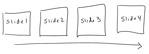
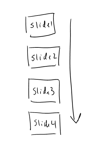
If you think about it, infographics are not much more than vertical slide shows. That’s right. They’re really no different than PowerPoint slides. But instead of clicking forward horizontally, they’re stacked nice and neat in a vertical column.

The Rapid E-Learning Blog - linear slides

The Rapid E-Learning Blog - vertical slides

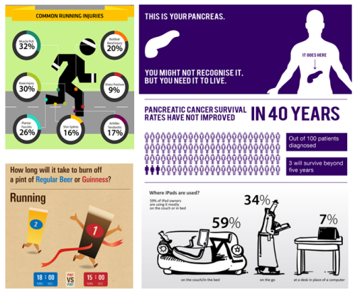
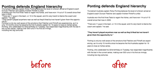
Compare this cool infographic from Paycor to the same content laid out in PowerPoint slides.

The Rapid E-Learning Blog - example of an infographic

Click to view the entire Paycor infographic.

The Rapid E-Learning Blog - infographic content in an elearning course

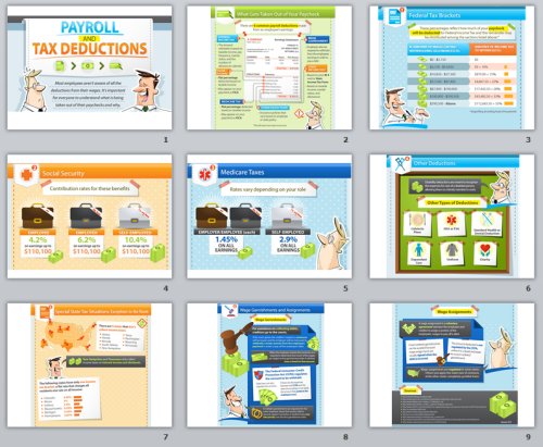
As you can see, the content is broken into very specific sections that are stacked and separated by color headings. They’re not any different than what you normally see in a PowerPoint slide template.

What Does it Mean for Elearning?

The need to share Information drives a lot of elearning; and usually there’s way too much information. So we tend to over inform which makes it hard to focus on the critical information. On the flip side, infographics do a great job focusing on key points of information. Understanding more about them will help us build better elearning.

Fast Company featured a video that explains the case for infographics. As you watch the video, see if you can identify common graphic design concepts like contrast, use of color, and flow of information.

The Value of Data Visualization from Column Five on Vimeo.

What Makes an Infographic?

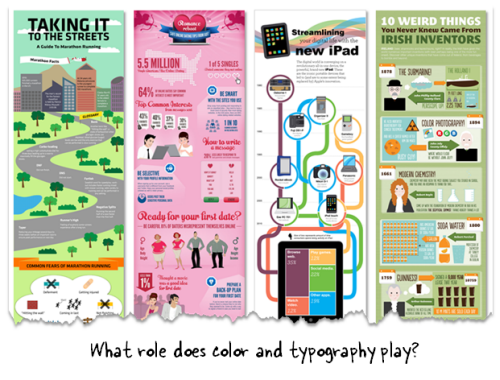
There are many parallels between infographic design and elearning. Making it a habit to view infographics is a great way to learn about visual communication. They may even inspire some template and layout ideas.

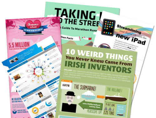
Here are two good sites if you want to regularly review nice infographics:

Here are some elements of infographic design that I find parallels what we do in elearning:

Focused information: It’s all about sharing information and making it memorable. Many elearning courses have too much data on single slides. Infographics do a great job weeding out irrelevant data. This keeps them focused.

The Rapid E-Learning Blog - infographic examples

How can you apply what you see in the infographics to your own courses? Instead of writing a title on the screen with a list of bullet points, write a single sentence that makes the point. Use that sentence to guide the visualization of the information.

Data visualization: Infographics have a visual hook. In some ways coming up with the visual hook is more art than anything else. So how do you learn to do a better job creating the right hooks? The key point is the data. Let the data tell the information. If you have to explain the data, then it’s wrong. The data should do the talking.

The Rapid E-Learning Blog - infographic data visualization

Let infographics inspire some ideas. I also recommend the visual design mind mapping exercise we do in our workshops. The output is very similar because you determine a visual theme with the right colors, design elements, and typography.

Color schemes: Most infographics have a visual hook and use bold colors and elements that really pop off the screen. These techniques also work with your elearning screens. In fact, I’d start by finding an infographic you like and then replicate the layout on the elearning course screen. That’ll give you some practice playing with layout ideas and colors.

The Rapid E-Learning Blog - bold colors and fonts used in infographic design

You don’t want the colors to compete with the information. Limit colors to just a few. Most infographics have a background color and then some other colors to create visual breaks between the sections. These can be headers or simple changes in the background.

There are many sites that will help with color schemes. Here are a few:

Bold fonts: Fonts are interesting because they display text that we read. But they’re also graphic elements that convey meaning and speak to your visual voice. We learned about this in an earlier post where we matched fonts to images.

The Rapid E-Learning Blog - what's the right font to match your course

Click here to view the demo.

You’ll notice that infographics are very deliberate in how they use fonts. You can learn to do this using the mind map activity. It helps know what fonts to use.

Once you know what type of font you need, go to a site like Dafont or Font Squirrel to search for the right font. If you need some good free fonts, check out this post where you learned how to get 150 free fonts from Google web fonts.

Icons & clip art. Infographics are also iconic. They find a visual hook, pair that with the right colors and fonts and end up with a visually intriguing and memorable graphic.

Most of us aren’t graphic designers and we don’t always have access to the graphic design resources we need to build elearning courses, let alone an infographic. But that’s OK.

There are all sorts of free icons and vector images that you can use to help in your course design. The key is to stick within a single style so that you don’t get that discordant Frankencourse look.

Even if all you have is clip art you can still find a single style and build your images from that. Check out this post where I used a single clip art style to build my elearning course template. You can do the same thing with your infographics.

The Rapid E-Learning Blog - use PowerPoint and clip art to design infographic style

Here are some resources to find free or low cost icons and vectors. Before using them make sure to check out the license agreements. Some lame companies entice you to free resources and then put all sorts of restrictions on how you can use them. In my book, free should be free!

Also, subscribe to sites like App Sumo and Might Deals. They usually offer some free or very low cost access to all sorts of graphics.

Building an infographic is a great way to practice compressing information into essential points. It also takes you away from the elearning mindset which can help shape a fresh perspective on your content. Practice building an infographic. It can only help you later in your course design. I like what Nicole Legault did on her site:
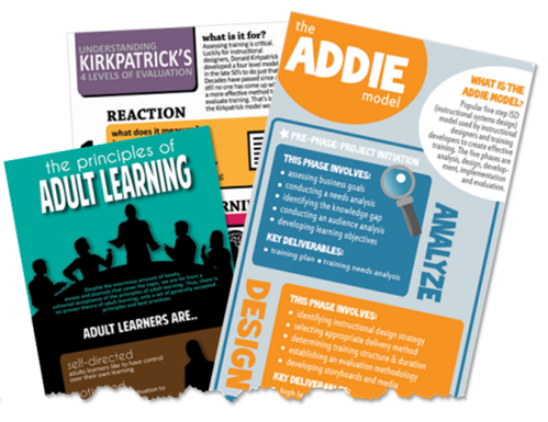
The Rapid E-Learning Blog - good examples of elearning aand training infographic

As you can see, there are many similarities between infographic and elearning course design. Both require weeding through data and drawing attention to key points and essential information. And since they’re both visual mediums, they are similar in their design elements, fonts, and color schemes.

While you may never build an infographic, making it a habit to review them is a worthwhile pursuit that can inspire your own elearning course designs.

Events

Free E-Learning Resources

Want to learn more? Check out these articles and free resources in the community.

Here’s a great job board for e-learning, instructional design, and training jobs

Participate in the weekly e-learning challenges to sharpen your skills

Get your free PowerPoint templates and free graphics & stock images.

Lots of cool e-learning examples to check out and find inspiration.

Getting Started? This e-learning 101 series and the free e-books will help.


The Rapid E-Learning Blog - Do you have the skills to succeed at elearning?

In a recent post, I shared my recent webinar with the E-Learning Guild and some of the conversation we had around rapid elearning.

In today’s post we’ll look at another part of the conversation where we discussed what skills are needed to succeed and how they can be nurtured.

Rapid E-Learning Developers Wear Many Hats

When I first started with elearning we’d have a team of people working on projects. Someone did the instructional design, someone else worked on graphics, and then we had a programmer who built the courses in Authorware or some other application.

The Rapid E-Learning Blog - elearning developers need to learn multiple skills

That’s usually not the case today. Most of the people I talk with usually work by themselves and mostly responsible for all parts of the course development from content design to the graphics and then the conversion to elearning.

While today’s software has made the job easier, but it’s also made it more challenging for the person who has to develop and deliver elearning courses.

Success Requires Multiple Skills

The Rapid E-Learning Blog - elearning developers need to be good project managers and instructional designers

Since so much of the development of the elearning course sits on the shoulders of just a few, it’s important to have multiple skills. Here are some of the skills that are critical to success:

  • Project consulting. This combines project management and performance consulting so that the project is focused on the right things and moving in the right direction.
  • Instructional design. It’s important to understand how people learn and how to build good elearning experiences.
  • Visual design. Elearning is a mostly visual medium, so it makes sense to understand how to craft the visual experience that works best with the course content.
  • Experience design. Learn to build a great user experience. This is a combination of user interface design and graphic design. It’s all about creating an environment that facilitates the best learning experience.
  • Expertise with your authoring tool. Regardless of the authoring tool you use, you need to become an expert using it. The tools are getting easier, but unless you learn to really use them you probably won’t go past basic course design.
  • Understand common elearning technologies. “Multi” is the key part of multimedia. There are many technologies that make up good elearning—audio, video, graphics, and web technologies. HTML5 and the iPad are ushering even more considerations. You don’t need to be an expert, but you should be familiar with the basics.

Acquiring Skills

One you understand the skills you need, the next step is figuring out how to acquire them. We’ll explore a few ways here, both formal and informal.

Formal education. The most common expectation is to acquire them through some sort of formal education. In a previous post we discussed whether or not you need an instructional design degree.

The Rapid E-Learning Blog - good books for elearning design

If you’re looking for formal education on instructional design, we started to compile a list of degree and certificate programs in the elearning community. There are also some good comments about the experience in the forum thread.

Informal education. I think getting a formal education is good and will open many doors. At a minimum, it lets you compete for jobs where having a degree is required. However, there’s a difference between a degree in instructional design (which can be broad) and gaining the skills to build good elearning courses.

You’ll definitely need to augment your formal education with informal activities.

Free tutorials. In this day and age there are all sorts of resources available to learn more. Want to learn PowerPoint? There are thousands of tutorials on sites like Youtube and Screenr. Here are two good posts that cover most of what you need to know about PowerPoint for elearning:

That’s just the tip of the iceberg. If you’re an Articulate user, the community offers hundreds of great how-to tutorials. There’s even a generic course on how to take a PowerPoint file and convert that to an elearning course. And those tips work regardless of the tools you use.

Of course, elearning isn’t limited to PowerPoint. The point is that if you want to learn then you’ll find a lot of free resources that help.

Read Books. There are many good books to help you get started. I’m sure everyone has a favorite. I started a list of books in the elearning community, but here are the most common that I usually recommend:

The Rapid E-Learning Blog - recommended books for gettign started in elearning

The links to Amazon books may produce a slight commission.

Real World Experience

A formal degree is only going to help you. But odds are you won’t learn enough to acquire all of the skills you need to get really good at this elearning thing. And you can only learn so much from reading and viewing tutorials.

At this point you have to get your feet wet and work on real projects. Most of the skills you need come from experience. And you only get the experience by working on projects and over time.

In an ideal world, you get to work on a variety of projects that will enhance your skills. But the reality for most people is that they work on the same types of projects over and over again. So they may have built 100 elearning courses, but basically they built one type of course a hundred times.

It’s up to you to get the diversity you need. Here are a few tips:

  • Make it a habit to review good elearning courses and multimedia examples. Then document what you like and try to work some of those things into different projects. This is a great way to develop your skills and push the envelope a bit at work.
  • Create before and after examples of good elearning. If you want to build more engaging courses at work, then convert one of the typical courses into something more engaging. Use that to show your organization the types of courses you should be building. People respond to good examples.
  • Create a personal portfolio. Some organizations will stifle your development. If that’s the case, then build a portfolio to practice different things. They don’t need to be big courses. For example, create ten different ways to navigate without a next button. This lets you practice ideas on a small scale and document your skills.
  • Volunteer. There are a number of opportunities to volunteer to build courses for others. LINGOs is always looking for help. And you may even get some recognition. Try local community groups like churches or the YMCA. I’m sure they’d love to put your skills to good use.

Stay Connected to the Industry

Years ago if you wanted to meet industry experts you had to go to trade conferences or workshops. And even then, did you really get to “meet” them?

Today, it’s so much easier. The online communities and social media tools make it easier than ever to connect with others. And here’s the thing about experts—we’re all experts, just at different levels. Even if you’re just getting started, your questions and fresh perspective help frame our understanding in new ways. You’re the fuel that keeps the community vital and growing.

The Rapid E-Learning Blog - the community is an extension of your work environment

In a practical sense, the online community is going to offer all sorts of help. It curates all of the latest news. It also shares expertise and offers free resources. Software vendors like Articulate make the tools to use, but it’s the community of users who develop the best practices and tricks to get the most out of them.

I see the community as an extension of your cubicle. Going forward your value to the organization is in large part going to be dictated by how well you’re connected to your industry peers. The person who is connected and knows where to find the help and resources is going to always have the advantage.

Like I stated earlier, the tools are getting easier to use, but that also places more pressure on you to have multiple skills. The opportunities to acquire them exist, even if you’re on a budget. You just have to be intentional about getting them.

How did you learn what you know? Did getting a degree help? Do you participate in a community or social media? We’d love to hear your thoughts. Share them by clicking on the comments link.

Events

Free E-Learning Resources

Want to learn more? Check out these articles and free resources in the community.

Here’s a great job board for e-learning, instructional design, and training jobs

Participate in the weekly e-learning challenges to sharpen your skills

Get your free PowerPoint templates and free graphics & stock images.

Lots of cool e-learning examples to check out and find inspiration.

Getting Started? This e-learning 101 series and the free e-books will help.


The Rapid E-Learning Blog - what can you learn from Google's designers to create your own elearning courses?

I read this interesting article the other day about how Google’s designers changed the look and feel of their products. It reminded me a lot of what we have to do when building elearning courses and it’s in line with many questions I get about elearning design during my workshops.

Here are some things that relate to what we do in the world of elearning.

Build Consistent Navigation

People generally expect that things work the way they expect them to. Navigation is one of those types of things. 

  • Don’t deviate from what people expect. Navigation should be consistent. Generally people look over the screen using a Z or F pattern. It makes sense that the back and forward navigation is at the bottom right corner since it isn’t critical information and one of the last things we need to see on that screen.
  • If you do deviate from expected norms, have a reason to do so. Don’t just haphazardly move things around the screen. I’ve seen buttons turned sideways and in different places just because there was no room on the slide or the designer wanted it to look different. This is a frustrating experience. When people start focusing on the navigation and not the instructional content, you’ve probably failed.

Use White Space in Graphic Design

White space is a just as much a design feature as any other graphic. However, I think some people aren’t comfortable with it on the screen. Empty space is like a vacuum that will keep sucking until it gets filled…kind of like my hallway closet or kitchen drawers. Typically we’ll move objects around to fill the space or add decorative graphics.

I worked on a project once where we had icons for six modules. The way they were designed they didn’t completely fill the top. So we had an empty corner (which was fine). But our client couldn’t handle the blank spot and didn’t want to change the icons. So she had us build an extra module just to fill the space.

Don’t be afraid of white space. It’s an ally when communicating visually. Here’s a good article on white space in graphics.

The Rapid E-Learning Blog - effective use of white space in graphic design

Change Isn’t Easy

It’s hard to institute change. That’s what Google ran into. While trying to persuade change can be frustrating there is something valuable in the process.

If change were easy we’d do it all the time and probably mess up more than we fix. The fact that we run into walls and roadblocks requires that we step back and assess the value of continuing versus the benefits of change.

How much effort are you really willing to put into the change? At one point is it not worth it. If it’s important you’ll find a way to get the change implemented. If not, then give up and spend your time and energy on things that will produce better value.

Compromise Can Make You Seem Indecisive

I’ve worked on projects where after a few meetings we ended up with three or four decent ideas instead of one good one. The team would split into different camps and support different ideas. Since they were all good enough ideas and we generally didn’t want to offend others (or seem overly aggressive pushing ours) we’d present all of the ideas to our clients and let them decide.

That’s probably what the Google designers did.


They presented then-CEO Eric Schmidt and other leaders with a set of four different concepts, with themes like making Google more like desktop clients, or differentiating products by color. It sounded like there were too many options and not enough conviction.


This is a lack of leadership. Instead, tell me which one is best and why?

Clients hire you for your expertise. They don’t want to make all of the decisions. In the Google example it looked like they presented too many choices and the lack of clarity made it seem no one was really convinced that one was better than the other.

  • Options are good. You should present options to your clients. But there should be a reason why you’re presenting them. Perhaps each option addresses a slightly different strategic perspective. For example: choose A if you want to go this route. Choose B if you want to go the other. Don’t make both options an A.
  • Present Multiple Treatments. Generally I present three treatments that range from least expensive (basic) to more expensive (most interactive and media intensive). Each choice is a little different and presents pros and cons for each approach. This gives the client some flexibility with a reason for doing so.

Before and After Examples Work

Instead of wasting your time trying to explain what you want to do, build some before and after examples to show your clients. Seeing the difference is better than hearing about it.

If you work in a large organization building the same boring click-and-read content and want to do more, then take that boring content and rework it to show what you want to do. Show them the difference between good and bad elearning.

The Rapid E-Learning Blog - before and after elearning examples

They’ve taken enough bad courses to recognize the difference. Having some examples ready to go is a good way to convince them to make the change. And it also cements your authority as an expert and not just order taker.

Stay Connected with Your Peers

When the initial presentation didn’t work, the Google designers became more strategic by staying connected with each other. This is something you can do, too.

Many times the training and elearning people are spread throughout the organization and not usually connected to each other.  But there’s a lot of power in being connected. In Google’s example, they were able to coordinate some of their design ideas.

I presented to the Humana group in Kentucky. They’re connected and run an internal training conference every year. It’s about as good as any other conference I’ve been to (on a smaller scale). This lets them create a sense of community and ability to share all sorts of expertise. Another group I met with the Washington State government has started doing the same thing by connecting their elearning developers. They share best practices and resources.

If you work for a large organization, see what you can do to connect with your peers. If you need some ideas, let me know. If you don’t have access to others in your organization then join the elearning community and use that as your community of peers.

The Rapid E-Learning Blog - join your peers in the elearning community

Here are a few examples that may give you some ideas. Recently someone wanted to do some benchmarking for healthcare organizations. From there, they created a monthly elearning healthcare chat about difference topics. Someone in higher education saw that and started something similar.

Doing some regular networking is good, but it doesn’t need to be that organized. Just jump into the community when you need some specific help with your elearning projects like how to streamline the content and create a great elearning course.

The article about the Google designer’s is a reminder that working on teams and trying to make change happen can be a challenge. It’s true for Google and it’s true for elearning.

Hopefully these ideas help you move in the right direction. Did you gain any other insights from reading the article about Google’s designers? If so, feel free to share them using the comments link.

Events

Free E-Learning Resources

Want to learn more? Check out these articles and free resources in the community.

Here’s a great job board for e-learning, instructional design, and training jobs

Participate in the weekly e-learning challenges to sharpen your skills

Get your free PowerPoint templates and free graphics & stock images.

Lots of cool e-learning examples to check out and find inspiration.

Getting Started? This e-learning 101 series and the free e-books will help.


The Rapid Elearning Blog - Rapid elearning questions

Recently I participated in an interview-style webinar for the E-Learning Guild. I really liked the process they used. It was a hybrid webinar—part interview and part presentation. They sent some questions and then I made up slides to go with my answers. If you do webinars, it’s a technique worth exploring.

I’ve had a few people ask about the interview so I pulled together some of the questions and answers. I broke the interview questions into a few chunks. Today we’ll look at the rapid elearning questions.

What is Rapid E-Learning?

When I first started building courses it took a team to build them. This required a lot of coordination with back and forth meetings and conversations. The process took time and wasn’t always productive.

In fact, I became a fan of the rapid authoring tools because they let me do much of the work myself. They enabled me to prototype and deliver elearning courses much faster than when using our multimedia team. Sure, I gave up some of the capabilities that custom programming offered, but for the most part the instruction was similar and the delivery was much faster and definitely more cost-effective.

The Rapid Elearning Blog - what is rapid elearning

Years ago I read an article where the mainstream newspapers complained that they were losing revenue and market share because of all of the bloggers. They said that the bloggers had fragmented the market. I don’t think that was entirely true.

The market was already fragmented. Instead, the bloggers started serving the market in a way that the large media companies couldn’t (or either chose to ignore).

The Rapid Elearning Blog - what is rapid elearning

In a similar sense, many of the complaints of rapid elearning come from vendors who are losing business. Before rapid elearning, you either had to hire a vendor to build courses, or hire your own staff. Many organizations couldn’t afford that. So for them elearning was an all or nothing proposition.

Today it doesn’t take much to build and publish courses. So in one sense rapid elearning has democratized the market and empowered all sorts of organizations to build their own content and serve their own niche markets. It has also provided opportunities to small vendors and freelancers to compete with the big shops.

I’ll also add that the easy authoring has changed much of the industry’s conversation from technology and programming to instructional design and effectiveness. This is good.

Does Rapid E-Learning Cause Click & Read Courses?

Having been in this industry for a while I can tell you that click-and-read courses existed before rapid elearning. In fact, Michael Allen’s Guide to e-Learning addressed some of this long before rapid elearning was prominent. Bad elearning is less the result of the tool used to create it and more the result of poor instructional design.

While click-and-read courses are not usually the ideal solution, they are a viable solution in some cases. I’ve experienced plenty of interactive elearning courses that were as pointless as any click-and-reads. So I am less concerned with whether or not courses are linear click-and-read and more concerned with building the best solution.

The Rapid Elearning Blog - click and read courses in elearning

Let’s review why there are so many click-and-read courses and explore possible solutions.

  • People build the types of courses that they’re used to. Many of our formal learning experiences are based on passive observation where we hear lectures and view presentations. So why not do the same with elearning? Plus, since so many other elearning courses are linear, it seems to be a reasonable model.
  • Many elearning developers are repurposing content from classroom learning. They typically start with PowerPoint slides and other assembled assets. So it tends to be easier to just do a simple conversion to Flash than to spend time thinking how to craft an experience better suited for elearning. We need to be more intentional when converting from one type of learning experience to another.
  • Organizations get what they want. Many of those who complain about boring elearning assume that the organizations want something different. My guess is that a lot of elearning is built less because of learning requirements and more for other reasons like regulatory compliance. In that world, some organizations only want a record of completion. So the easier, the better. It may not be the best or right solution, but it is the solution that helps the organizations meet their goals.
  • Elearning developers work with limited resources. From my experience this is the biggest reason for simple elearning courses. There’s a lot pressure to get things done quickly and with limited resources. Because of this, the elearning developers (who many times work by themselves without programmers and graphic designers) are forced to build the simplest courses possible.
  • Rapid elearning tools make building courses easy. Because click-and-read courses are the easiest build, we tend to get a lot of them. The goal is to complement easy authoring with instructional design. As we noted above, people tend to build the types of courses they know or with the resources they have.

The Rapid Elearning Blog - common rapid elearning developers

What Does Rapid Mean for Instructional Design?

I get a lot of email asking where the rapid part of rapid elearning is. This is a good question.  Like I mentioned earlier, it used to require a team to build courses. Today that’s not the case. So if you started a few years ago, then today’s tools are truly rapid. But if you’re just getting started, then the idea of rapid is a bit foreign.

Essentially you have tools that automate or speed up the production of the course. They remove the need to be a programmer. And the tools are only getting easier to use. I’ve been testing the beta version of Storyline. In the example I used a few weeks ago, I built the drag and drop video player in about 5 minutes. That was unheard of years ago.

The Rapid Elearning Blog - the role of instructional design in elearning

However, easier authoring doesn’t mean you can skip instructional design. Good elearning is more than putting content online. Instructional design needs to be more intentional than that; and that’s probably an area of opportunity for most of us.

With that said, rapid elearning tools do offer some shortcuts and allow for reusable interactivity. So while you do need to focus on instructional design, there are many ways to pre-built instructionally sound interactions
that can be quickly repurposed for other courses.

What I like about the tools is that the doors are open for people to enter the industry and as they gain experience the good tools will grow with them.

How Do You Know You’re Building the Right Type of Course?

The easiest way to know if you’re building the right type of course is to determine if you’re still being paid. If you receive a paycheck you’re heading in the right direction.

When I meet with clients I try to determine what type of course they want to build. I often find that what they want is less elearning and more multimedia marketing. Determine if their course is about sharing information or changing behaviors. Is it a viewing or doing course?

The Rapid Elearning Blog - are your courses viewing or doing

If it’s a viewing course, then determine the best way to present the information. Elearning may not be the best option. If it’s a doing course, then determine what needs to be done and build your course to help people learn and practice doing it.

What Are Some Ways to Build Better E-Learning?

In a simple sense, elearning courses have three core elements that can be asked as questions. They help ensure that you cover the essential considerations.

  • What will the course look like? It needs to look like something. How it looks can impact the effectiveness of the course. Even if you do nothing with the design, that’s still a design decision.
  • What content needs to be in the course? Elearning courses don’t need to have the same content you’d have in other types of learning experiences. Determine what belongs in the course and what can be delivered in other ways.
  • What will the learner do with the information? Presenting information is common. But what’s less common is getting the learner to use the information. How can you get them to use what you’re presenting and make decisions similar to those they’d make away from the course?

The Rapid Elearning Blog - push vs pull elearning

Switch from pushing information to helping the learner pull it. We have this tendency to push information out, which is the cause of many linear, click-and-read courses. Try to reframe the content. How can you get the learner to pull information in? Presenting quick simulations, scenarios, or questions is easy enough to do and allows the learned to engage the content in meaningful ways.

Sometimes rapid elearning isn’t the right solution. Rapid elearning tools are getting more sophisticated and easier to use. But that doesn’t mean they’re always the right solution. I have a simple hierarchy.

The Rapid Elearning Blog - rapid elearning hierarchy

  • Start with rapid elearning. From my experience, most elearning courses can be built with a rapid elearning approach. This lets you meet your goals and it’s less expensive than having a programmer on staff building the type of content rapid elearning tools can create. If you have Flash programmers on staff, this frees them up to fully utilize their Flash skills.
  • Combine rapid elearning with custom content. Many organizations today are using multiple tools. So it’s common to see a course built using Articulate Presenter’s player structure combined with custom Flash interactions. Going to the first point, the Flash developer doesn’t need to build everything, just those things that require custom development.
  • Create custom content and interactivity. Sometimes rapid elearning isn’t the right solution. By following a hierarchy like this one, you’re able to free your resources to work on those courses that require more than what the rapid tool will give you. The worst thing is to spend all of your time and money building custom content when a rapid tool suffices. And then when you need custom development the resources are no longer available.

There’s a lot to this world of elearning regardless of the tools you use. But the tools are getting easier to use and they’re offering a lot more capability. It won’t be long before you ask why you’re wasting time custom programming when you can use an authoring tool that does the work for you.

The easy and sophisticated authoring allows you to shift focus from the technology to good instruction which is the key to success. Being intentional about instructional quality will move you in the right direction and help you build much more effective elearning.

Events

Free E-Learning Resources

Want to learn more? Check out these articles and free resources in the community.

Here’s a great job board for e-learning, instructional design, and training jobs

Participate in the weekly e-learning challenges to sharpen your skills

Get your free PowerPoint templates and free graphics & stock images.

Lots of cool e-learning examples to check out and find inspiration.

Getting Started? This e-learning 101 series and the free e-books will help.