The Rapid Elearning Blog

Archive for February, 2012


The Rapid E-Learning Blog - Cool backgrounds will make you the life of the elearning party.

During the year I conduct dozens of elearning workshops. I dedicate a large part of the workshop to graphic design because based on what I see, it’s an area that challenges many elearning developers.

Most of the people I meet have a training background. They may have some graphic design skills, but they usually find their roots in training. So they tend to be stronger in instructional design than graphic design.

Elearning courses are mostly a visual medium which means that graphic design is a key part of building effective elearning courses. In fact, it’s one of the three core considerations in the design of elearning courses:

  • What will the course look like?
  • What content needs to be in the course?
  • What will the learner do with the content?

Regardless of how you approach your course design, the course has to look like something. Even if you decide to do nothing but a white screen with black text, that’s a design decision.

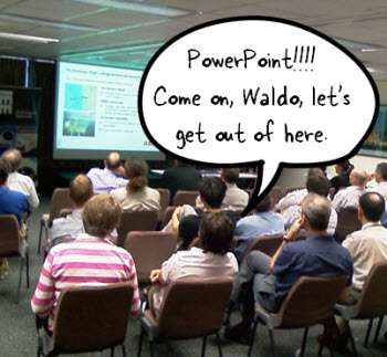
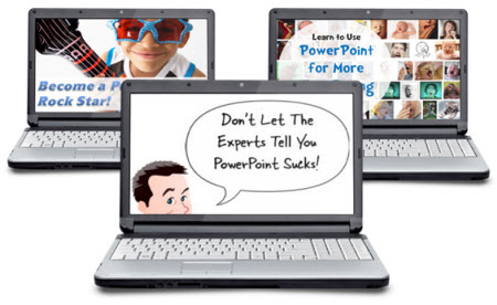
In today’s post I want to offer a simple trick to help you get past the standard PowerPoint design or that template-screen look. It’s not going to make the instruction in the course better (you still need instructional design) but it can definitely make it a bit more visually engaging.

Change Your Background Image

It’s amazing what a nice background can do for the look of your screen. The right background can offer a visual richness that makes the content more inviting.

The Rapid E-Learning Blog - backgrounds can make your elearning course look better

Many rapid elearning developers will use the application’s default background or a pre-built template. That’s a fast way to go, but it doesn’t always work with your content. Instead of a template, try adding a background images that matches the content of your course. It’s a step in the right direction and requires very little effort.

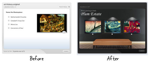
The image above shows a quiz using the default background and one that uses a richer one. That background is a simple stock image and makes a perfect way to show off the art work in a museum.

Find the Right Background

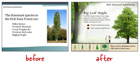
Determine to put the learner in a context that matches the content. For example, in our elearning workshop we walk through the Hoh Rainforest design makeover. The goal is to craft a visually immersive experience. What can we do to get the person into the rain forest? For us it starts with finding a rain forest background image and then we add other complementary elements.

The Rapid E-Learning Blog - example of elearning course makeover

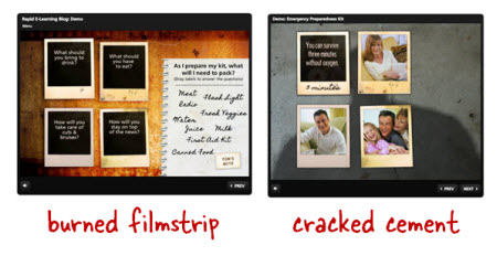
Below is another example.  As you can see we took what’s a typical looking slide and converted it to one that has more visual appeal. Since the topic was how to change a tire we went with an automotive theme. Contextually it’s a better fit with the content than the template. 

The Rapid E-Learning Blog - example of elearning course makeover

The Rapid E-Learning Blog - example of a simple background

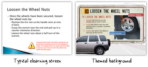
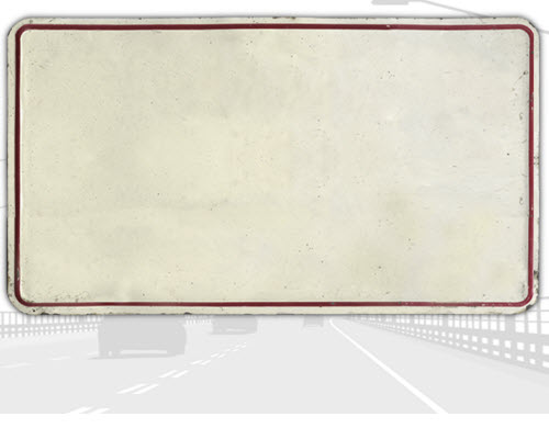
The background is a bit more structured. It consists of a highway backdrop (grayed out stock image) and the content area is a license plate (another stock image). The content on both screens is the same, but which course looks more inviting?

The license plate theme was designed by David for a free starter course we offer in the elearning community. He walks through the process of creating it. But what if you don’t have the graphic design skills to create something like this?

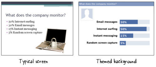
One solution is to find inspiration from other sources. In the example below, the course topic is how an organization monitors Internet usage. Using the Internet to access Facebook at work is very common. So instead of the typical screen, we designed a screen that mimics the Facebook look by using similar colors and lines.

The Rapid E-Learning Blog - example of an elearning course that mimics Facebook

An even easier solution is to settle on a single image background. Think about your course content. What is the one design element that says “this is the topic?” In the Hoh Rainforest demo, we found a single rain forest background image that lets us “step into the rain forest.”

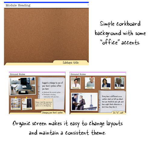
What is the one background image that you can use to bring people into your content? Here are some ideas that are simple and offer flexible layouts. In the corkboard example, the background is the corkboard image.

Corkboards typically have paper and notes tacked to them. I like that type of background because it helps build a single visual theme but gives a lot of freedom in how the content can be laid out. You can also do something similar with a desktop or whiteboard.

The Rapid E-Learning Blog - example of an organic elearning course background image

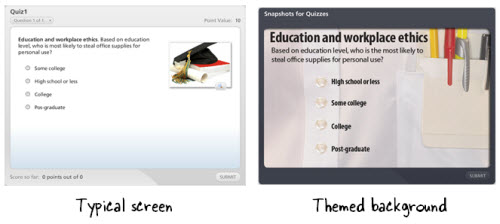
Below is another example. We’re asking questions about workplace ethics. Instead of the default background that comes with the application, we found a shirt that matches a corporate look. It’s just a simple background image. Nothing fancy. But it really adds some nice texture and interest to the screen.

As you can see, you don’t need to modify the image to create a rich-looking background. The quiz example below is just a picture of a shirt pocket.

The Rapid E-Learning Blog - example of a simple background image in an elearning course

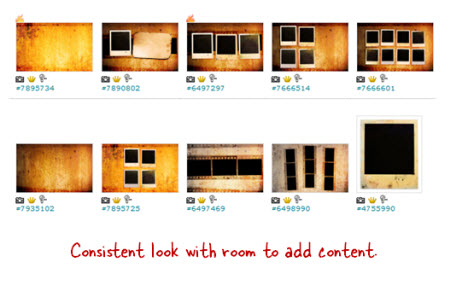
The first step is to determine a single image that represents the essential theme of the content. Then do a search for an image using Microsoft’s site or a stock image site like istockphoto or fotolio.

Here are a couple of ideas for inspiration. I like to look for wallpaper images. They tend to be a little out there, but used the right way can add a nice touch to your courses.

The Rapid E-Learning Blog - wallpaper ideas to inspire an elearning course background

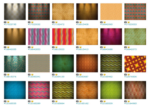
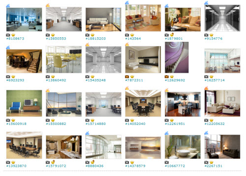
Here’s a link to an idea that probably works better for you. They’re interior images. They’d make great backgrounds for all sorts of elearning courses. You don’t need to buy the expensive images either. I usually get the small versions which just cost a couple of dollars.

The Rapid E-Learning Blog - interiors that can be used for elearning course design

Going back to what I stated earlier, your course is going to look like something. You just have to decide what this is. We’re not all graphic designers but as you can see it doesn’t take much to move from the basic white screen or template to something that fits your content better and has a richer look.

Find the one image that represents the essence of your content and then build from there.

Events

Free E-Learning Resources

Want to learn more? Check out these articles and free resources in the community.

Here’s a great job board for e-learning, instructional design, and training jobs

Participate in the weekly e-learning challenges to sharpen your skills

Get your free PowerPoint templates and free graphics & stock images.

Lots of cool e-learning examples to check out and find inspiration.

Getting Started? This e-learning 101 series and the free e-books will help.


The Rapid E-Learning Blog - 3 PowerPoint tutorials

I know it’s hard to believe, but apparently, there are many people who don’t like PowerPoint. Obviously, there are a lot of bad presentations created with PowerPoint, but it seems to me the blame rests on the shoulders of the presenter and not the tool. Besides, PowerPoint’s a versatile tool that’s used for more than bad presentations.

Personally, I think PowerPoint’s one of the single best multimedia applications. The secret is to look at PowerPoint in a different way. And once you do that you’ll see that it offers an assortment of capabilities.

I just returned from the Training 2012 Conference in Atlanta where I presented on some PowerPoint tips and tricks. For those of you who couldn’t attend, I’ve included links to PowerPoint resources that I’ve shared in previous sessions.

The Rapid E-Learning Blog - free PowerPoint resources and tutorials.

Recently, I was sharing how PowerPoint makes a good image editor. After the session, someone asked about this video where you learn to create a stickout effect that lets the image stick outside the box. It’s a basic cropping technique that allows you to open up the page and add more visual interest to the screen. The person wanted to know how to do that in PowerPoint.

The Rapid E-Learning Blog - the stickout cropping technique

I like this question for a few reasons. It lets me demonstrate how PowerPoint can be used to edit images. And it helps teach more about the features and capabilities of PowerPoint in general. Even if you don’t use PowerPoint to do this on a regular basis, practicing this technique is an excellent way to learn more about PowerPoint’s features.

So let’s look at a few ways to create the “stickout” effect in PowerPoint.

PowerPoint Tutorial 1

The Rapid E-Learning Blog - edit images in PowerPoint tutorial

Click here to view tutorial 1.

PowerPoint 2010 has a background removal feature. However, if you’re using older versions of PowerPoint you can still get the stickout effect. This tutorial shows how.

PowerPoint Tutorial 2

The Rapid E-Learning Blog - edit images in PowerPoint tutorial

Click here to view tutorial 2.

In this tutorial you learn to use PowerPoint 2010’s background removal feature to create the stickout effect.

PowerPoint Tutorial 3

The Rapid E-Learning Blog - edit images in PowerPoint tutorial

Click here to view tutorial3.

This tutorial combines the background removal feature with a duplicate image. Learning to work with layers and multiple images is definitely going to open possibilities when editing images in PowerPoint.

Consolidated PowerPoint Tutorials

I know some of you can’t access the YouTube tutorials at work, so I downloaded the video files and used them to test a drag and drop video player idea in Articulate Storyline. You drag the DVD icon to the orange box and it loads the video. The cool thing is that it only took a few minutes to build the functionality.

The Rapid E-Learning Blog - PowerPoint tutorial videos in Articulate Storyline drag and drop elearning

Click here to view the three PowerPoint tutorials.

You may never need to use this specific image editing technique in PowerPoint, but going through these tutorials will help you learn more about PowerPoint’s features and develop a greater appreciation for the application’s capabilities.

Events

Free E-Learning Resources

Want to learn more? Check out these articles and free resources in the community.

Here’s a great job board for e-learning, instructional design, and training jobs

Participate in the weekly e-learning challenges to sharpen your skills

Get your free PowerPoint templates and free graphics & stock images.

Lots of cool e-learning examples to check out and find inspiration.

Getting Started? This e-learning 101 series and the free e-books will help.


The Rapid E-Learning Blog - create the right visual design for your courses

A while back I shared an example of how to create more engaging course objectives. It’s a great way to get past the bullet list of learning objectives that we often see in courses. I then did a follow up post on how to quickly find images for your elearning courses. The tips in that post are good, but they set up an issue we commonly run into when building courses.

If you look at the images I recommended and the images I used in the course, you’ll see that I didn’t use the images I recommended. I’ll have to admit, I did that to set up this blog post. Let me explain. 

The Rapid E-Learning Blog - compare two backgrounds

Many aren’t intentional when it comes to the visual design of their elearning courses. They usually start with a nice looking template and then as they build the course they’ll add images that represent the content on the screen.

If they have some design skills it’ll look good. But if not, then they end up with a discordant look where the graphics don’t quite match the content. And most likely the graphics won’t quite match the other graphics either.

The Rapid E-Learning Blog - find image packs for consistency

That’s where my earlier tip to find an image pack really works. It lets you get a design for your course that is consistent and polished, and inexpensive.

No Plan Means You Waste Time

But here’s where you may run into some problems. You can waste a lot of time looking for just the right images. But worst of all, you end up letting the images you find drive the course design. That’s not ideal. And that’s kind of what happened to me with my demo.

My initial idea for the demo was beyond my resources, so I decided to look for photo frame pictures on istockphotos. This led me to the Polaroid idea, which then led to the image packs that I wrote about. The image packs worked great because for a few dollars I was able to build a series of rich looking screens for my elearning demo.

But, when I added more content to the demo I soon realized that the images (which were made up of burned filmstrips) just didn’t look right with the earthquake content. The look was rich but it didn’t match the earthquake content and seemed out of place.

How to Craft a Visually Immersive Experience

Elearning courses are mostly visual. When you build a course you have to have the right visual look to match your content. I like to think of it as creating a visually immersive experience where you’re trying to place the learner in the same space as the content.

For example, in our workshops we use this demo of the Hoh Rain Forest. The goal is to place the learner in the rain forest so we walk through the process of converting a simple PowerPoint slide to something more immersive.

The Rapid E-Learning Blog - before and asfter examples of visual design

Going back to the burned filmstrip images, they didn’t work for an earthquake course. When I think earthquake, I think more about damaged buildings. So what I did was swap the burned filmstrip background with a cracked cement image. It works better for the earthquake theme and content.

Visual Design Tips

Here are some quick tips to help build your next course.

  • Find inspiration. Going through stock image and template sites is a good way to come up with design ideas. Perhaps you’ll discover a new way to layout your screen elements. Or maybe you’ll find a cool color scheme. Make time to find inspiration. I keep a notebook of links and ideas so when I need something I can look through it for ideas.
  • Plan your visual design. Looking for inspiration is something you do outside of the course design. It’s an ongoing discipline. But when you start to build your elearning course, you need to be intentional about the design. It’s not something you do on the fly. Otherwise you waste time and probably won’t end up with the best looking course.
  • Image packs from the same artist or style can save time and money. Just like I mentioned in the earlier post, finding image packs will help when it comes to the overall look of your course. But don’t let them drive the design process. Decide what you need before looking for images.
  • Create an immersive visual design. Put the learner where the course will be. In the Hoh Rain Forest demo, the goal is to place them in the forest. If you’re building a course on operating room technology, how will that look compared to one on office policies? And how’s that different than teaching something about warehouse safety? Your visual voice speaks to you and forms a mental image consistent with the course topic. Learn to tap into that voice and you can build a look that matches your content.
  • Keep it simple. Since most of us aren’t graphic designers it helps to have a few simple rules to keep us from creating a mess. At a minimum find the right type of background that lets you craft a visually immersive screen. Just changing a background can do wonders. Then limit yourself to two fonts. One for the titles and one for the body. Determine your color palette before you start building. You probably only need three or four. Determine how you’ll use them and then be consistent throughout the course. A few simple rules applied with intention go a long way.

There’s a lot more to the visual design process. We actually go into it quite a bit in the workshops I do. I have those listed below. The main point is that before looking for images, determine what you want to find. Otherwise you’ll end up wasting time or letting the pictures you find dictate your course design rather than the content doing that.

Do you have some simple graphic design tips you can share for the elearning developer who’s just getting started? Share them by clicking on the comments link.

Events

Free E-Learning Resources

Want to learn more? Check out these articles and free resources in the community.

Here’s a great job board for e-learning, instructional design, and training jobs

Participate in the weekly e-learning challenges to sharpen your skills

Get your free PowerPoint templates and free graphics & stock images.

Lots of cool e-learning examples to check out and find inspiration.

Getting Started? This e-learning 101 series and the free e-books will help.


The Rapid E-Learning Blog - Inspirational elearning examples

Many people are stuck in the world of linear, click-and-read content. Sometimes it’s because that’s all the organization wants. And sometimes it’s because we’re not quite sure how to make something more interactive. It’s probably the subject I’m asked about the most. One of the most frequent questions I get. The cool thing is that regardless of the tools you use, you can still build interactive content.

One of the best ways to learn to build better courses is to find some good examples, break them apart, and then try to build something similar. This way you get some hands-on practice, which is a lot more valuable than reading about interactive elearning.

So in today’s post, we’ll look at a popular example and talk through a few ideas on interactivity.

Get Them to Pull Information

In large part interactivity requires a shift away from pushing the content out (which is common) and instead creating an environment where the learner pulls content in. A good way to get them to pull information is creating a situation where they need to make an informed decision.

I usually recommend throwing people in the pool. Instead of dumping them with a pile of information, dunk them in a pool of opportunity. Let them deal with real-life situations and learn through their decision-making.

Put them in the types of situations where they need to make the decisions you want to them to make. That creates the opportunity for them to demonstrate their understanding and if they’re deficient in understanding they’re motivated to pull the information they need to make an informed decision.

Learn By Dissecting the Work of Others

When I learned to create videos, I’d record TV commercials and then break them down scene by scene. Commercials are great because they’re very effective in communicating essential ideas and they’re short. It’s a lot easier dissecting a 30 second commercial than a 2 hour movie.

After viewing the commercial I’d create storyboards for each scene. Then I’d analyze the scenes, how they were edited, and consider the motivation from one shot to the next. This process of dissecting the commercial slowed it down for me and helped me see what was happening better. The same can be done with elearning courses.

Today we’ll look at a popular example that Cathy Moore shared a while back. We’ll do a simple break down of the module. This is a good example because it’s interactive, engaging, and it’s short enough to go through it a few times.

The Rapid E-Learning Blog - interactive decision-making scenario

Click here to review the module first.

Basic breakdown of the course:

  • Introduction. The course starts with an introduction that sets the stage and expectations. You can consider it the establishing shot. We want to establish what the learner’s seeing so that they know where they’re at and what’s expected.
  • Context. After the introduction, they begin to build some context. They’re putting the learner in a real situation and then offering some guidance on getting through it. You’ll notice instead of a bunch of screens of information about the culture and country, they provide two characters who will provide differing perspectives. What I like about that approach is there’s a bit of ambiguity in the way they share their perspectives. This is much more like real life where things aren’t always tidy or obvious. It brings a healthy tension to the scenario.

The Rapid E-Learning Blog - provide context for your elearning scenario

  • Challenge. Once the scenario’s set up the learner’s offered a challenge which is the course objective—make a good impression and build a relationship with the Haji. The scenario presents a series of mini challenges that build on each other. The squad leaders offer advice that can help with the decision-making.

The Rapid E-Learning Blog - provide a good challenge for your elearning scenario

  • Choices. After collecting the advice a decision needs to be made. The course provides a few choices. One thing you’ll notice is that the choices are all plausible and viable. The problem with many interactive elearning scenarios is that they are very obvious and don’t deal with the nuances we face in real life. If all of the choices are viable it puts more pressure on us to pay attention and collect the right information. We want them to learn and not guess their way through the situation.

The Rapid E-Learning Blog - provide viable and relevant choices for your elearning scenario

  • Consequences. Each choice produces a consequence, with some more positive than others. Sometimes progress I made in the relationship and sometimes it’s a step backwards. I like the quick feedback because in lieu of a real conversation, you need to read the body language of the Haji. It’s enough of a tip without being too much feedback. Another thing I like about this particular scenario is that the choices aren’t all do or die. You can make a poor choice and still recover if you’re paying attention to the information you collect. Often we provide immediate feedback and that’s it. In this scenario you may find the right outcome but realize it wasn’t the best. It kind of motivates you to go back and find out what was a better outcome.

The Rapid E-Learning Blog - provide feedback and consequences for your elearning scenario

Your Next Steps

As you can see, breaking down the scenario is a great way to come up with a formula that could work for your own scenario.

  • Introduction. Set expectations. Let them know what to expect and how long it should take. It also helps if the course is visually engaging.
  • Context. Put the learner in a real world environment where they make the types of decisions that impact their performance. Not sure what that is? What’s the goal and expected outcome after the course? How can they demonstrate that they’re able to meet the objectives?
  • Challenge. Give them some good challenges that get them to think. You can even add a few distractors. Some people like to jump ahead and answer questions first and wait for feedback. But others will want a bit more information to make an informed decision. Give them the freedom to do so.
  • Choices. What choices do they have to work through the scenario? Make them viable and real. If they’re obvious choices, then the interactivity is wasted. Sometimes I throw them for a loop by making all choices wrong or all of them correct. Not having an “all of the above” or “none of the above” option adds some healthy tension.
  • Consequences. Each decision produces consequences. Sometimes the consequence is simple feedback and sometimes it can become another decision-making challenge. Do this to vary the pacing. You don’t always need to provide immediate feedback. Delay it. You’ll notice that in the scenario there’s some feedback from the Haji to give you a sense of what direction you’re moving, but it’s not “right” or “wrong” feedback. You just have to keep plodding forward and you’ll find out if you succeed at the end.

Without too much focus on the great visual design of the course, take note of how you can navigate through the module. There’s always a place to restart and also quickly advance through the modules. This gives the learner freedom and control. It also encourages going through the course a few times. My guess is that most people go through the module at least twice if not more. Would that be the case if every screen was locked like they are in many courses?

Action Items

Cathy discusses the scenario in more detail on her blog. But before you look at it, do this. As you go through the course try to map out the flow. How many individual screens are there? Go through it a few times. You’ll start to see a pattern and realize that the structure of the program is not that complicated and easy enough for you to do, regardless of your authoring tool.

The secret is taking the time to analyze the course and then creating a model that you can repeat with your own content.

Here’s another cool scenario-based module that’s been making the rounds. It’s a good one to dissect. Do the same thing; make some notes on what you like and how it flows. Try to create your own outline of the course. Then use that structure as a guideline for your own scenario.

The Rapid E-Learning Blog - good example of an interactive elearning scenario built in Articulate Storyline

Click here to view the interactive scenario.

If you want to look at other multimedia examples for inspiration, David does a great job collecting them at his elearning examples site. Most of them are smaller interactions so they’re perfect to break apart.

Perhaps you can take one of your linear courses and convert it to an interactive scenario using the same structure and outline as the soldier scenario. It’ll be good practice and I’m sure you’ll wow them at work.

If you do rework a course and make it more interactive, feel free to share the link. We’d love to see what you do.

Events

Free E-Learning Resources

Want to learn more? Check out these articles and free resources in the community.

Here’s a great job board for e-learning, instructional design, and training jobs

Participate in the weekly e-learning challenges to sharpen your skills

Get your free PowerPoint templates and free graphics & stock images.

Lots of cool e-learning examples to check out and find inspiration.

Getting Started? This e-learning 101 series and the free e-books will help.